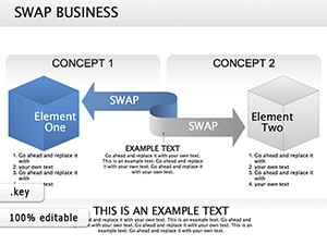
Streamline your data storytelling with our column Keynote diagrams collection, crafted for analysts, educators, and business leaders who demand clarity in every chart. These templates specialize in vertical bar representations, ideal for comparing metrics like sales figures or performance indicators across categories. With Apple`s native Keynote format, integration is effortless, ensuring smooth animations and responsive scaling.
Targeted at users seeking precision without complexity, each diagram includes customizable axes, labels, and color gradients that adapt to your dataset. From stacked columns for multi-series analysis to clustered bars for side-by-side comparisons, these designs eliminate guesswork. High-fidelity vectors maintain sharpness on Retina displays, while built-in themes align with corporate palettes.
Dive into our column diagrams category and discover tools that turn raw numbers into compelling narratives. Instant downloads mean you`re presentation-ready in minutes.
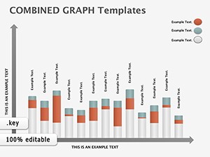
Column diagrams excel at highlighting variances and trends, making them indispensable for quarterly reviews or academic lectures. Our Keynote templates elevate this by incorporating interactive elements like hover effects for detailed tooltips, which standard charts lack. This interactivity fosters deeper audience engagement, turning passive viewers into active participants.
Unlike generic Keynote defaults that require extensive tweaking, our templates arrive pre-formatted with consistent spacing and legend placements. For example, a sales report might feature animated column builds that reveal growth quarter-over-quarter, synced to your narration pace. This not only saves design time but also enhances retention of key insights.
A standout feature is the data import compatibility - paste from Excel or Numbers directly, with auto-adjusting scales. Best practices recommend using no more than seven categories per chart to avoid clutter, ensuring scannability.
Go beyond basics by combining columns with Keynote`s shape libraries for hybrid visuals, like embedding pie slices within bar tops for nuanced breakdowns. In marketing pitches, animate columns to "grow" in real-time as you discuss projections, creating a dynamic reveal that captivates.
For remote teams, these templates support export to PDF with preserved animations for screen shares. Innovate in sustainability reports by color-coding columns with eco-friendly gradients, visually tying data to environmental impacts.
| Aspect | Column Keynote Templates | Default Keynote |
|---|---|---|
| Animation Options | Pre-set builds & transitions | Basic fades |
| Data Handling | Auto-scaling imports | Manual entry |
| Customization Depth | Layered editable elements | Limited themes |
These enhancements position our templates as essential for polished, data-driven storytelling. Select and download yours to refine your next deck effortlessly.
Implementing these strategies will amplify your presentations` persuasiveness and professionalism.
Designed for Keynote 13 and later, ensuring full feature support including advanced animations.
Simply copy-paste from spreadsheets; the templates auto-adjust columns and labels accordingly.
Yes, all transitions and builds are fully customizable via Keynote`s inspector panel.
Export to PowerPoint or PDF for cross-platform compatibility while retaining core visuals.
Alt text for charts and high-contrast options promote inclusive viewing experiences.
Optimized at under 10MB each, balancing quality with quick loading times.
Elevate your data game - explore the category and secure your column diagrams template today.
Copyright © 2009-2026 ImagineLayout All rights reserved.