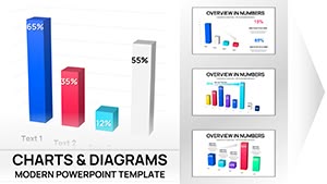
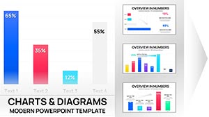
Harness the power of precise visuals in Keynote with our column chart templates, perfect for creative directors, financial planners, and tech presenters. These charts erect sturdy columns of data, shaded in harmonious hues to delineate categories like expenses, user growth, or survey results, all optimized for Apple`s seamless ecosystem.
They empower users by simplifying edits - tweak values on the fly, align with your slide master, and export crisply. Say goodbye to pixelated imports; hello to native finesse that makes dense info digestible and decisions decisive.
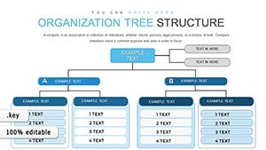
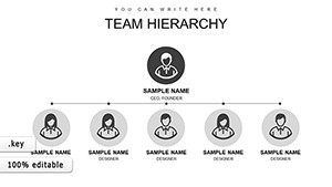
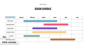
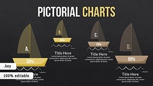
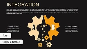
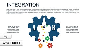
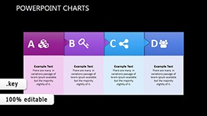
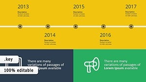
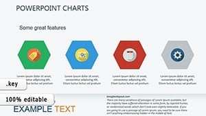
View our column Keynote charts and select a style to scaffold your story. One-click downloads deliver instant enhancement.


Keynote`s stock charts lack flair for nuanced narratives, yet our column variants infuse vitality with gradient fills and curved caps, rendering variances vivid without visual noise. This elevates boardroom briefs, where subtle shades signal subtleties over stark stocks.
Mac users rave about the layer-based construction, facilitating non-destructive tweaks for iterative designs.
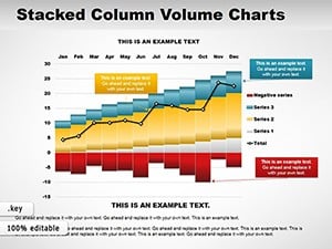
Financial Overviews: Erect columns for asset allocations, clustering by risk levels for portfolio pitches.
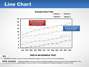
Design Reviews: Track user testing metrics, with waterfalls for iterative improvements.
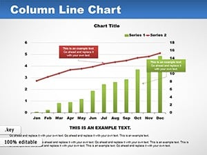
Tech Demos: Benchmark app features via side-by-side columns, underscoring UX wins.
Ground with axis titles in sans-serif clarity, then cluster logically for at-a-glance groups. Leverage Keynote`s magic move for column transitions between slides, and embed tooltips for hover details. Prioritize WCAG contrasts for broad accessibility.
Templates transcend templates with shape-based builds, vector-sharp on any resolution.
A fintech app`s metrics deck columns engagement by demographic, igniting investor interest. In creative agencies, stacked variants map project phases, clarifying timelines transparently.
These elevate evidence to eloquence.
Assess assortments and acquire a chart charmer. Download to define your data destiny.
Direct copy-paste from spreadsheets, preserving formulas and formats.
Manual overrides for logarithmic or custom intervals, plus auto-fit toggles.
Build-in or simultaneous reveals, synced to slide timings precisely.
PDF, PowerPoint, or image sequences for cross-platform sharing.
Up to 20 series per chart, with legend auto-placement.
Copyright © 2009-2026 ImagineLayout All rights reserved.