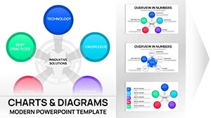
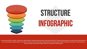
Transform raw numbers into compelling narratives using our circular chart templates crafted for PowerPoint. These designs go beyond basic pies, offering layered cycles that reveal patterns, progressions, and interconnections in your data.
Ideal for analysts, executives, and educators, they simplify complex datasets like market shares or performance metrics into intuitive visuals. Picture a multi-ring chart tracking quarterly sales growth, with each arc pulsing with color-coded insights - perfect for boardroom impact.
Fully vector-based and animation-ready, these templates integrate seamlessly with PowerPoint`s tools. Customize fills, legends, and transitions to match your brand, saving precious prep time. Whether charting project milestones or ecological balances, these charts make your points stick.
Browse our circular PowerPoint charts and chart your path to persuasive presentations.

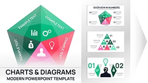

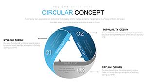


Circular charts shine in showcasing cyclical data, from seasonal trends to feedback mechanisms, providing a 360-degree view that`s more engaging than linear graphs. In PowerPoint, our templates harness SmartArt enhancements for effortless scaling and morphing effects, turning static data into interactive stories.
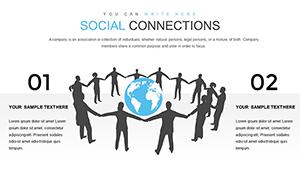
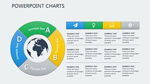
Business analysts use them to depict revenue streams looping through departments, highlighting bottlenecks at a glance. In education, they illustrate planetary orbits or election cycles, making abstract concepts tangible. Marketers map content funnels, with conversion rates radiating from the center.
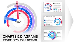
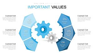
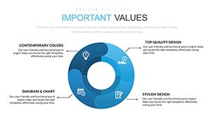
Unlike PowerPoint`s generic doughnuts, our pre-styled versions include thematic icons and subtle gradients, elevating professionalism while cutting design time by 70%.
In finance, a circular chart can radialize portfolio diversification, with asset classes as segments showing risk correlations. Healthcare pros diagram patient care cycles, from diagnosis to recovery, emphasizing preventive loops. Tech teams visualize agile sprints, with velocity metrics encircling team contributions.
For non-profits, track donation impacts in a virtuous cycle: funds to programs back to awareness. Creative agencies chart campaign lifecycles, from brainstorming to ROI measurement.
Pair with PowerPoint`s chart tools for hybrid views, like overlaying line trends on circular bases for comprehensive analytics.
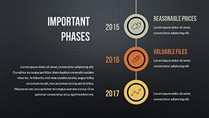
Experiment with asymmetry for storytelling - widen arcs for growth areas in a budget cycle. Embed hyperlinks in segments for drill-down details during Q&A. In sales decks, animate a chart to "fill" progressively, mirroring achievement milestones.
These touches not only inform but inspire, turning data dumps into dialogue starters.
Unlock the cycle of success - select and download your circular PowerPoint chart today.
Use the Animations pane to apply spin or grow effects, sequencing by segment for phased reveals.
Yes, connect to external sources like Excel for automatic refreshes on slide load.
Full control over colors, fonts, and labels via the Format Shape menu.
Built-in 3D rotations and perspectives for depth without performance lag.
Up to 20 segments, with grouping for denser datasets.
Export as images or PDFs, or copy-paste into Google Slides.
Harness these circular charts to make your PowerPoint presentations a full circle of excellence. Continue discovering templates that data-ify your success.
Copyright © 2009-2026 ImagineLayout All rights reserved.