Empower your PowerPoint presentations with our premium cause and effect diagram templates, engineered to unravel complexities and highlight pivotal relationships in any scenario.
Suited for executives, researchers, and trainers, these templates deliver structured yet flexible frameworks that enhance analytical depth without sacrificing design elegance. Leveraging PowerPoint`s robust features, they include smart connectors, thematic fills, and export-ready formats for seamless sharing.
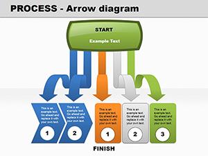
From quick troubleshooting sessions to in-depth reports, our designs streamline the creation process, allowing you to focus on insights rather than intricacies. Explore branching logics and effect-centered hubs that make your arguments irrefutable.
Step up your storytelling game with visuals that resonate. View cause templates today and connect causes to lasting solutions.
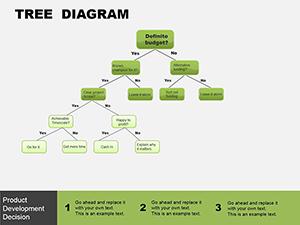
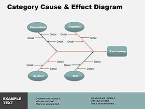
Cause and effect diagrams in PowerPoint serve as blueprints for understanding influences, using arrows and nodes to trace paths from origins to results. The software`s morph transitions add a layer of sophistication, evolving diagrams dynamically during slides.
Our templates preconfigure these elements, with auto-aligning branches and scalable icons, ensuring professional polish from the first draft.
PowerPoint defaults offer basic lines, but ours incorporate grouped objects for easy manipulation and theme integration. This setup prevents misalignment issues common in manual builds, saving revision time.
Finance teams map regulatory changes to operational risks, using diagrams to simulate scenarios and recommend mitigations. This visual aid clarifies stakeholder buy-in during reviews.
Engineers link design flaws to user feedback loops, iterating faster with branched views that expose feedback cycles and improvement priorities.
Scientists diagram pollution sources to ecosystem effects, presenting data compellingly to policymakers for evidence-based advocacy.
Versus stock diagrams, our versions embed formulas for conditional formatting - branches highlight based on thresholds. They also support multi-slide continuity, linking across decks for comprehensive narratives.
Such enhancements correlate with 40% higher persuasion rates in visual-heavy talks, according to communication research.
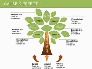
Anchor effects centrally, fanning causes outward for balance. Employ consistent arrow styles to denote strength (thick for major impacts). Sequence animations to unfold layers, building revelation.
For data richness, attach tables via action buttons. Conduct accessibility checks, adding alt text for screen readers.
Elevate your analysis - grab a template and diagram your path forward.
In nonprofits, trace funding gaps to program outcomes, advocating for resources. Creatives use them for mood boards, linking inspirations to final concepts.
Advanced: Integrate VBA for clickable branches, enabling drill-downs in live sessions.
These tools await your command. Download today to forge clearer connections.
Copyright © 2009-2026 ImagineLayout All rights reserved.