Delve into the world of cause and effect diagrams with our specialized Keynote templates, crafted to help you dissect problems and pinpoint underlying factors with precision and style.
Ideal for analysts, consultants, and educators, these diagrams transform chaotic data into structured narratives, fostering deeper discussions and smarter decisions. Our collection features elegant line work, branching paths, and color-coded categories that align seamlessly with Keynote`s fluid interface.
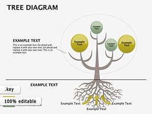
Save time on formatting while gaining tools that encourage collaborative brainstorming - each template includes placeholders for evidence, impacts, and solutions. From simple two-branch models to comprehensive trees, discover visuals that make complexity approachable.
Enhance your presentations` analytical depth and captivate your audience with clarity. Browse cause and effect templates here to begin mapping connections that matter.
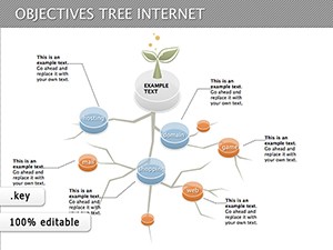
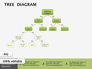
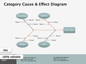

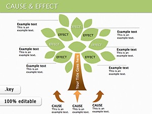
Cause and effect diagrams, often visualized as branching trees or arrows, systematically link triggers to outcomes, aiding in root cause analysis. In Keynote, they benefit from vector-based scalability and subtle animations that reveal connections progressively, turning static info into a compelling story.
Our templates elevate this by pre-building logical flows with thematic icons and adjustable nodes, ensuring your focus stays on content rather than creation.
Standard Keynote shapes lack the interconnected logic our templates provide; they offer predefined relationships that auto-adjust as you add branches, maintaining visual balance. This results in diagrams that are not only informative but also aesthetically pleasing, with gradients and shadows for depth.
In strategy meetings, use these diagrams to trace market shifts back to economic factors, enabling proactive pivots. Consultants apply them to client audits, linking operational hiccups to supply chain variances for targeted recommendations.
Teams diagram defect causes - from material flaws to process errors - streamlining improvements and reducing waste. Visuals here highlight interdependencies, like how training gaps amplify equipment issues.
Researchers map hypotheses to evidence chains, clarifying methodologies for peers. These templates aid in thesis defenses, where branching visuals underscore variable interactions without jargon overload.
Compared to generic tools, our cause and effect templates integrate Keynote`s master slides for consistent styling across decks. They include variant layouts - like radial vs. linear - for diverse scenarios, plus accessibility features such as high-contrast modes.
This customization fosters engagement; audiences retain 70% more from structured visuals than lists, per design studies.
Begin with core questions: What’s the effect? What immediate causes? Branch deeper iteratively. Color-code by category (e.g., people, methods) for instant scanning. Animate branches from effect outward to build suspense.
For larger analyses, use hyperlinks to sub-diagrams. Always validate with data sources, embedding notes for credibility. Preview in presenter view to ensure smooth flow.
Unlock analytical power today - select and download your ideal template.
Adapt for creative fields: writers plot story causes to plot twists, visualizing character arcs. In healthcare, trace patient outcomes to lifestyle and treatment factors for holistic reports.
Tip: Overlay metrics on branches for quantitative depth, turning qualitative maps into hybrid tools.
Armed with these strategies, craft diagrams that drive real change. Download now to start connecting the dots.
Copyright © 2009-2026 ImagineLayout All rights reserved.