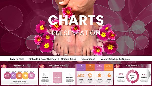
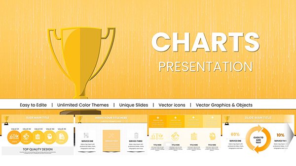
Bring your career data to life with our specialized Keynote chart templates, crafted to visualize progress, trends, and projections with precision and style. Ideal for performance reviews, strategy sessions, or skill assessments, these tools help you communicate insights that drive decisions.
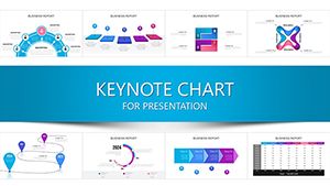
Aimed at analysts, managers, and presenters who need to distill numbers into narratives, the templates offer a range of chart types - from pie charts for market shares to Gantt timelines for project milestones. With native Keynote integration, scaling and styling are effortless, ensuring compatibility across devices.
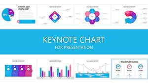
Enhance your slides with color-coded legends, interactive elements, and annotations that highlight key takeaways. Whether tracking salary growth or team productivity, these designs make data accessible and persuasive.
Peruse our options and select charts that amplify your professional voice today.


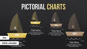
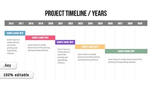

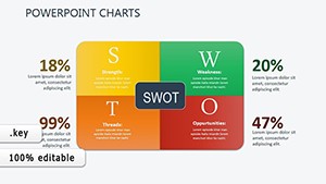
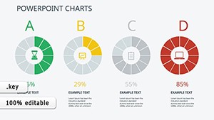
What sets these apart is their focus on career-specific metrics, like promotion ladders visualized as stepped bar charts or competency radars for self-assessments. Default Keynote charts require manual setup; ours come pre-formatted with formulas for auto-updates, saving valuable prep time.
For example, a sales forecast template uses line graphs with trend lines to predict quarterly targets, complete with confidence intervals for realism.
From consulting firms charting client ROI to HR teams graphing retention rates, these templates fit myriad roles.
Built-in charts often lack thematic consistency; ours align with broader slide decks for unified aesthetics. They`re vector-based for infinite scalability and include accessibility tags for screen readers.
These steps ensure your charts inform without overwhelming.
A project manager visualized resource allocation with stacked area charts, clarifying bottlenecks and earning project approval. An executive coach used radar charts to profile client strengths, tailoring development plans that accelerated promotions.
In nonprofits, impact reports with heat maps have swayed donors by quantifying outreach effectiveness. These cases underscore the templates` power to turn data into dialogue.
Empower your presentations with precise charts - grab a template and visualize victory.
Yes, import data from Numbers or Excel for live updates in Keynote.
Select templates include 3D options, but we recommend 2D for better readability.
Use Keynote`s color picker to match your brand palette effortlessly.
Yes, optimized for up to 1,000 data points without performance lags.
Export as images or PDFs for standalone use in reports.
Make data your ally in career advancement - download chart templates and chart your course.
Copyright © 2009-2026 ImagineLayout All rights reserved.