Delve into the world of butterfly Keynote diagrams, where the intricate patterns of wings inspire visuals that connect ideas seamlessly. These templates transform mundane data flows into elegant narratives, perfect for illustrating processes, relationships, and transformations in your presentations.
Designed for Keynote users who value aesthetics alongside functionality, each diagram features scalable vector elements, intuitive drag-and-drop editing, and built-in animations that simulate gentle wingbeats. From venn overlaps mimicking butterfly symmetry to flowchart paths evoking migration routes, these tools help clarify chaos into coherent stories.
Audience engagement soars with these designs - consultants use them for client strategy sessions, scientists for research overviews, and designers for concept mapping. With a variety of layouts from radial hubs to linear sequences, there`s a diagram for every need. Save hours on creation and focus on your message. Peruse our selection and select a template that resonates with your vision today.
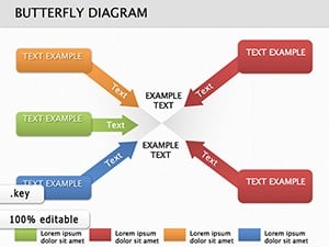
Butterfly Keynote diagrams excel at representing interconnected systems, drawing from the insect`s symmetrical beauty to create balanced visuals. They outperform traditional arrows and boxes by adding a layer of metaphorical depth, helping viewers grasp nuances like feedback loops in project management or symbiotic relationships in biology.
For business analysts, a butterfly diagram can depict market influences with central body as core strategy and wings as external factors. Educators appreciate how these visuals aid in teaching evolution or supply chains, making abstract theories tangible. In creative fields, artists employ them for storyboarding, where each `wing` segment highlights plot developments.
Versus standard diagram tools in Keynote, which can feel mechanical, butterfly versions introduce organic curves that reduce cognitive load and boost recall by evoking familiarity. Studies show nature-inspired graphics increase comprehension by up to 40% in group settings.
Our butterfly diagrams shine through their modularity - mix and match components across templates for bespoke creations. Unique propositions include embedded hyperlinks for interactive drills and color-coded layers for multi-tiered analysis. Follow best practices like anchoring the diagram`s `body` to your main thesis and using wing spans to proportion subtopics evenly.
Enhance with micro-animations, such as sequential reveals that build the diagram petal by petal, drawing eyes progressively. Professionals note quicker audience buy-in, as the visuals prime creative thinking before diving into details.
Innovative uses include gamifying training with clickable wing paths or layering AR elements for virtual conferences. These diagrams aren`t mere illustrations; they`re catalysts for deeper discussions.
With seamless integration and endless adaptability, our butterfly Keynote diagrams are your shortcut to polished, persuasive visuals. Download one and watch your presentations metamorphose.
Absolutely, all elements are vector graphics, ensuring sharp quality at any scale in Keynote.
Yes, use Keynote`s text tools to insert and format labels that update with your content changes.
Templates are font-agnostic, supporting any language Keynote handles for global presentations.
Designed for recent versions but backward-compatible; minor adjustments may be needed for legacy software.
Export as PowerPoint first, then import to Slides - most features transfer smoothly.
Apply `Scale` or `Rotate` builds sequentially to mimic natural unfolding for dramatic effect.
Copyright © 2009-2026 ImagineLayout All rights reserved.