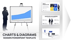
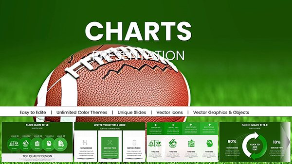
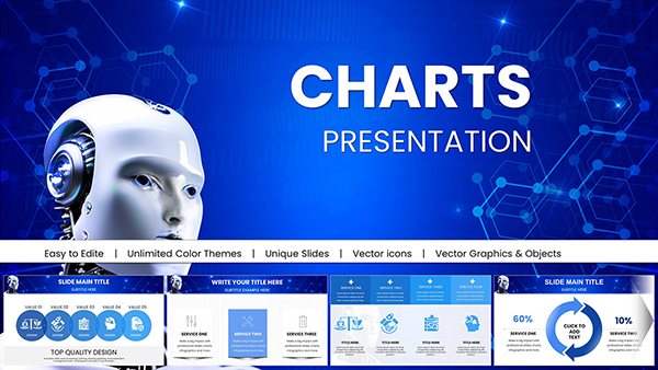
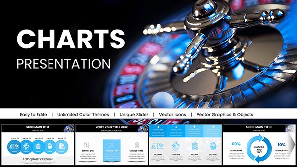
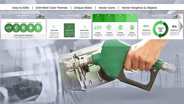
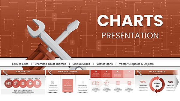
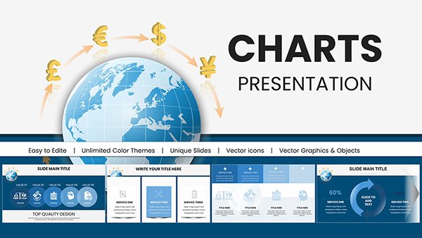
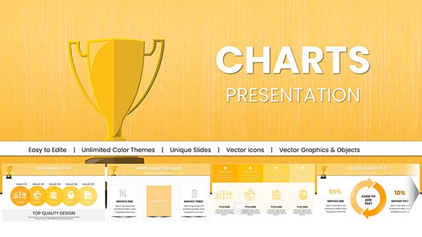
Upgrade your presentations with our professional PowerPoint chart templates designed for business success. Each template transforms raw data into clear, engaging visuals that captivate your audience and enhance understanding.
Whether reporting quarterly performance, analyzing market trends, or presenting financial insights, these ready-to-use charts save you hours while elevating the visual quality of your slides.
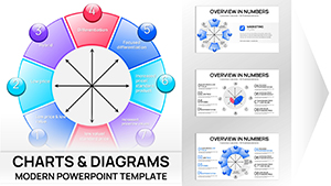
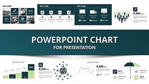
Business Analyst PowerPoint Charts Template for Impactful Presentations
ID: #PC00292
$25.00
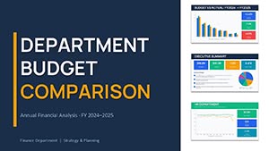
Enhance Your Business Presentations with PowerPoint Charts
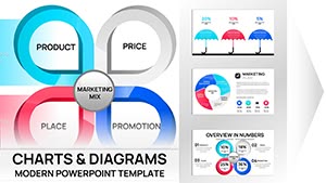
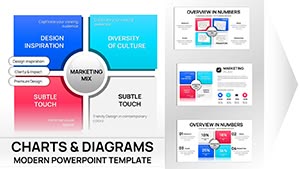
Our collection offers diverse chart types including bar, line, pie, area, and scatter plots, each crafted to simplify complex data and communicate insights effectively.
Real-World Use Cases
Sales and marketing reports
Financial analysis and forecasting
HR and workforce analytics
Education and training presentations
Benefits over Default Templates
Unlike standard PowerPoint charts, our templates feature professional design, cohesive color schemes, optimized typography, and smart placeholders for consistent, polished visuals.
Creative Tips and Best Practices
Highlight key data points with contrasting colors
Simplify layouts by removing unnecessary elements
Include context with units, timeframes, and benchmarks
Test charts at presentation size and customize colors and fonts to align with your brand identity.
Frequently Asked Questions
What types of charts are included?
Bar, line, pie, area, scatter, and advanced dashboard charts suitable for various business presentations.
Can I customize colors and fonts?
Yes, all templates are fully editable to match your corporate style guide and brand colors.
Are these templates compatible with Google Slides?
Most templates work seamlessly in both PowerPoint and Google Slides with minor adjustments.