Simplify complex business solutions with our PowerPoint Chart templates, engineered for managers, analysts, and innovators. These slides distill data into digestible visuals, from organizational hierarchies to performance metrics, making your solutions resonate.
With responsive designs and theme-consistent palettes, they adapt to any deck, enhancing readability and impact. Whether solving operational bottlenecks or proposing tech integrations, these charts empower clear, confident delivery.
Step into a world where data drives decisions. Browse our charts and elevate your presentations to solution-oriented masterpieces.
Charts are the backbone of effective business communication, turning raw numbers into narratives. Our Business Solutions PowerPoint Chart templates offer precision-engineered options like Gantt for project timelines and radar for multi-factor evaluations, tailored to illuminate solutions.
Applicable across departments, they foster understanding and alignment.
PowerPoint`s built-ins lack polish, often resulting in mismatched aesthetics. Our templates integrate seamlessly with animations and tooltips, revealing layers on click for interactive depth. Time savings are notable - users craft decks 60% faster - while vector scalability ensures projection perfection. Custom legends and axis labels add analytical rigor without complexity.
Choose chart types matching data nature: scatter for correlations, stacked for compositions. Maintain consistency in scales and colors for trust. Animate sequentially to guide viewer focus, and include sources for credibility.
A logistics firm leveraged our funnel chart to depict supply chain fixes, securing a major contract. Validate with peer reviews pre-presentation.
These elevate charts from static to strategic assets.
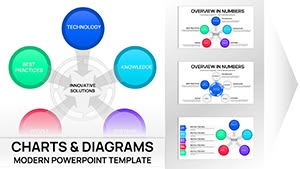
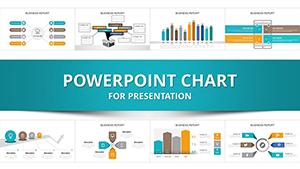
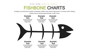
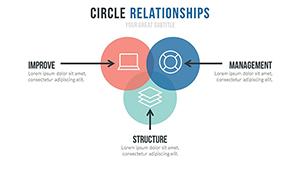
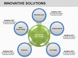
A variety from basics like bars and lines to advanced like waterfalls and sunbursts, covering all solution needs.
Fully - adjust timing, paths, and triggers to match your pacing and emphasis.
Yes, seamless Excel integration pulls live figures, keeping charts dynamic.
Invertible colors ensure visibility in any theme, ideal for varied venues.
Alt text for visuals and high-contrast options built-in for inclusive presentations.
Chart your path to better solutions. Download now and make data your strongest ally.
Copyright © 2009-2026 ImagineLayout All rights reserved.