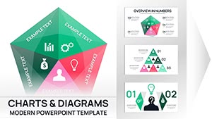
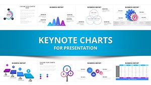
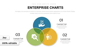
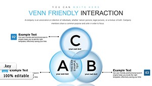
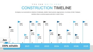
Drive productive discussions with business meetings Keynote chart templates that distill data into decisive insights. Crafted for executives, facilitators, and analysts, these include agenda timelines, KPI dashboards, and decision trees to navigate conversations efficiently.
From sales funnels to risk matrices, they transform raw numbers into narrative powerhouses. Keynote`s charting prowess enables real-time tweaks, keeping meetings agile.
Optimized for virtual or in-person formats, they foster alignment. Personalize with company motifs for branded coherence.
Enhance every huddle - examine our charts and download to chart courses confidently today.
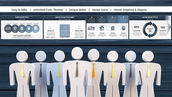
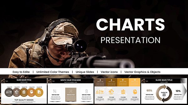
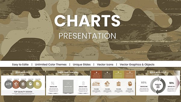
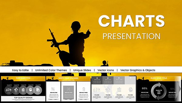
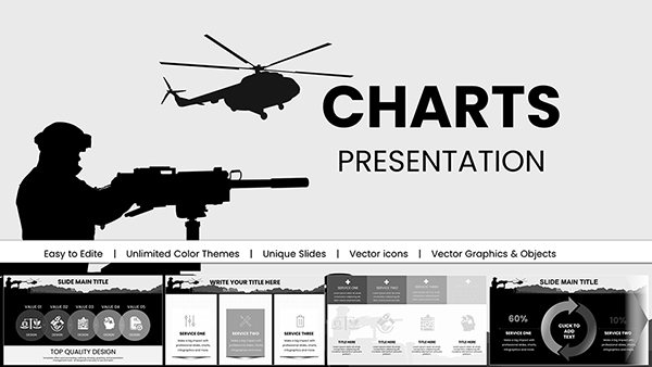
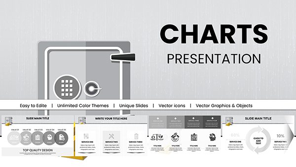
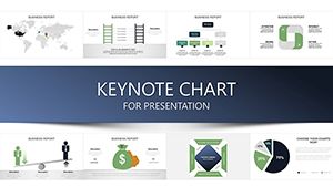
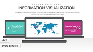
Effective meetings hinge on visuals, and our Keynote chart templates deliver, eclipsing plain graphs with interactive elements like drill-down pies and animated bars. Managers deploy them for quarterly reviews, spotlighting variances that spur actions.
Prime perks: vector scalability for crisp prints and formula integrations for accuracy, minimizing errors. This elevates discourse from debate to direction.
They advance beyond basics with conditional formatting for at-a-glance alerts.
Prioritize simplicity: limit to 5-7 data series per slide. Harmonize colors with meeting themes, using tools for gradient fills. Animate sequentially to guide focus, aligning with discussion flow.
Promote accessibility via labels and legends, aiding diverse participants. These tactics sustain attention and comprehension.
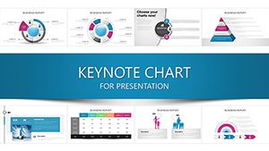
Repurpose for board reports with executive summaries or team retrospectives via sentiment gauges. Consultants tailor for client debriefs, embedding benchmarks. Versatility extends utility across hierarchies.
Embrace analytics: charts for AI-driven forecasts or ESG metrics modernize agendas.
Director Kim shortened stand-ups using our dashboards, reclaiming hours weekly. Analyst Pat clarified budget shifts with waterfalls, averting overruns. These shifts illustrate visualization`s velocity.
Layer narratives with annotations to contextualize trends profoundly.
Steer smarter - download Keynote charts now and meeting mastery. Venture into related visuals for variety.
Copyright © 2009-2026 ImagineLayout All rights reserved.