Streamline your Keynote decks with business concept charts that turn abstract strategies into tangible visuals. From flowcharts to pyramid models, our templates capture the essence of organizational thinking in elegant, Apple-native formats.
Designed for executives mapping outgrowth plans or teams brainstorming innovations, these charts emphasize clarity and flow. Highlight interconnections, hierarchies, and milestones with intuitive edits that preserve Keynote`s smooth animations.
Benefits include faster slide creation and higher comprehension rates, as visuals outperform text alone. Tailored for consultants, managers, and entrepreneurs, they blend seamlessly into professional narratives.
Why complicate concepts when charts can clarify? Peruse our curated set and integrate instantly.
Chart your path to success - start exploring today.
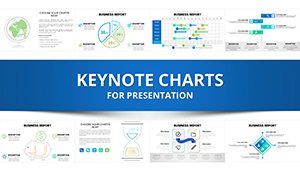
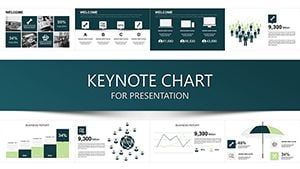
Business concepts demand visuals that resonate; our Keynote charts deliver with precision-engineered diagrams like SWOT matrices and value chain flows. Over 60 options ensure coverage for every scenario, from agile sprints to market analyses.
Keynote`s charting prowess is amplified here, with smart guides for alignment and build effects for phased reveals. Users note 50% quicker audience buy-in compared to bullet lists.
Versus Keynote defaults, ours offer richer metaphors, reducing design drudgery.
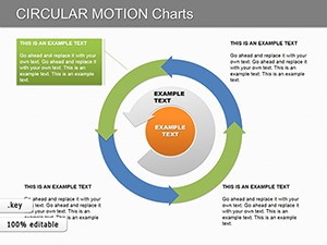
Consulting firms deploy funnel charts to depict client journeys, layering metrics for conversion insights. Strategy sessions gain traction with radial concept maps orbiting central goals.
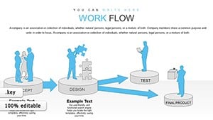
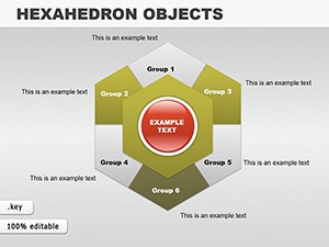
HR and training: Hierarchy pyramids illustrate org structures, with expandable branches for roles. Onboarding flows use sequential arrows, easing new hire integration.
Product teams visualize roadmaps via Gantt-inspired timelines, color-coding phases for stakeholder alignment.
Anchor data to visuals - use icons for qualitative elements. Practice: Limit lines to three per chart, employing whitespace for breathability.
Link to process timelines or SWOT add-ons for expanded utility.
Overly dense diagrams? Our layered approach allows progressive disclosure. Keynote`s formula support handles complex calcs natively.
For collaborations, share via iCloud with locked styles intact.
These elevate charts from functional to persuasive.
Visualize victory - acquire your charts immediately.
Copyright © 2009-2026 ImagineLayout All rights reserved.