Strong business analysis relies on clear data visualization. Our business analysis chart templates for PowerPoint help analysts and managers turn numbers into actionable insights with professional, engaging designs.
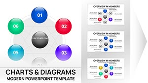
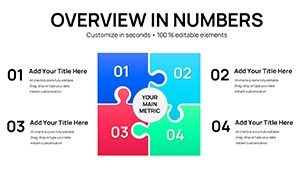
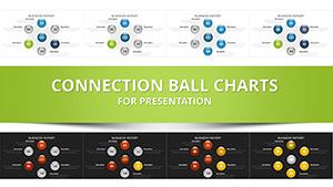
Choose from over 100 fully editable, animated templates including SWOT diagrams, Pareto charts, funnel models, matrix layouts, and dashboard-style visuals - all updated for 2026 presentations.
Perfect for strategy sessions, performance reviews, and market studies, these ready-to-use options save time while delivering impactful results.
Transform raw data into compelling stories that drive decisions.
Generic charts can obscure insights. Our templates provide sophisticated layouts, color schemes, and structures designed specifically for analytical work, making patterns and opportunities immediately visible.
Advantages include deeper audience understanding, faster consensus, and more confident recommendations.
Expert-crafted designs help analysts focus on interpretation rather than formatting.
These templates work brilliantly for:
A Pareto chart, for example, can quickly highlight the 20% of issues causing 80% of problems, guiding prioritization.
Best approaches:
Download a free business analysis template and apply these tips now!
Our collection covers Pareto, funnel, bubble, matrix, BCG, and dashboard layouts - everything needed for thorough business analysis.
Yes, customize every element in PowerPoint with ease.
Yes, multiple variations of popular analysis frameworks.
Yes, many free templates with premium expansions.
Most templates include built-in animation options.
Over 100 specialized business analysis charts.
Copyright © 2009-2026 ImagineLayout All rights reserved.