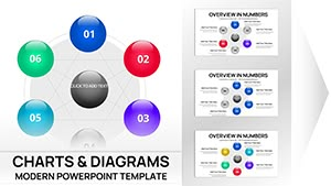
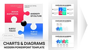
Empower your Keynote presentations with business analysis charts that distill complex data into actionable visuals. This collection includes flow diagrams, SWOT matrices, and performance dashboards, engineered for analysts and executives.
Targeted at consultants, managers, and strategists, these charts facilitate deeper dives into market trends, operational efficiencies, and growth opportunities. With drag-and-drop editing, transform raw numbers into compelling stories.
Boost decision-making by highlighting patterns others miss. Whether quarterly reviews or strategic overviews, these tools ensure precision and persuasion.
Chart your course: Review our business analysis Keynote charts and integrate one into your workflow.

Business analysis Keynote charts excel in translating metrics into narratives, featuring adaptive grids and trend lines that surpass static spreadsheets. Finance teams deploy them for variance analyses, where waterfall charts reveal profit drivers vividly.
Unlike default graphs, these incorporate thematic consistency, aligning with corporate palettes for seamless branding. The outcome: presentations that inform and influence stakeholders confidently.
Guideline: Label axes clearly and annotate outliers to guide interpretations. These charts accelerate insights, often halving prep time.
Unpack benefits: Interactive toggles allow drill-downs during live sessions. A project lead might sequence bubble charts to cluster initiatives by ROI and feasibility.
Insight: Layer secondary data for context, like overlaying benchmarks on bar series. They outshine basic tools by supporting scenario modeling.
Amplify with color coding - greens for positives, reds for alerts - to cue quick reads.
Cater to audiences: Boards favor summaries, analysts detail dives. Validate data sources pre-insert to maintain integrity.
Cloud compatibility enables real-time updates in team environments.
Analyze ahead: Download a chart template and refine your analysis today.
Copyright © 2009-2026 ImagineLayout All rights reserved.