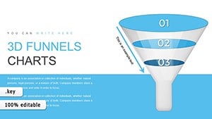
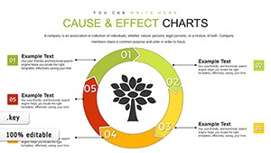
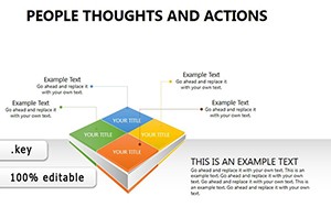
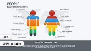
Elevate activity tracking with business activities chart templates optimized for Keynote. For creative directors, analysts, and strategists, these graphics distill multifaceted operations into elegant, Apple-native visuals that inspire confidence.
Including radial plots for cyclical tasks and scatter for correlations, they facilitate nuanced storytelling. Key gains: Streamlined prep and audience wow-factor in keynotes or internal shares.
Leveraging Keynote`s precision, designs ensure pixel-perfect renders. Curate from our charts to fit your activity emphasis perfectly.
Product teams chart feature adoption, bubble plots showing user segments. Finance reviews expense activities, combo charts blending categories.
Event planners map attendance trends, area charts for growth projections. R&D logs experiment outcomes, box plots for variability.
Keynote basics lack flair; ours feature gradient fills and motion paths, crafting immersive data experiences effortlessly.
Standout: Magic Move transitions between charts. Tips: Cluster related visuals, label sparingly, and sync with slide themes.
Inventive: Animate chart builds to mimic activity sequences live.
Illuminate operations - browse Keynote chart templates now.
A creative agency charted project timelines, securing extensions. Wellness apps visualized user habits, informing updates.
Polish: Calibrate colors for colorblind views, and rehearse transitions.
Chart a course to clarity. Secure your templates and shine.
Copyright © 2009-2026 ImagineLayout All rights reserved.