Bullet PowerPoint Charts
Secure your data stories with bulletproof PowerPoint chart templates, built for resilience and reliability. Tailored for auditors, scientists, and executives facing scrutiny in every metric.
These templates offer fortified features like error bars, dual axes, and validation layers, benefiting users in finance, research, and compliance. They withstand rigorous reviews while maintaining visual integrity.
From bullet graphs for performance targets to control charts for variability, they anchor your arguments solidly. Protect your narrative from misinterpretation.
Examine the lineup and bolster your toolkit today.
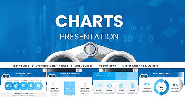
Search Marketing PowerPoint: Binoculars Charts for Insights
ID: #PC00979
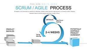
Scrum Agile Process PowerPoint Charts Template for Presentation
ID: #PC00828
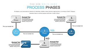
Process Phases PowerPoint Charts Template: Mapping Architectural Journeys
ID: #PC00824
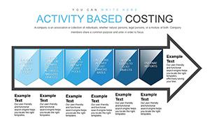
Activity-Based Costing Arrow PowerPoint Charts Template for Presentation
ID: #PC00823
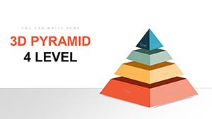
3D Pyramid PowerPoint Charts: 7-Level Template for Immersive Data
ID: #PC00729
3D Pyramid PowerPoint Charts - Editable PPTX | ImagineLayout
ID: #PC00726
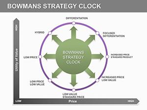
Bowmans Strategy Clock PowerPoint Template
ID: #PC00185
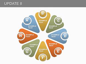
Pie Update 8 PowerPoint Charts Template: Revolutionize Your Data Storytelling
ID: #PC00155
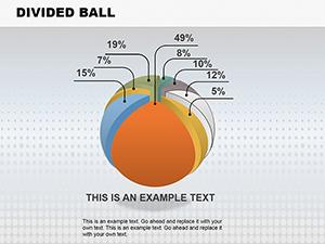
Divided Ball PowerPoint Charts Template
ID: #PC00149
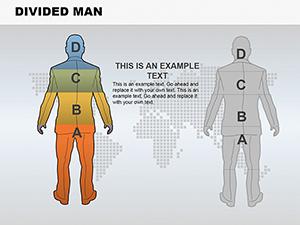
Divided Man PowerPoint Charts Template Presentation
ID: #PC00144
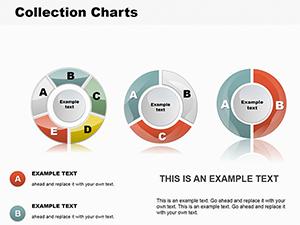
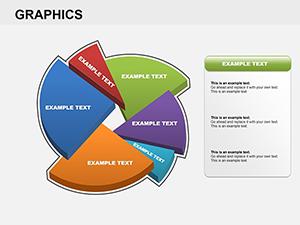
Collection Pie PowerPoint Charts Template
ID: #PC00139
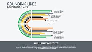
Rounding Lines PowerPoint Charts: Curve Your Data into Architectural Mastery
ID: #PC00106
Pie Charts PowerPoint Template - Fully Editable | Instant Download
ID: #PC00105
3D Pie Graphics PowerPoint Charts Template: Bring Data to Life in 3D
ID: #PC00092
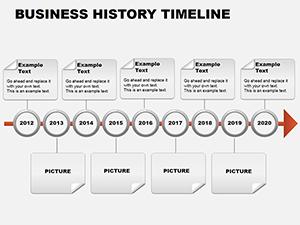
Business History Timeline PowerPoint Charts
ID: #PC00084
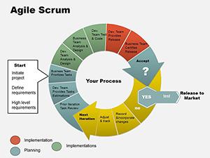
Agile Scrum PowerPoint Charts - Fully Editable | ImagineLayout
ID: #PC00083
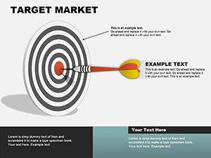
Target Market PowerPoint Charts Template Presentation
ID: #PC00081
Fortifying Presentations with Bulletproof Charts Reliability trumps flash; our templates embed safeguards like data validation and trend lines, surpassing fragile builds in durability. Auditors verify claims via annotated bars; scientists plot confidence intervals meticulously.
They instill confidence, with scalable proofs for peer scrutiny. In compliance, pyramid charts stack regulatory layers unassailably.
Critical Deployments Finance: Variance analyses in bullet formats.Research: Error-plotted scatters.Compliance: Checklist-integrated gauges.Engineering: Tolerance bands in histograms. Uphold standards: Cite sources in footers, cap decimals for focus. Templates wire these defenses inherently.
Resilient Design Strategies Reinforce with secondary datasets or what-if scenarios. In a risk assessment, a tornado chart ranks sensitivities bulletproofly.
Adjust via formula bars for recalcs. Share securely via protected views.
Vetted Examples Quality Control: Shewhart charts for process stability.Budgeting: Waterfall decompositions.Trials: Forest plots for meta-evidence. Bulletproofing yields trust - data shows 40% fewer queries. Validate inputs pre-build.
Frequently Asked Questions Anchor in facts - stock for audits or labs. Static for archives, dynamic for lives.
Overlay audits or benchmarks. In science, they fortify hypotheses.
Security Measures Encrypt embeds. Audit trails via comments. Backup variants. Defend your data with unyielding charts. Reliability is your edge.