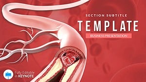
Blood tests form the cornerstone of diagnostics, yet explaining results can be challenging. Our Keynote templates for blood tests streamline this, providing intuitive designs that turn numbers into narratives everyone can follow.
Labs, doctors, and wellness coaches benefit from slides featuring reference range gauges, trend graphs, and anomaly highlights. These elements make interpreting CBCs or lipid panels straightforward, fostering trust and clarity in consultations.
With Keynote`s polish, animations reveal outliers smoothly, keeping explanations dynamic. Adaptable for telehealth or in-office use, they fit seamlessly into your workflow.
Unlock the potential to make science relatable. Scan our library and grab a template to enhance your next result review.
Distinctive for their lab-inspired aesthetics - think pipette motifs and grid backgrounds - these templates make data pop without overwhelming. A cholesterol slide with rising bar animations intuitively shows risk levels, far more engaging than static tables.
Full vector scalability ensures crispness on Retina displays or shared screens.
In practice, they reduce explanation time while boosting comprehension rates.
Generic Keynote themes demand custom graphing, leading to inconsistencies. Ours include pre-formatted SI unit converters and flaggable abnormals, cutting setup by hours and ensuring accuracy across international standards.
Best approach: Lead with normal ranges, then spotlight variances - our structures support this flow naturally.
Add Spotlight effects to emphasize critical values in glucose tests or link to apps for ongoing tracking. A nutritionist used one for client reports, turning routine check-ins into motivational milestones. For workshops, gamify with quiz slides on test meanings.
These touches transform data into dialogues.
Browse and download to clarify results effortlessly.
Pair with disease overviews for holistic blood health talks. Clarity is key.
Multiple choices - select and simplify.
Copyright © 2009-2026 ImagineLayout All rights reserved.