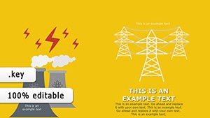
Discover the power of our Keynote diagrams templates, designed to distill complex information into digestible formats that enhance understanding. From flowcharts mapping processes to Venn diagrams illustrating overlaps, these tools are essential for anyone crafting persuasive narratives in presentations.
Business analysts, project managers, and educators find these templates invaluable for breaking down workflows or comparing methodologies without overwhelming slides. Each design emphasizes clarity with minimalistic lines, intuitive icons, and scalable vectors that maintain sharpness on any display.
By focusing on user-friendly editing, you can tweak connections and labels in moments, allowing more focus on your core message. Whether outlining team structures or brainstorming creative flows, these diagrams elevate your content from ordinary to outstanding.
Unlock clearer ideas today - explore our full range of Keynote diagrams templates.

While Keynote`s built-in shapes suffice for simple sketches, they fall short in sophistication for professional use. Our templates provide pre-configured layouts with smart guides for alignment, reducing errors and ensuring polished results. Default options might require constant resizing, but these come with responsive elements that adapt to content changes seamlessly.
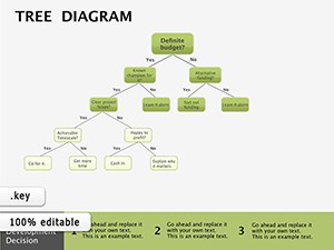
For example, a hierarchical org chart in our library auto-adjusts branches as you add roles, unlike manual drawings that demand tedious repositioning.
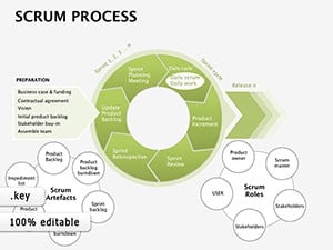
In consulting, swimlane diagrams clarify responsibilities in project timelines, preventing miscommunications during client reviews. Tech teams use sequence diagrams to prototype software interactions, fostering efficient development cycles.
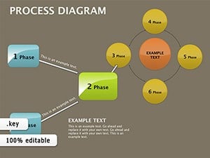
Instructors employ mind maps to explore topic branches, helping learners connect dots in interactive sessions - a cycle diagram might trace historical events, making lessons memorable.
Leaders leverage pyramid diagrams for goal hierarchies, visually stacking priorities to align teams on objectives.
Begin with a rough sketch on paper to define structure, then select a template that mirrors it. Use contrasting colors for emphasis - blues for processes, greens for outcomes - and incorporate subtle shadows for depth. Group related elements to maintain organization during edits.
Preview in presentation mode early to check flow; adjust arrow directions for logical progression. For voiceovers, pair with concise notes in the speaker view.
A nonprofit used a Sankey diagram to show resource flows in their annual report, revealing impact paths that inspired donor confidence. In product design, affinity diagrams clustered user feedback, sparking feature innovations during ideation meetings.
One designer recounted employing a radial diagram for brand positioning, with spokes representing attributes - it clarified competitive edges in a pitch that won the contract.
Simplify your storytelling - grab a Keynote diagrams template and communicate with confidence.
With these diagrams at your fingertips, complex ideas become your greatest assets. Browse the selection and elevate every presentation you create.
Copyright © 2009-2026 ImagineLayout All rights reserved.