Master the art of data storytelling with our specialized PowerPoint chart templates, engineered to turn raw numbers into persuasive visuals. Perfect for analysts, managers, and presenters who need to convey trends and forecasts with precision and flair.
These templates feature a variety of chart types - from bar graphs to pie slices - each optimized for clarity and impact. Enjoy drag-and-drop editing, auto-scaling axes, and color-coded legends that make complex datasets accessible at a glance.
Targeted at business intelligence pros and academic researchers, they streamline your workflow, ensuring professional polish without the hassle. Integrate seamlessly with Excel for live data pulls.
Peruse our chart collection and empower your presentations with data that drives decisions!
Effective charts aren`t just pretty pictures; they`re tools that unlock understanding. Our PowerPoint chart templates prioritize intuitive design, using grid alignments and minimalistic styling to highlight patterns without distraction. This approach contrasts sharply with cluttered defaults, where overlapping elements obscure key insights.
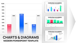
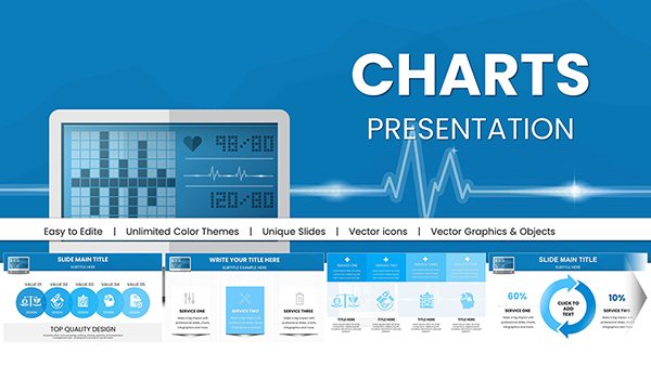
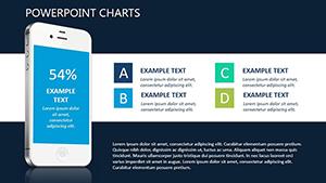
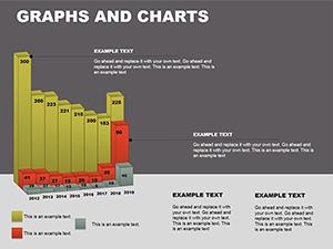
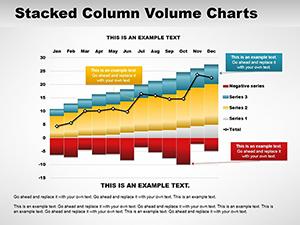
In finance, deploy line charts to track stock fluctuations over quarters. Marketers can use donut charts for audience segmentation, revealing preferences in vibrant segments. Scientists benefit from scatter plots that correlate variables with pinpoint accuracy.
Our templates shine by embedding formulas for dynamic updates, saving recalculations and ensuring accuracy. They also adhere to universal design standards, like sufficient spacing for color-blind users.
Begin with selecting the right chart type, then refine axes for scale and add trendlines for projections. Layer in annotations for context, turning a basic bar into a narrative powerhouse.
Envision a sales team reviewing pipeline health - our funnel chart template morphs stages with color gradients, instantly spotting bottlenecks.
Transform your data game - download a chart template and visualize victory.
David, a data analyst, adopted our radial template for client dashboards, slashing explanation time by half and winning praise for clarity. Elena, in healthcare, mapped patient outcomes with heat maps, informing policy changes effectively.
Such applications demonstrate versatility - from e-commerce trend spotting to environmental impact modeling.
Link to external sources for real-time refreshes, test readability at 10 feet, and version control for iterations. Full support for PowerPoint`s chart engine means no compatibility woes.
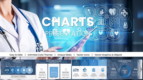
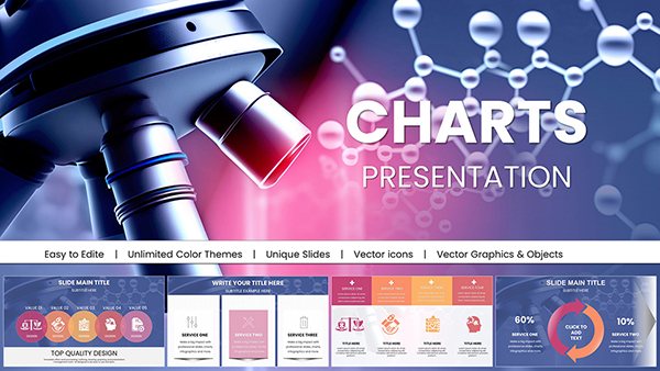
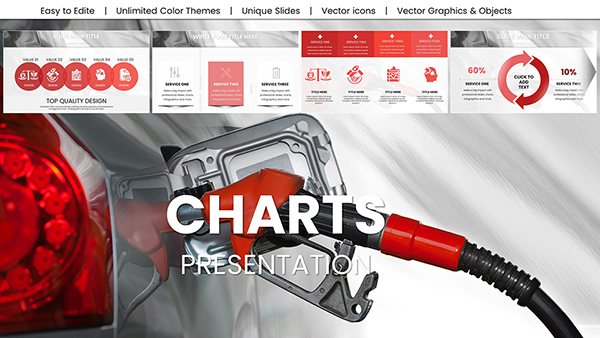
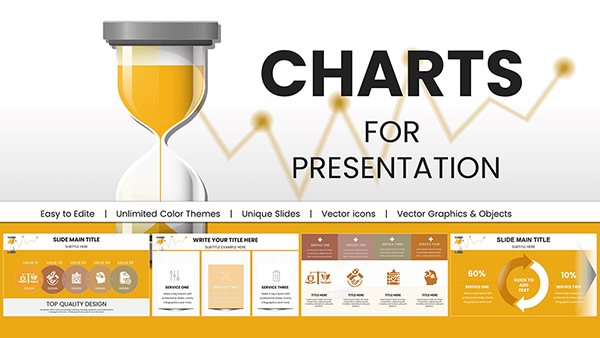
From bars and lines to pies and radars - over 20 varieties for diverse needs.
Yes, embed live links for automatic updates as spreadsheets change.
Built-in sequences reveal data progressively for dramatic effect.
Use filtering options and aggregation tools to simplify without losing essence.
Charts that communicate win audiences. Secure your PowerPoint chart template now.
Copyright © 2009-2026 ImagineLayout All rights reserved.