Transform raw data into persuasive visuals using our curated PowerPoint chart templates. Designed for analysts, executives, and educators, these slides make complex information digestible at a glance. From bar graphs to pie charts, each template emphasizes clarity and elegance, helping you convey trends and forecasts with confidence.
Ideal for quarterly reviews, sales forecasts, or academic lectures, they feature intuitive layouts that adapt to your dataset sizes. Save hours on formatting and focus on the story behind the numbers. Our collection spans modern minimalism to bold infographics, ensuring a fit for every presentation style.
Browse now to discover templates that not only present data but elevate your narrative, driving decisions and discussions forward.
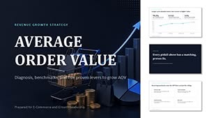
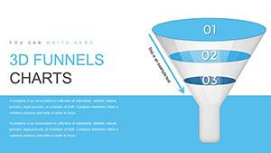


Charts are indispensable in business intelligence, where they distill vast datasets into actionable insights. Our templates shine in financial reporting, allowing CFOs to illustrate revenue streams via stacked area charts that highlight growth phases clearly. In marketing, teams deploy funnel diagrams to map customer journeys, pinpointing drop-off points with color-coded segments for targeted strategies.
Educational settings benefit too - professors use scatter plots to demonstrate correlations in research data, making abstract concepts concrete for students. Healthcare professionals visualize patient trends with line graphs, aiding in treatment planning discussions.
Retailers craft heat maps to reveal sales hotspots across regions, overlaying icons for product categories to inform inventory decisions. Tech firms illustrate user engagement with radial charts, showcasing metrics like session duration in a compact, eye-catching format.
PowerPoint`s native charts often suffer from bland aesthetics and limited customization, resulting in slides that fail to engage. Our templates counter this with refined palettes and smart animations, transforming static graphs into interactive elements that reveal data layers progressively.
For instance, a default pie chart might overcrowd with labels, obscuring proportions; ours employs exploded segments and tooltips for cleaner, more informative displays. This leads to higher audience comprehension, as visual clarity can boost retention rates by 40% according to design studies.
Moreover, while basic options lack scalability for large datasets, our designs handle thousands of points without lag, maintaining crisp renders on high-res screens.
Select chart types wisely: Use bars for comparisons, lines for trends over time. Maintain consistency in scales to avoid misleading perceptions, and always include source footnotes for credibility.
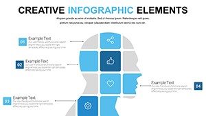
Integrate icons sparingly to annotate peaks or valleys, adding context without clutter. For accessibility, ensure high contrast ratios and alt text for screen readers.
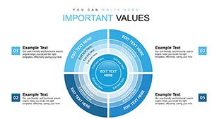
The "Growth Accelerator" template features animated bar races ideal for competitive analysis, where bars climb in real-time to show market share shifts. For sustainability reports, "Eco Metrics" offers circular gauges mimicking speedometers, visually tracking carbon reduction goals.
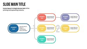
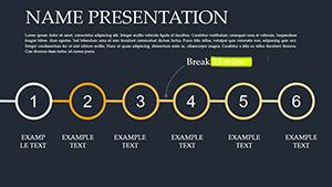
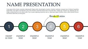
Sales pros love "Pipeline Flow," a horizontal process chart that maps deal stages with progress indicators, making forecasts feel achievable.
Ready to visualize your data like a pro? Download a template and see the difference.
Our library covers bar, line, pie, scatter, area, and radar charts, plus advanced hybrids like waterfall and Gantt for comprehensive data needs.
Yes, direct linking from Excel ensures real-time updates, keeping your slides synchronized with source spreadsheets.
Fully - adjust timing, easing, and sequences to match your presentation`s pace and emphasis.
Optimized for efficiency, they support up to 10,000 data points with smooth rendering and no performance dips.
Yes, color schemes auto-adjust for dark backgrounds, ensuring readability in any viewing environment.
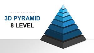
Subtle 3D options are available for depth without distortion, ideal for emphasizing volume-based data.
Copyright © 2009-2026 ImagineLayout All rights reserved.