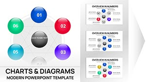
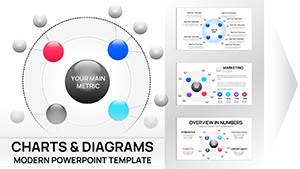
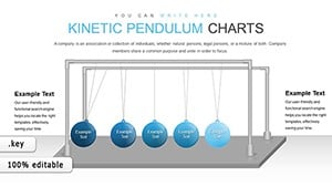
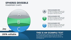
Experience the bounce of innovation with Balls Keynote Charts, transforming static data into vibrant, interconnected visuals. Suited for researchers, marketers, and teams, these spherical templates depict distributions, lifecycles, and hierarchies with effortless charm.
Proportional sizing and linking lines make relationships pop, while color schemes differentiate insights intuitively. In Keynote`s ecosystem, they shine with smooth animations that suggest real motion, elevating routine reports to engaging spectacles.
Whether outlining org structures or product evolutions, these charts foster memorable discussions. Easy to adapt, they fit any theme or scale. Peruse our options and infuse your keynotes with spherical sophistication - start downloading to roll out better stories.
Elevating Keynote Presentations with Spherical Visuals
Balls Keynote Charts infuse fun into facts, using orbs to convey multi-dimensional data that flat alternatives can`t match. They excel in showing clusters and flows, crucial for collaborative environments where quick understanding drives progress.
For R&D pros, visualize experiment phases as orbiting balls; marketers can chart consumer behaviors in networked spheres. This approach boosts retention by making info feel alive and approachable.
Diverse Use Scenarios
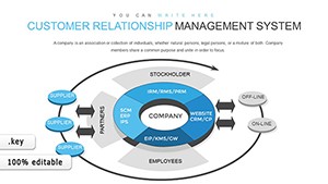
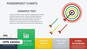
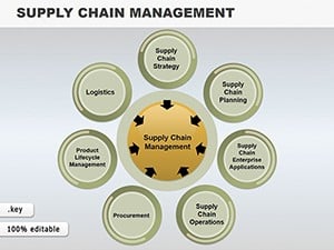
HR Strategies: Map team dynamics with connected balls for org chart innovations.
Market Research: Display share distributions via sized spheres for trend spotting.
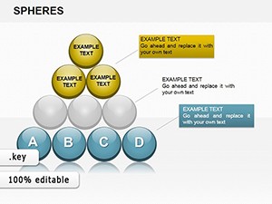
Product Development: Illustrate cycles with looping arrangements to trace evolutions.
Academic Lectures: Represent theories like ecosystem balances through balanced clusters.
Superior to traditional plots, they add thematic grouping, aiding outlier detection and narrative flow.
Distinctive Features and Best Practices
Vector precision ensures flawless scaling, with flexible layouts for grids or cycles. Pro tips: Animate connections gradually for reveals, use opacity for depth, and space generously for legibility.
Apply creatively in interactive sessions by linking to hyperlinks within balls. Secure your charts today and master data delivery with poise.
Optimization Steps
Match colors to data categories for instant recognition.
Group outliers with glow effects to draw focus.
Incorporate text labels inside larger spheres for space efficiency.
Version control changes for team reviews.
These ensure charts enhance, not overwhelm, your keynotes.
Frequently Asked Questions
Ideal for negative data? Code with contrasting colors or off-center positions.
Labeling options? Internal text or callout lines for clarity.
Animation compatibility? Native Keynote effects like bounces for entrances.
Large group handling? Subset to essentials, use drill-downs.
Export quality? Retains vectors in PDF or video formats.