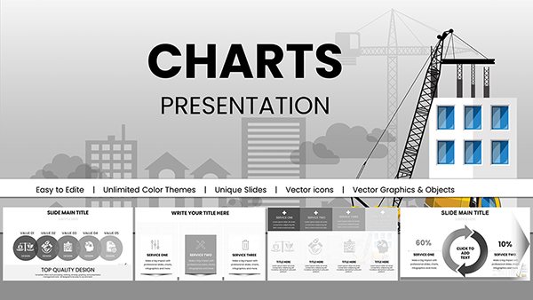
PowerPoint chart templates are designed for professionals who need to present data with precision, structure, and visual authority. Whether you are preparing a financial report, performance dashboard, investor presentation, or analytical review, structured charts communicate insight far more effectively than default shapes or basic spreadsheet screenshots. This category is built for business users who require clarity, comparability, and executive-ready formatting.
Unlike manually created charts in standard PowerPoint layouts, these templates provide pre-aligned grids, balanced typography, consistent color logic, and scalable data visualizations. They are ideal when accuracy, credibility, and readability matter - especially in consulting, finance, marketing analytics, and strategic planning contexts.

Business presentations often fail not because of weak analysis, but because of poor visual translation of numbers. A well-structured chart transforms raw figures into patterns, trends, and comparisons that executives can absorb in seconds. This category focuses specifically on chart-centric slides where quantitative insight is the core message.
These templates are especially effective when presenting:
Instead of adjusting axis labels, resizing legends, and fixing alignment manually, you begin with a professionally structured visual framework that supports analytical storytelling.
Standard PowerPoint charts are functional but visually generic. They often require time-consuming formatting and lack visual hierarchy. In contrast, professional chart templates provide:
Key figures stand out through contrast and scale. Secondary data is intentionally muted. This ensures the audience immediately understands what matters most.
Proper margins, balanced white space, and grid-based alignment create a clean, corporate-ready appearance that strengthens credibility.
Colors are not decorative - they follow business logic. For example, comparisons use controlled contrasts, and growth indicators apply intuitive visual signals.
All elements remain fully editable, allowing you to adapt values, labels, or categories without breaking layout integrity.
Board-level presentations require clarity and confidence. Structured bar charts, line graphs, and combination charts help leaders quickly evaluate performance trends and strategic outcomes.
Income statements, cost breakdowns, and investment comparisons benefit from professionally styled column and stacked charts that maintain accuracy while improving readability.
Campaign performance, funnel conversion, and channel ROI reporting become more persuasive when displayed through comparative visual frameworks.
Consultants rely on charts to validate recommendations. Professionally designed slides enhance analytical authority and client trust.
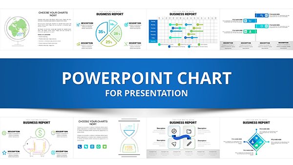
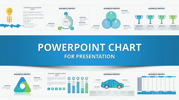
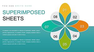
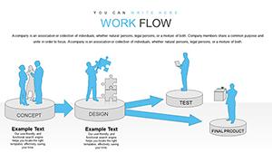
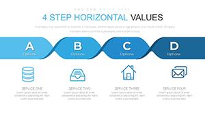
This category may include a wide range of visual structures, such as:
Each layout is designed to preserve clarity even when multiple data points are presented simultaneously.
Chart templates are specifically built for numerical data visualization. Unlike diagrams that illustrate processes or conceptual relationships, charts focus on measurable values and quantitative comparison. If your objective is to explain workflow, hierarchy, or structure, diagram templates are more appropriate. However, when your message relies on numbers, percentages, financial figures, or metrics, chart-based slides are essential.
This category exists separately because data reporting demands a higher level of precision and alignment than conceptual visuals. The user decision here is clear: choose chart templates when your message depends on measurable evidence rather than narrative explanation.
Even the best-designed chart can become unreadable if overloaded. Focus on the most relevant data points that support your argument.
Use callouts or subtle emphasis techniques to direct attention toward conclusions rather than leaving interpretation entirely to the audience.
When presenting multiple charts in one deck, align axis ranges to preserve accurate comparisons.
A short explanatory headline above the chart improves comprehension and reinforces the analytical takeaway.
Select these templates when:
If your presentation depends on evidence-based persuasion, professionally structured charts significantly improve clarity and impact.
PowerPoint chart templates provide more than aesthetic improvement - they strengthen analytical communication. By combining structured layout, visual hierarchy, and business-focused formatting, these slides help transform raw data into compelling insight. For professionals who rely on numbers to drive decisions, these templates offer a reliable and efficient foundation for high-quality reporting.
Yes, all chart elements including data values, labels, colors, and layout components are fully editable directly within PowerPoint.
Absolutely. The structured layouts are particularly suitable for income statements, growth analysis, cost comparisons, and investment reporting.
Most collections include various chart formats such as bar, line, stacked, area, and pie charts to support different analytical needs.
Choose charts when your message is based on measurable numerical data. Diagrams are more suitable for illustrating processes, structures, or conceptual relationships.
Copyright © 2009-2026 ImagineLayout All rights reserved.