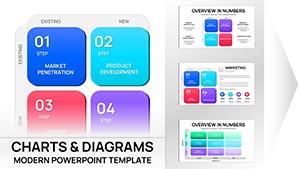
Empower your growth playbook with Ansoff Model PowerPoint charts, engineered for analysts and leaders seeking structured insights. These charts unpack the model`s essence through robust, data-ready designs that facilitate informed choices across all four strategies.
From penetration benchmarks to diversification forecasts, they equip you with tools for compelling, evidence-based discussions. Suited for corporate settings, they bridge theory and execution effortlessly.
This category arms you with visuals that drive dialogue. Choose one and position your organization for sustainable expansion.
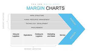
Dynamic Margin Analysis PowerPoint Charts: Unlock Business Insights with Precision
ID: #PC00770
$22.00
Harnessing Ansoff in PowerPoint Charts
Our Ansoff Model PowerPoint charts fortify presentations with layered matrices - each quadrant alive with formulas for dynamic updates. Perfect for quarterly planning, they quantify potentials with bar overlays and trend lines.
Directors dissect options, teams align priorities. Excel integration amplifies their prowess.
Core Use Cases
Banking: Diversification grids for product lines.
Software: Penetration analytics for user bases.
Real Estate: Development timelines for portfolios.
A logistics provider`s network build: the chart`s grid expands with route data, pinpointing low-risk entries - a roadmap to scale.
Superior to Standard Matrices
Standard ones ignore interconnections; ours link quadrants with flow arrows, revealing cascades. High-res scalability beats fuzzy defaults.
Optimization Tips
Input scenario variables for what-if simulations. Advice: Sequence reveals from low to high risk for persuasive buildup.
Includes pivot table hooks for advanced users.
Examples and Strategic Twists
For e-learning platforms: stack quadrant charts with enrollment projections, using glow effects for highlights. Twist: Add decision trees branching from each cell.
In manufacturing, frame as cost-benefit visuals. Tip: Employ thematic colors - green for growth, amber for caution.
Advanced Features
Embed VBA for automated recalcs, evolving charts live.
CTA: Boldly plan - get your Ansoff chart for PowerPoint power.
Frequently Asked Questions
Clarifying paths to proficiency. Discover more charts today.