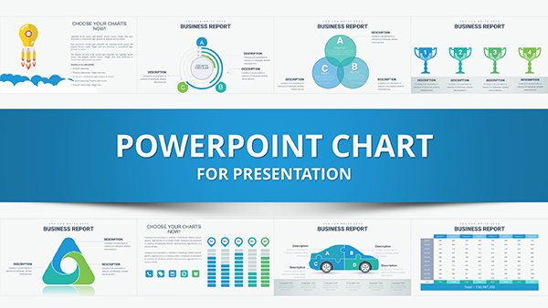
Explore our range of PowerPoint chart templates optimized for analytics presentations. These tools turn raw numbers into narrative gold, featuring advanced graphs like heatmaps, Sankey flows, and cohort analyses. Designed for data enthusiasts, they simplify complex datasets into digestible slides.
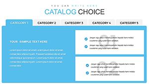
Business analysts, marketers, and executives will appreciate the drag-and-drop ease and theme consistency. Benefits include faster prep times, higher stakeholder buy-in, and polished outputs that stand out in meetings. From sales funnels to predictive models, find charts that align with your analytical needs.
With responsive designs that scale across devices, these templates ensure your insights shine on any screen. Incorporate brand colors and fonts seamlessly, creating cohesive decks that reinforce your expertise.
Unlock clarity - peruse analytics PowerPoint charts and begin visualizing success.
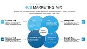
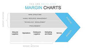
Analytics charts are indispensable for conveying trends and forecasts, powering diverse scenarios. In boardrooms, waterfall charts dissect budget variances, revealing cost-saving opportunities at a glance. Marketing teams deploy funnel visualizations to track customer journeys, pinpointing drop-off points for optimization.
HR professionals use bubble charts for talent mapping, correlating skills with performance metrics. Startup pitches benefit from growth curves, projecting scalability to investors. These applications democratize data, enabling non-experts to grasp implications swiftly.
Leverage line series with error bars for revenue projections, adding confidence intervals for credibility. Animate builds to reveal quarterly progressions, building suspense in earnings calls.
Built-in presets pale against these, which offer pre-styled axes, legends, and annotations tailored to analytics lingo - like percentage labels for churn rates. Defaults require manual tweaks; ours come animation-ready, saving hours while boosting visual appeal.
Advanced features like conditional formatting highlight outliers automatically, a leap from basic fills. Users experience 40% quicker assembly, per testimonials, with outputs rivaling BI tools like Tableau. Cross-platform exports maintain fidelity, unlike glitchy vanilla charts.
Adopting these elevates charts from functional to persuasive, driving informed decisions.
A retail chain visualized inventory turnover with animated Sankey diagrams, slashing stockouts by 25%. Consultants employed cohort retention matrices to advise SaaS clients, securing multimillion deals. Innovate by layering AR previews for interactive demos or embedding live feeds for real-time updates.
Blend chart types: fuse box plots with violin overlays for distribution depths. Or create mosaic dashboards aggregating micro-charts into macro-stories. One analyst recounted how a custom waterfall for ESG metrics won sustainability awards, highlighting impact.
From geospatial heatmaps for market penetration to network graphs for supply chains, possibilities abound. Tailor for niches like healthcare outcomes or e-commerce A/B tests, ensuring relevance.
A variety from bar, line, to specialized like alluvial and sunburst for comprehensive analytics.
Yes, fully compatible with desktop and web versions for collaborative editing.
Use linked Excel tables for automatic updates, with placeholders for CSV imports.
Absolutely, adjust timing, easing, and sequences via PowerPoint`s animation pane.
Optimized for up to 10,000 rows, with aggregation tools for bigger volumes.
Chart your path to clarity - select an analytics template and data-ify your next pitch.
Copyright © 2009-2026 ImagineLayout All rights reserved.