Simplify intricate data flows using our analytics Keynote diagrams templates, ideal for strategists, project leads, and data scientists. These templates encompass process maps, Venn diagrams, and network graphs, all fine-tuned for Keynote`s intuitive interface.
Drag-and-drop connectors, auto-alignment, and scalable nodes make building diagrams a breeze, while embedded legends and hover states reveal deeper metrics. Perfect for unraveling supply chains or user behavior paths, they turn opacity into opportunity.
Strengthen your analytical storytelling. Check out the range and diagram your way to clearer insights.
Keynote diagrams clarify the abstract in analytics contexts. Operations analysts map ETL pipelines, using swimlane flows to delineate data ingestion stages and bottlenecks. UX researchers diagram journey trees, branching user paths with sentiment nodes for pain point identification.
Consultants illustrate strategy canvases, positioning client models against industry benchmarks via matrix diagrams. Tech teams visualize API architectures in entity-relationship maps, highlighting dependencies for agile sprints.
Verbose reports bury insights; our diagrams condense via spatial logic - a flowchart trumps paragraphs in conveying sequence. Keynote natives are functional, but templates preload smart connectors that snap intelligently, reducing manual adjustments.
Depth-wise, add-ons like gradient fills denote data intensity, absent in basics, aiding quick scans.
Auto-balance layouts for hierarchy, plus shape libraries with analytics icons like databases and queries. Best practices: Use consistent line weights for cohesion, group related elements, and animate builds to reveal complexity incrementally. Embed formulas for dynamic sizing based on node values.
Ingenious use: A logistics firm linked diagrams to sensor data, pulsing nodes by real-time throughput, transforming static overviews into live monitors.
Integrate with Keynote widgets for dashboard hybrids or export to Figma for design handoffs. In fraud detection, radial diagrams spotlight anomaly clusters. For content strategy, affinity maps group thematic nodes from qualitative data.
Case in point: A media agency`s audience segmentation used layered onion diagrams, peeling demographics to behaviors, informing targeted campaigns vividly.
Conclude with key takeaways, distilling diagram essence into bullets.
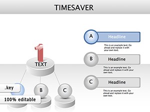
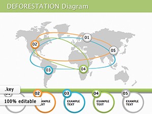
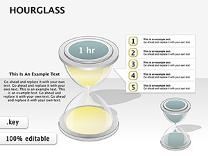
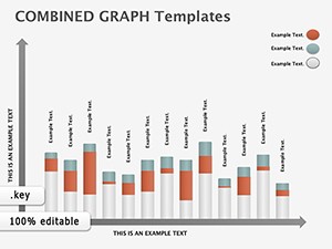
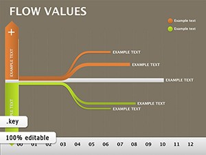
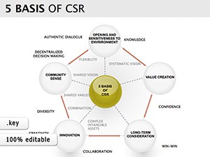
Flowcharts, org charts, timelines, and custom polyline variants.
Linked tables propagate edits to connected nodes.
Yes, via XML or image overlays with editable recreations.
Hyperlinks and build orders create navigable experiences.
Zoom controls and collapsible groups manage complexity.
Unlock analytical clarity with Keynote diagrams that map success. Browse our analytics collection and start connecting the dots - download your template now.
Copyright © 2009-2026 ImagineLayout All rights reserved.