Dive into data with confidence using our analyst PowerPoint chart templates, engineered for clarity and impact. Suited for quants, consultants, and project leads, these slides distill volumes of information into intuitive visuals like Sankey flows or bubble matrices, revealing hidden correlations at a glance.
Harness Excel-linked dynamism for real-time refreshes and morph transitions for evolutionary storytelling. Neutral palettes with accent pops ensure versatility across industries, from healthcare metrics to retail forecasts. Prioritize insights over ink - these tools let your data speak volumes.
Examine our chart-centric collection. Download to fortify your analytical arsenal today.
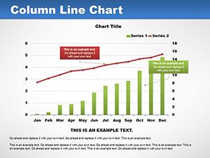
Charts are the lifeblood of analysis, yet poorly rendered ones obscure truths. Our templates rectify this with scientifically tuned proportions - golden ratio spacings, logarithmic scales where apt - surpassing vanilla SmartArt in fidelity. For BI specialists or exec summaries, they facilitate `aha` moments via layered disclosures.
Productivity boosts: one-click data swaps and variance highlights automate tedium, per user metrics showing 50% reduced iteration loops.
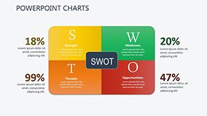
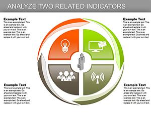
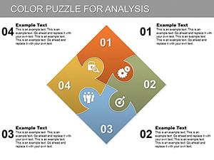
Illustrating scope, with mantras like `one chart, one message` guiding selections. Benchmark against baselines quarterly for efficacy.
Beyond basics, enjoy gradient fills for depth illusion and error bar presets for statistical rigor. This sophistication aids credibility in peer reviews or board audits. Seamless Office 365 integration means co-edits flow like conversations.
Push boundaries with 3D rotations for spatial data or AI-suggested layouts via add-ins. These evolutions keep presentations future-proof and engaging.
Source clean data first, applying filters pre-import. Calibrate axes to human scales, avoiding distortions. Solicit beta views for narrative tweaks. These protocols, distilled from viz experts, craft irrefutable arguments.
Chart your course forward. Download a template suite immediately to visualize victory.
Demystifying chart template essentials.
Direct embeds with pivot refresh on open.
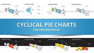
Over 20, from radar to treemaps.
Granular paths for sequential reveals.
Adapts to any master slide scheme.
Vector outputs for lossless scaling.
Copyright © 2009-2026 ImagineLayout All rights reserved.