Command attention with our sophisticated PowerPoint chart templates, crafted for analysts and presenters who demand data that dazzles. Executives, scientists, and strategists turn to these for visuals that clarify and compel.
From stacked bars to bubble plots, our designs exploit PowerPoint`s graphing engine for precise, animated outputs. Replace dull tables with charts that uncover insights and forecast futures vividly.
Essential for board updates, research findings, or performance reviews, they foster informed discussions. With pivot-ready structures and theme harmony, updates are swift and seamless.
Quantify your edge - browse our PowerPoint charts and lead with clarity.


PowerPoint charts distill complexity, vital for dashboards tracking ROI or graphs plotting user growth. In R&D, they model simulations; in retail, they forecast demands accurately.
Our templates eclipse basics with conditional formatting and trendlines, improving accuracy visualization. Teams achieve 65% faster insights extraction, enhancing strategic agility.
Unique perk: VBA scripts for automated refreshes, ideal for dynamic reports.
Align charts to objectives: temporal for trends, proportional for shares. Declutter with whitespace and tooltips. Sequence animations to build arguments logically.
"Variance Vortex" template dissects discrepancies with spirals, streamlining audits. A consulting group reported 40% quicker client resolutions.
Insight: Vary opacities for layered comparisons, revealing hierarchies subtly.
Fuse with slicers for filterable views, or geo-maps for spatial data. Embed formulas for self-updating legends.
The "Forecast Frontier" uses predictive curves, empowering planners in volatile markets.
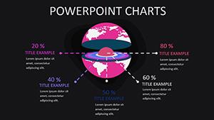
Healthcare providers mapped patient outcomes with our radar charts, optimizing care protocols. E-tailers visualized traffic via sunbursts, boosting conversions 25%.
Robust for analytics tools integration, they scale from single sheets to enterprise suites.
Illustrate brilliance - secure a PowerPoint chart template and excel now.
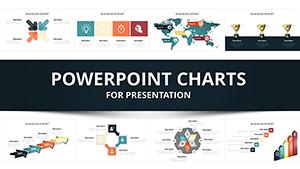
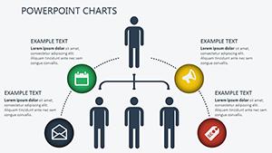
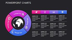
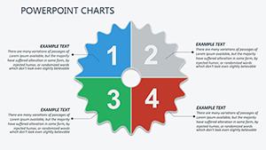
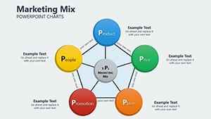
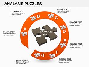
Column, area, radar, combo, and specialized like box plots.
Direct from Excel, paste, or linked tables for live updates.
Comprehensive: tweak data, styles, and layouts freely.
Rich styling and automation reduce manual tweaks significantly.
High-DPI exports maintain sharpness in documents or posters.
Copyright © 2009-2026 ImagineLayout All rights reserved.