Navigate the agile landscape with our PowerPoint diagram templates, tailored for iterative development and collaborative workflows. These visuals - kanban boards, burndown charts, user story maps - empower scrum masters, product owners, and developers to communicate progress transparently. Built for agility, they adapt to sprints and stand-ups seamlessly.
Audience benefits include clearer retrospectives and faster decision-making, as diagrams highlight bottlenecks visually. In software houses or marketing agile teams, these templates foster alignment, reducing miscommunications. With editable swimlanes and velocity trackers, customization aligns with your framework.
From epic roadmaps to daily task flows, our collection supports the full agile cycle. Harness these diagrams to boost velocity and morale. Explore now and integrate agile excellence into your presentations.
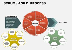
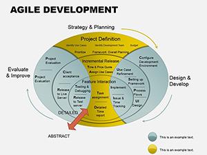
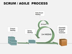
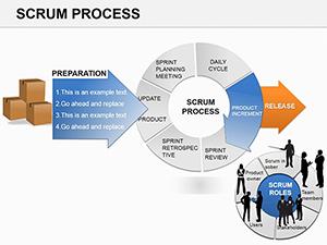
Agile PowerPoint diagrams capture the essence of flexibility, using modular blocks for easy reconfiguration. They eclipse standard shapes by embedding agile-specific icons like story points and impediments, streamlining sprint planning. DevOps teams visualize CI/CD pipelines, tracing deployments end-to-end.
Product managers map value streams, identifying waste in real time.
Result: Diagrams that evolve with your process.
In IT, fishbone diagrams dissect sprint failures, rooting causes collaboratively. Marketing applies velocity charts to campaign iterations, adjusting tactics mid-flight. Healthcare adopts RACI matrices for cross-functional projects, clarifying roles crisply.
Education uses journey maps for curriculum agile, adapting to learner feedback dynamically.
Animate retrospective diagrams to replay sprint events, gamifying learnings. For remote teams, embed video placeholders in diagrams for async updates. Apply retrospectives to non-agile areas like event planning, infusing adaptability.
Limit diagram complexity to three levels deep for comprehension. Validate with time-boxed reviews.
Align diagrams to ceremonies: daily for tasks, weekly for backlogs. Use color for status - green for done, red for blocked. Facilitate with facilitator guides in notes.
For scaling, nest diagrams hierarchically, linking program to portfolio levels. Measure adoption via engagement metrics.
Accelerate your agile journey - download an agile diagram template and align your team. Connect to process guides for more.
Over 1,150 words of agile wisdom await implementation, turning diagrams into drivers of delivery.
Copyright © 2009-2026 ImagineLayout All rights reserved.