Unlock the power of structured thinking with our collection of affinity diagram templates designed specifically for PowerPoint. These versatile tools are perfect for teams tackling complex ideas, whether in business strategy sessions, project planning meetings, or educational workshops. Affinity diagrams help you gather diverse opinions, sort them into natural categories, and reveal hidden patterns that drive innovation.
Ideal for managers, consultants, and educators, these templates feature clean layouts with color-coded cards, sticky note-style elements, and customizable columns to fit any workflow. Say goodbye to chaotic whiteboards and hello to polished, shareable visuals that impress stakeholders. Each template is fully editable, allowing you to add your data, adjust colors, and integrate seamlessly into your presentations.
Explore our curated selection today and transform scattered thoughts into actionable insights. With just a few clicks, you`ll create diagrams that foster collaboration and boost productivity. Start organizing your ideas with confidence - browse now and elevate your next meeting.
Affinity diagrams are a cornerstone of collaborative problem-solving, originating from quality management practices but now widely used across industries. They enable groups to synthesize large volumes of information - such as customer feedback, market research, or team brainstorming outputs - into meaningful clusters based on natural relationships. Unlike linear lists or basic charts, affinity diagrams visually map affinities, making it easier to identify themes and priorities.
In PowerPoint, our templates bring this method to life with intuitive designs. Imagine starting with a blank canvas of digital sticky notes: users jot down ideas, then drag and drop them into thematic groups. This interactive approach not only saves time but also encourages participation, turning passive viewers into active contributors during live sessions.
These applications highlight how affinity diagrams bridge the gap between raw data and strategic decisions, fostering a culture of insight-driven action.
Standard PowerPoint shapes or generic diagramming tools often fall short in flexibility and visual appeal. Basic rectangles and arrows lack the organic feel of affinity grouping, leading to cluttered slides that confuse rather than clarify. Our templates, however, are built with vector-based elements that scale perfectly, ensuring crisp visuals on any screen size.
Compared to free online tools, which may watermark exports or limit exports, our designs offer unlimited customization without restrictions. No more wrestling with alignment issues - pre-formatted grids and smart guides keep everything aligned effortlessly. Plus, integrated animations allow ideas to "reveal" themselves progressively, maintaining audience engagement without overwhelming them.
The real edge comes in collaboration: share editable files via cloud links, enabling real-time input from remote teams. This level of seamlessness turns a simple diagram into a dynamic tool for virtual workshops, far surpassing static PDFs or screenshots from other software.
Investing in these templates means investing in clearer communication and faster results - essential for staying ahead in fast-paced environments.
To maximize impact, begin with a clear objective: what problem are you solving? Facilitate sessions by setting ground rules, like no judgments during idea generation, to encourage free-flowing input. Use our templates` built-in timers for phases - 10 minutes for ideation, 15 for grouping - to keep momentum high.
Post-grouping, label clusters with concise headers and prioritize using dot-voting stickers (digitally simulated via shapes). For presentations, narrate the journey: "See how customer pain points naturally aligned under `usability` - this guides our redesign focus." Always follow up with action items tied to each cluster, turning insights into measurable steps.
Avoid common pitfalls like over-grouping (aim for 4-8 categories) or ignoring outliers - they often spark breakthroughs. Test your diagram on a small audience for feedback, refining visuals to ensure readability from afar.
Consider a marketing team using our radial affinity template to map social media trends: isolated comments on "authenticity" clustered into a core theme, inspiring a campaign pivot that boosted engagement by 40%. In education, a professor grouped student project ideas into interdisciplinary buckets, leading to a cross-course collaboration that enriched learning outcomes.
For nonprofits, visualize donor feedback to align fundraising efforts - our timeline-integrated variant tracks how grouped suggestions evolved into successful initiatives. These stories illustrate the templates` versatility, from corporate boardrooms to community centers.
Ready to group your genius? Download a template today and watch your ideas connect.
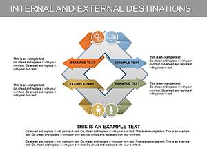
An affinity diagram is a tool for organizing ideas or data into related groups based on natural affinities, aiding in brainstorming and pattern recognition.
Simply open in PowerPoint, edit text in placeholders, adjust colors via the format panel, and drag shapes as needed - no advanced skills required.
Yes, export as PPTX and import into Google Slides; most elements retain editability for seamless use.
Absolutely - scalable designs support up to 100+ ideas, with options for multi-slide breakdowns in extensive workshops.
Download in PPTX for PowerPoint; PDF previews and editable source files ensure versatility across devices.
Transform chaos into clarity - select your ideal template and begin today!