Elevate your accounting presentations with our professionally designed Keynote chart templates. Perfect for finance teams and analysts, these templates provide clear visuals for budgets, financial reports, and performance tracking.
Each chart is fully editable and customizable, allowing you to match corporate branding and create polished, high-impact presentations effortlessly.
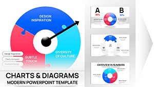
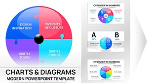
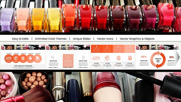
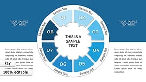
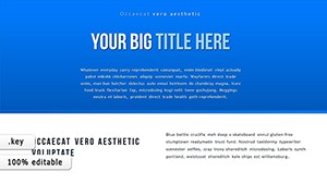
Presentation Ideas Keynote Charts: Fuel Your Ideas with Relational Power
ID: #KC00521
$19.88
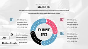
Why Choose Accounting Keynote Charts
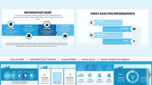
Accounting Keynote charts help finance professionals present complex data clearly and professionally. These templates are superior to default charts because they offer editable elements, pre-designed layouts, and high visual clarity.
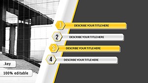
Practical Use Cases
Financial Reports: Visualize income statements, balance sheets, and cash flows.
Budget Presentations: Compare actual versus projected figures with clarity.
Investor Updates: Create compelling charts for stakeholders.
Internal Analytics: Track KPIs and department performance efficiently.
Benefits Over Default Templates
Pre-built layouts save time on design.
Fully editable elements for custom branding.
Enhanced readability with professional color palettes.
Creative Tips for Impact
Use consistent color coding for financial categories.
Animate key figures for presentation emphasis.
Combine chart types for deeper insights.
Upgrade your accounting presentations today by exploring our extensive Keynote chart collection and deliver insights with confidence.
Frequently Asked Questions
Can I customize colors in these charts?
Yes all charts are fully editable including colors fonts and layout to match your branding.
Are these charts suitable for investor presentations?
Absolutely they are designed to communicate financial data clearly and professionally to stakeholders.
Do these templates support real-time data updates?
Templates can be linked to spreadsheet data for live updates depending on your Keynote version.
Can I use these charts for educational purposes?
Yes they are perfect for teaching finance concepts or presenting case studies in class.