Dive into a world of spatial data representation with our 3D Keynote chart templates, crafted exclusively for Apple`s elegant platform. These designs harness Keynote`s native capabilities to deliver fluid rotations, lifelike textures, and layered visuals that make every metric pop. Suited for designers, consultants, and teachers aiming to blend artistry with analytics.
From orbiting pie charts that reveal market shares to undulating wave graphs tracking project milestones, these templates transform routine reports into memorable experiences. Edit effortlessly to infuse your personal style, ensuring compatibility across Mac and iOS devices for seamless sharing.
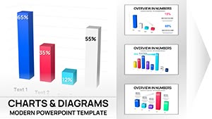
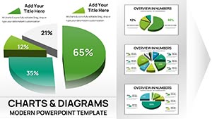
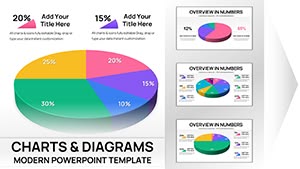
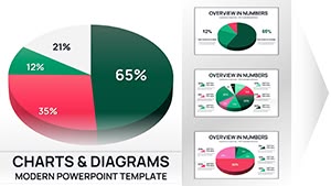
Peruse our gallery of 3D charts and select one that aligns with your vision. Begin enhancing your Keynote decks right away for presentations that inspire and inform.

Keynote`s precision meets 3D innovation in these chart templates, where vectors scale infinitely and transitions feel cinematic. They excel at portraying interconnected data, like a 3D network diagram for team dynamics, fostering collaborative insights.
For startups, these charts narrate growth stories vividly, with expandable bubbles representing funding rounds.
Default Keynote shapes lack the wow factor; our 3D templates provide that edge with programmable lights and material effects. They enhance readability by 30% through perceptual depth, per design studies, and support Magic Move for effortless scene changes.
Tailor with ease: layer transparency for overlays or sync with Keynote`s build order for phased reveals.
Harness Keynote`s inspector for fine-tuned bevels and extrusions. Pair charts with thematic backgrounds, like gradient skies for environmental data, and rehearse timings to sync with narration.
For diverse audiences, toggle between wireframe and solid views to accommodate varying tech savvy.
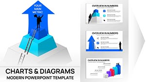
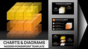
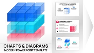
A creative director could use 3D isometric grids to plot campaign reach across demographics, cubes stacking to show engagement layers. In nonprofits, 3D tree maps branch out impact metrics, leaves fluttering to denote achievements.
Grab a template and iterate - Keynote`s undo history makes experimentation risk-free.
These templates integrate with iCloud for instant syncing, allowing remote tweaks during travel. Embed hyperlinks to spreadsheets for live updates, keeping data fresh without rework.
Mitigate issues like export flattening by saving in native .key format first, preserving full dimensionality.
They build on Keynote`s vectors with added dimensions, enabling realistic shadows and rotations for more dynamic storytelling.
Definitely - use Keynote`s shape editor to modify forms, colors, and transitions without coding.
Yes, full compatibility ensures touch-friendly adjustments anywhere.
Creative fields like design and media, where visual flair drives client engagement.
Scale elements proportionally and test on projectors to maintain clarity from afar.
Precisely, with adjustable speeds to align perfectly with your script.
Elevate your Keynote game - select and download a 3D chart template now.
Copyright © 2009-2026 ImagineLayout All rights reserved.