Cycle Period PowerPoint Diagrams


When computational processes involve loops and iterations, clarity isn't optional - it's essential for debugging ideas and aligning teams. The Cycle Period PowerPoint Diagrams template delivers exactly that: 11 editable slides honed for depicting repetitive actions, variable shifts, and period-based flows in a way that's intuitive and insightful. Geared toward developers, operations leads, and analysts who juggle algorithms or workflows, this tool turns tangled code logic into elegant visuals that foster understanding and innovation.
Delivered as a .potx file for PowerPoint 2016+ and Google Slides compatibility, it integrates pie charts, arrows, and cyclic paths that you can tweak in minutes. From simple do-while loops to multi-variable simulations, each slide captures the rhythm of repetition without clutter. An ops engineer at a software firm leveraged these for a system architecture review, using the arrow cycles to trace data handoffs - sparking refinements that streamlined runtime by key margins.
Core Components Driving Your Process Visuals
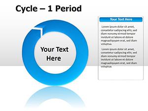
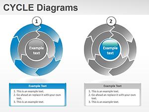
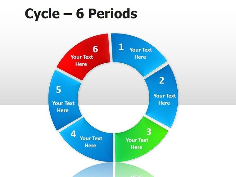
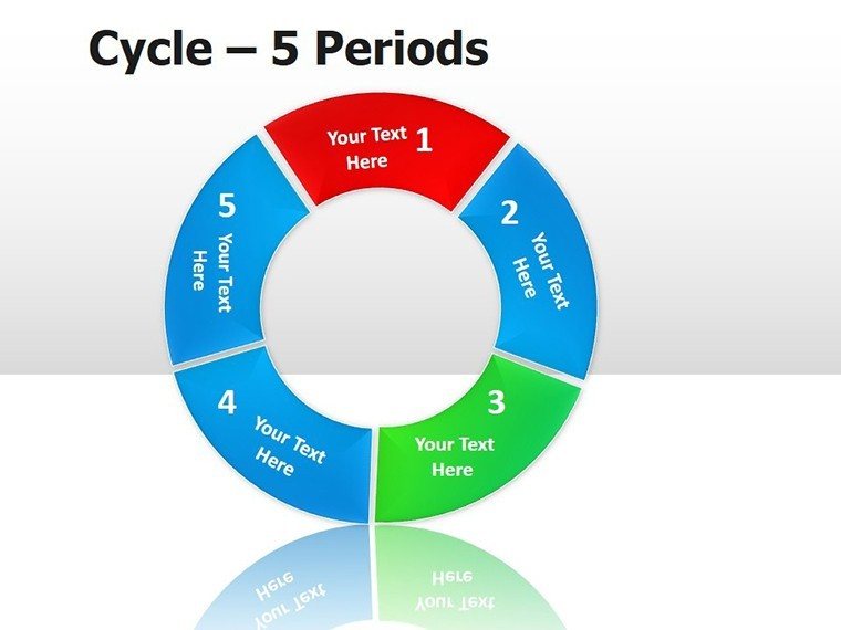
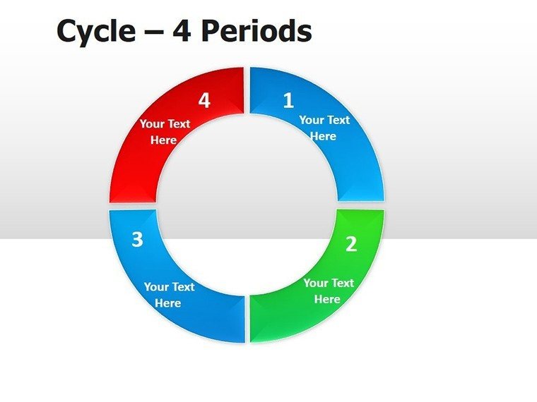
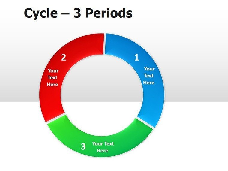
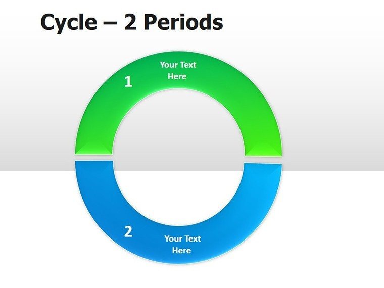
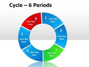
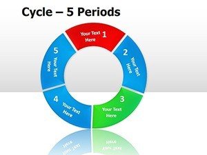
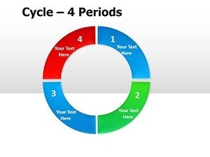
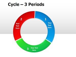
Opening with slide 1's basic pie-segment cycle, it fractions a period into actionable arcs, labeling inputs and outputs. Slide 3 escalates to arrow-infused loops, curving back on themselves to show conditionals and resets - think iteration counters visualized. Deeper in, slide 7's layered pies dissect nested periods, ideal for sub-routines within larger computations.
Edit freely: Rotate segments, adjust arrow curvatures, or infuse with code snippets via text boxes. The arrow motifs provide directionality, while pie divisions quantify proportions, all in scalable vectors for any resolution.
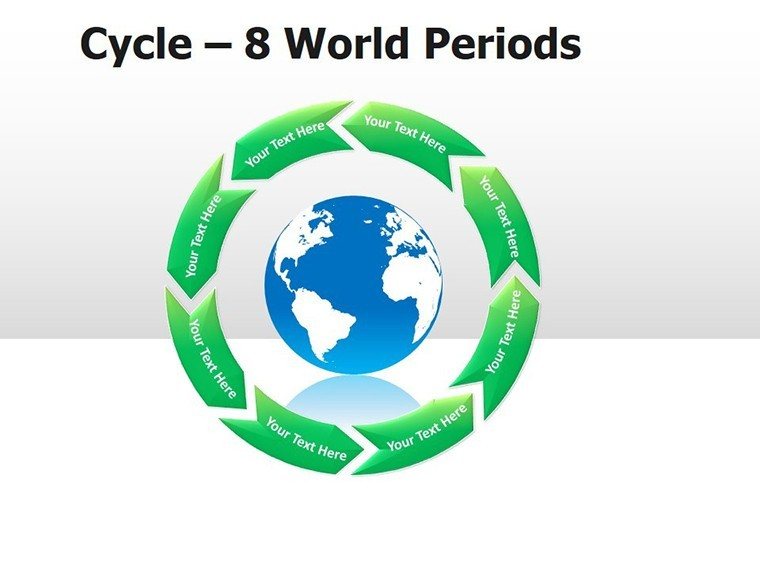
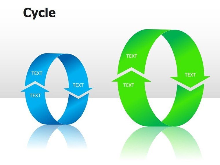
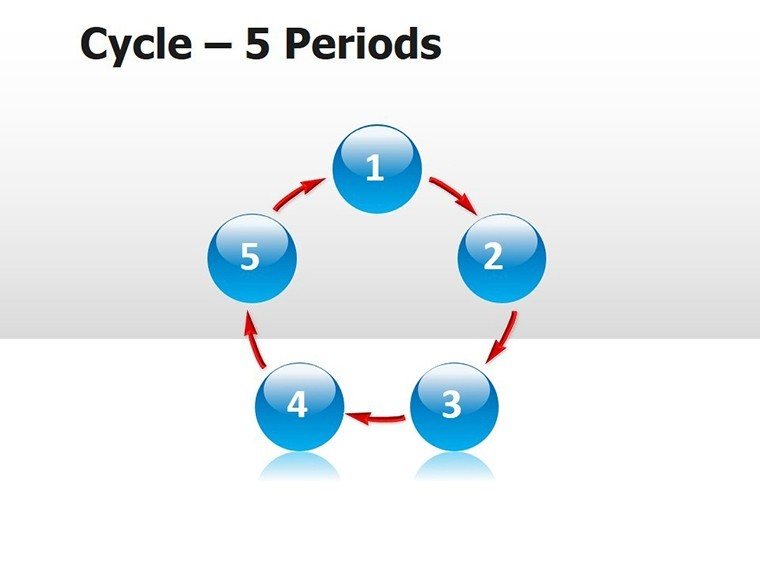
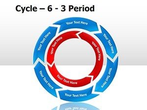
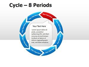
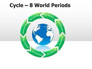
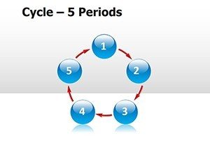
- Cyclic Arrow Paths: For looping sequences and feedback mechanisms.
- Pie-Based Divisions: To portion periods or variables proportionally.
- Modular Edits: Rearrange or scale without distortion.
- Theme Flexibility: Neutral bases for tech or custom palettes.
Targeted Uses: From Code Reviews to Workflow Audits
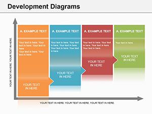
In tech environments, slide 5's extended arrow chain models ETL cycles - extract, transform, load - each bend a transformation step. For ops, educators apply slide 9's pie-arrow hybrid to inventory rotation periods, segmenting stock levels with directional flows. Analysts might sequence slides 4-8 for simulation runs, marking epochs with color-coded segments.
Streamlined method: Map your variables first on foundational slides, then layer iterations. Expert nudge: Use opacity gradients on arrows to denote probability branches, adding nuance without overload.
- Define the Loop: Select a cycle slide matching your repetition type.
- Label Variables: Annotate changes along paths.
- Quantify Periods: Divide pies or timelines with metrics.
- Animate for Flow: Sequence reveals to mimic execution.
Outpacing plain diagrams, this set's focus on computation cuts explanation time, emphasizing logic over aesthetics. Suited for whiteboards or widescreens, it maintains precision in hybrid settings.
Optimizing Loops: Techniques for Deeper Insights
Boost interactivity by hyperlinking segments to appendices, or fade in variables sequentially for walkthroughs. For cross-functional decks, align with UML standards subtly through arrow notations. The compact 11-slide count encourages focused narratives, expandable via duplicates.
Master your cycles with precision. Acquire this template for $22 and loop in efficiency.
Frequently Asked Questions
What types of cycles does this template cover?
Repetitive processes like loops, iterations, and variable-driven periods in computations.
Is it editable in non-PowerPoint software?
Yes, Google Slides handles the .potx for easy imports.
How many diagrams are provided?
11 slides, ranging from simple to complex cyclic visuals.
Can I embed actual code in the slides?
Certainly - use text boxes or shapes for snippets alongside diagrams.
Are the elements vector-based?
All arrows and pies are vectors, ensuring scalability and clarity.