Text Box Indicators Diagram Template


Struggling to make your key metrics pop without overwhelming your slides? This Text Box PowerPoint Diagram Template delivers clean, arrow-guided tables and structured boxes that turn numbers into narratives. Tailored for analysts and presenters who demand precision, it helps you highlight performance indicators with professional finesse, keeping your audience focused on what matters most.
Compatible with PowerPoint 2016 and beyond, this $19 one-time buy grants lifetime edits for endless projects. Whether tracking quarterly KPIs or outlining process steps, these 14 slides provide the framework to communicate complex info simply and effectively. Start customizing now and watch your reports transform from forgettable to influential.
Masterful Design for Data-Driven Stories
This template stands out by blending simplicity with sophistication. Unlike cluttered default PowerPoint tables that scream amateur, these text boxes feature rounded edges, subtle shadows, and directional arrows that guide the eye logically. Each slide is a blank canvas for your data, with pre-formatted grids that resize intuitively as you input figures.
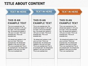
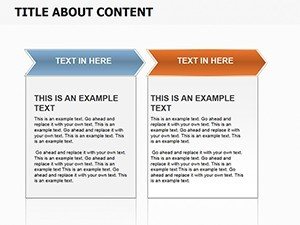
Explore the variety: from single-column highlight boxes for standout stats to multi-row tables linking metrics via curved arrows. Colors are brand-agnostic - swap palettes in seconds to align with corporate themes. The result? Slides that not only inform but persuade, ideal for boardrooms where every detail counts.
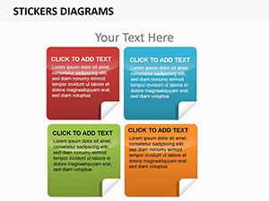
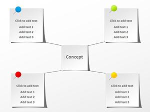
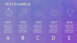
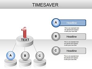
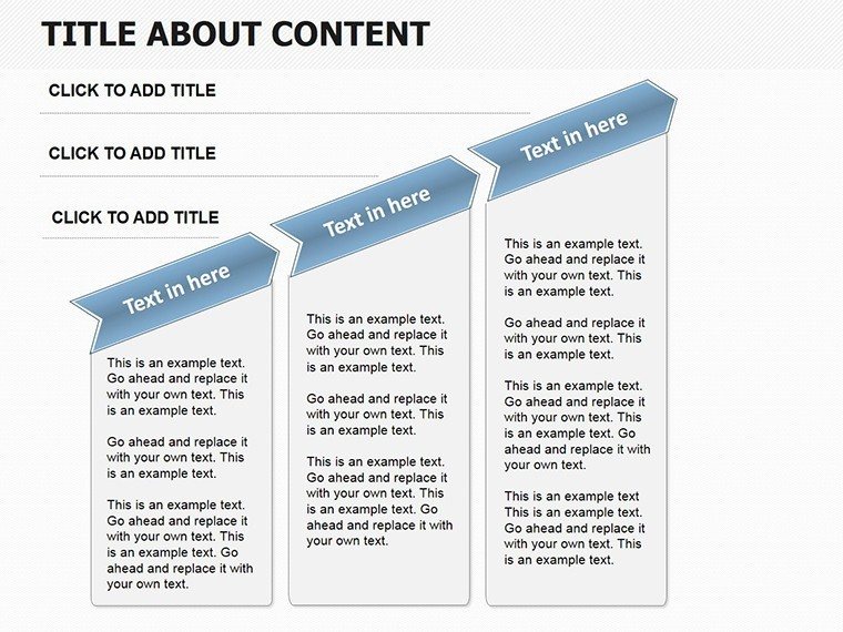
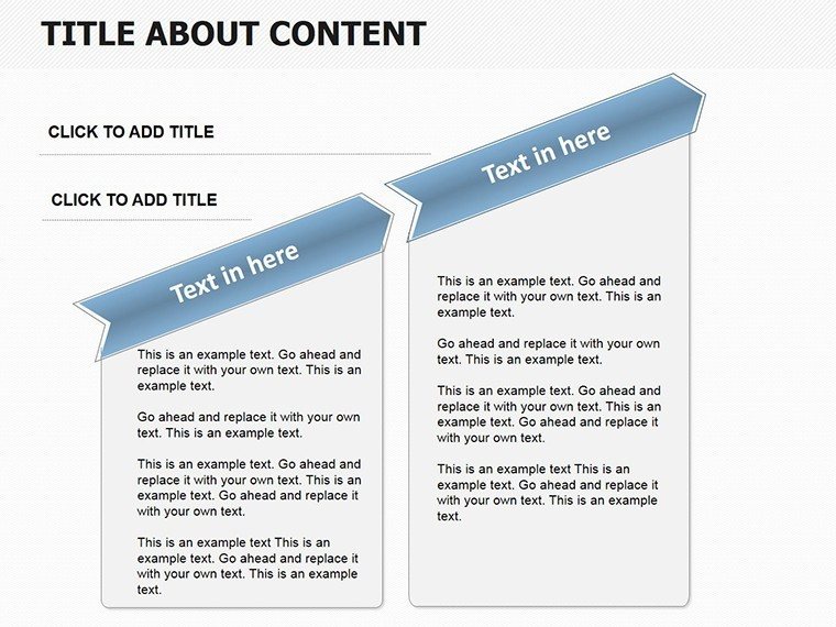
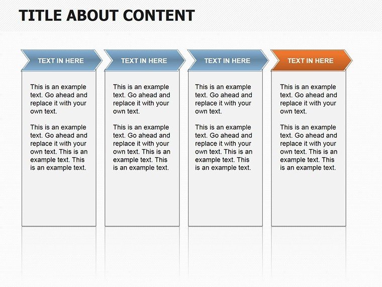
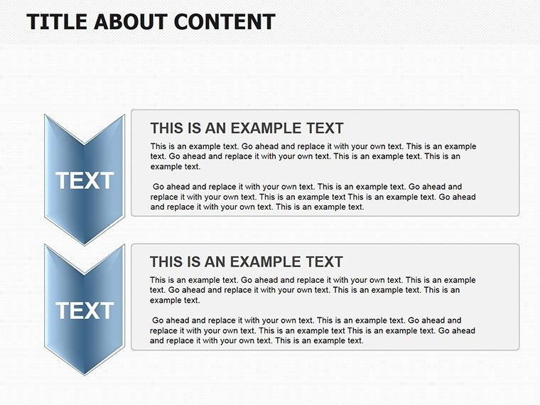
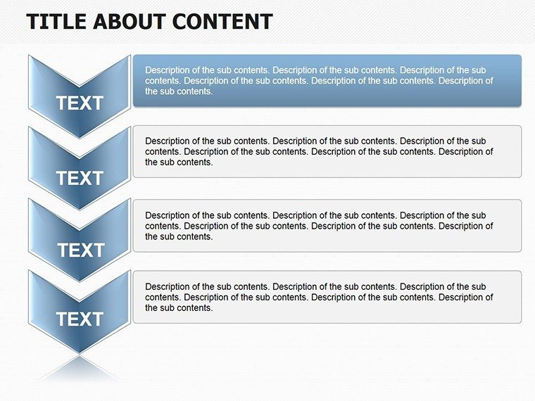
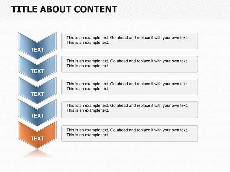
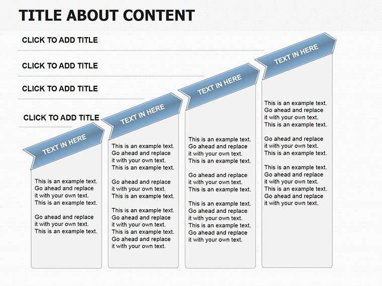
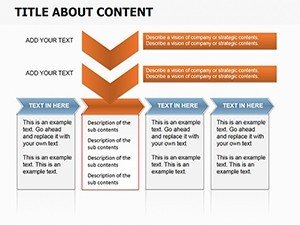
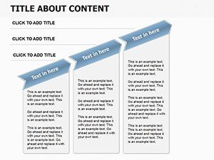
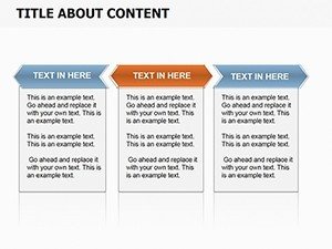
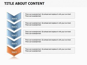
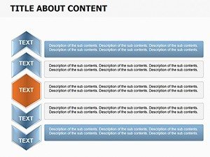
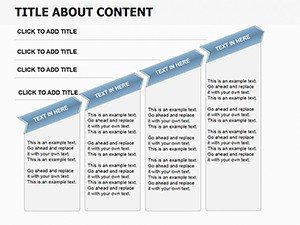
- Modular Text Boxes: Stackable units for building custom layouts, perfect for comparing before-and-after metrics.
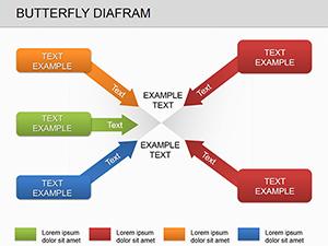
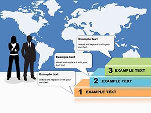
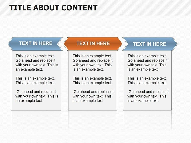
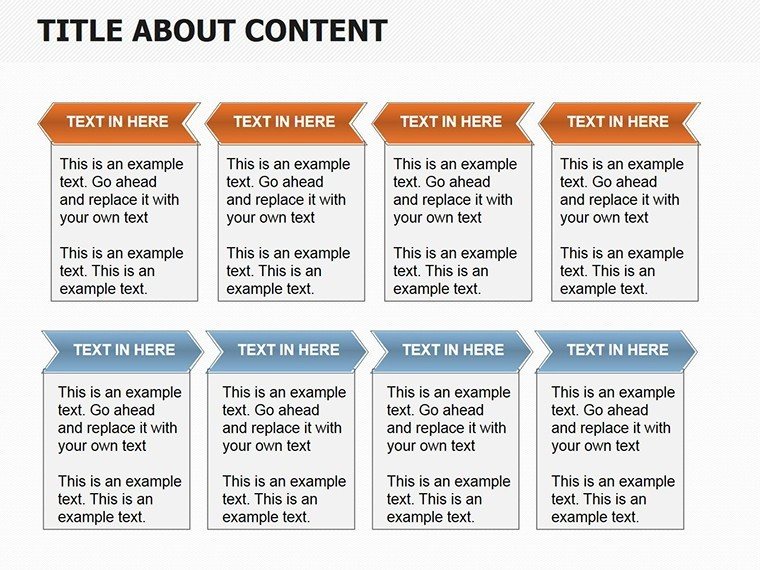
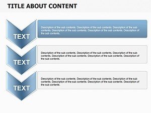
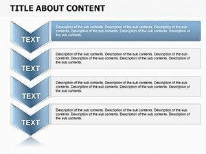
- Arrow Connectors: Dynamic lines that point from cause to effect, enhancing flow in sequential data displays.
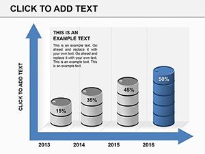
- Table Variants: From basic two-by-two grids to expanded matrices supporting up to 20 data points per slide.
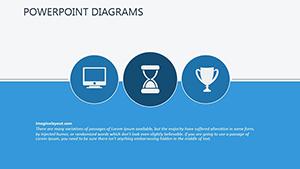
- Indicator Icons: Embedded symbols like checkmarks or trends that reinforce textual cues without clutter.
Editing is user-friendly: Select a box, type your content, and auto-adjustments handle alignment. For power users, layer in formulas via linked Excel embeds, ensuring live updates during presentations.
Practical Scenarios Where It Shines
Envision a sales manager reviewing regional performance. Using a slide with arrow-linked text boxes, she maps revenue drivers to outcomes, sparking targeted strategy tweaks that lift targets by 15%. It`s practical magic - data visualization that fosters actionable insights.
In project management, timeline-integrated tables track milestones with color-coded indicators, helping teams spot delays early and adjust on the fly. Clients appreciate the transparency, leading to smoother collaborations and repeat business.
For HR dashboards, these diagrams outline employee metrics in digestible boxes, from retention rates to skill gaps, making talent discussions more strategic and less spreadsheet-heavy.
Financial Reporting
Break down budgets with tiered tables and guiding arrows, turning fiscal jargon into clear pathways for decision-makers.
Process Optimization
Map workflows step-by-step, using boxes to denote phases and arrows for dependencies, streamlining team understandings.
Performance Reviews
Highlight achievements and areas for growth in balanced layouts, ensuring feedback sessions feel fair and forward-looking.
Versus standard PowerPoint inserts, this template cuts design time by 50%, with built-in responsiveness that adapts to widescreen or standard formats seamlessly.
Workflow Tips and Best Practices
To maximize value, import your dataset first, then populate boxes sequentially - this leverages the template`s auto-flow feature for consistency. Add fade-in animations to arrows for sequential reveals, building suspense in your delivery.
Best practice: Limit text per box to 10 words for scannability, pairing with bolded KPIs. This approach has helped users like consultants close deals faster by making proposals scan-proof.
Don`t wait to sharpen your edge. Secure the Text Box Indicators Template now and elevate every metric you present.
Frequently Asked Questions
Is this template suitable for non-designers?
Yes, its drag-and-drop interface makes it accessible for beginners while offering depth for experts.
How do the arrows enhance data presentation?
Arrows create visual narratives, directing attention from inputs to outputs for better comprehension.
Can I resize tables without distortion?
Absolutely, all elements are vector-scaled, maintaining crispness across any slide dimensions.
Does it support integration with external data sources?
Yes, link to Excel for real-time updates, keeping your indicators always current.
What file format is provided?
You`ll receive a .pptx file, fully editable in PowerPoint 2016 and newer versions.