Population PowerPoint Diagrams: Mapping Humanity's Mosaic


Type: PowerPoint Diagrams template
Category: Illustrations
Sources Available: .pptx
Product ID: PD00204
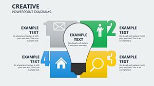
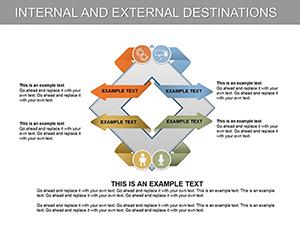
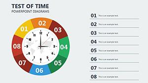
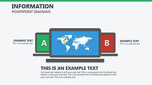
Template incl.: 20 editable slides
From sprawling megacities to remote villages, humanity's footprint is as diverse as it is dynamic - yet conveying these patterns often feels like herding cats. Our Population PowerPoint Diagrams template changes that, offering 20 editable slides that elegantly capture the interplay of demographics, migrations, and ecological influences. Crafted for urban planners, geographers, and policy makers, this set transforms abstract stats into vivid tapestries, whether you're advocating for sustainable zoning or analyzing refugee flows in global reports. It's more than diagrams; it's a lens for understanding how climate, landscapes, and human resilience shape our world.
In the face of rapid urbanization - projected to house 68% of the global population in cities by 2050, per UN data - tools like these are indispensable. Our template echoes methodologies from esteemed sources like the World Bank’s migration studies, providing radial distributions for population densities and layered maps for geochemical variances. Fully editable in PowerPoint or Google Slides, you can infuse regional flavors: Adjust gradients to denote radiation zones in hazard assessments or animate migration arrows for temporal storytelling. The payoff? Audiences grasp nuances - like how uneven growth exacerbates housing crunches - without wading through walls of text, fostering informed dialogues that drive real change.
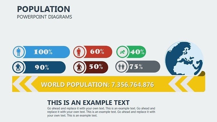
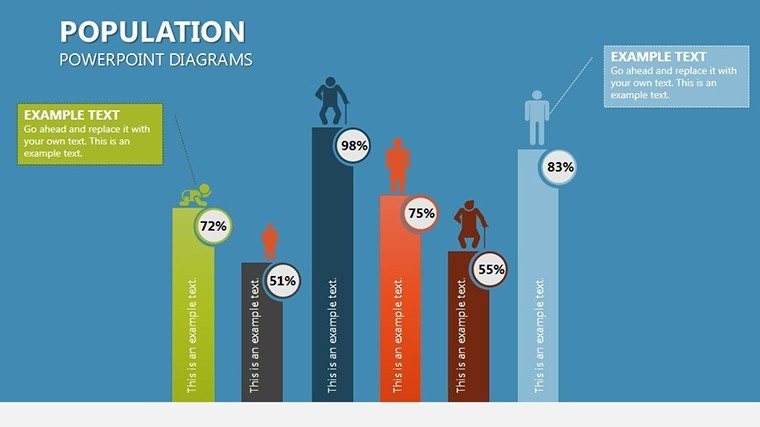
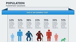
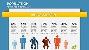
Slide #0 introduces a global overview with a choropleth-style world map, hotspots glowing to spotlight density clusters from Tokyo's bustle to Sahara sparsity. Progress to Slide #7's bar-stack for morphological traits, where you can swap datasets to explore physiological adaptations across biomes - a hit in anthropology seminars. Architecture ties in seamlessly: Urban designers use Slide #12's network graphs to simulate commuter patterns, aligning with AIA's emphasis on equitable space planning.
Core Features: Precision Tools for Demographic Depth
What makes these diagrams indispensable? A blend of scientific rigor and visual poetry. Professional layouts ensure scalability, from keynote projections to handout PDFs, with vector-based elements that retain crispness at any zoom.
- Environmental Layering: Integrate climate overlays on base maps, editable to reflect IPCC scenarios for forward-looking projections.
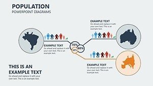
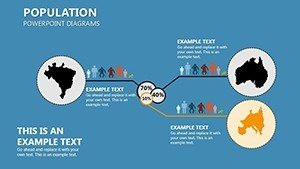
- Migration Modeling: Flow diagrams with directional vectors, customizable for mass movements like post-disaster relocations.
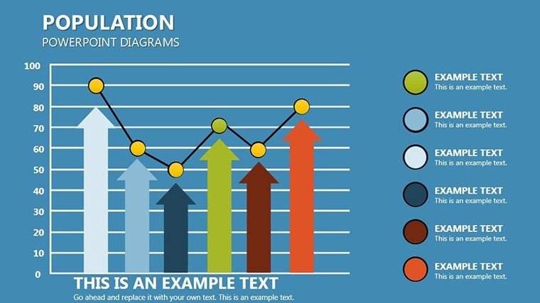
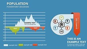
- Variability Visuals: Scatter plots for geo-physiological correlations, with trend lines auto-generated from imported CSVs.
Unlike clunky Excel exports, these maintain narrative cohesion, as evidenced by planners at firms like AECOM who credit similar viz for winning community buy-in on green initiatives.
Hands-On Guide: Building Your Population Narrative
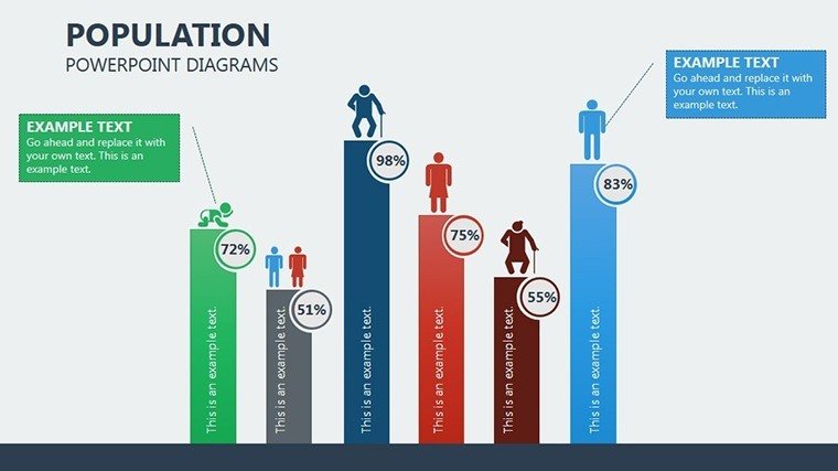
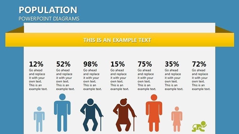
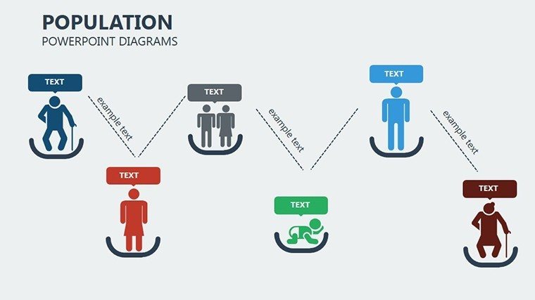
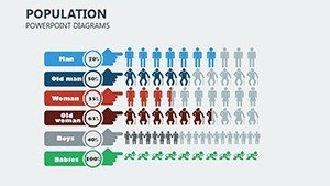
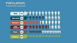
Tasked with a city council brief on sprawl? Launch with Slide #3's pyramid for age structures, layering fertility rates to forecast booms - essential for infrastructure pitches.
- Data Dive: Source from census APIs, paste into editable tables; watch pyramids reshape in real-time.
- Contextualize: Add legend callouts for factors like geochemical influences, tying visuals to policy implications.
- Engage and Export: Embed hyperlinks to sources for credibility, then share via interactive PDFs for stakeholder feedback.
This method has streamlined reports for NGOs, cutting dissemination time while amplifying advocacy reach.
Targeted Scenarios: From Policy to Planning
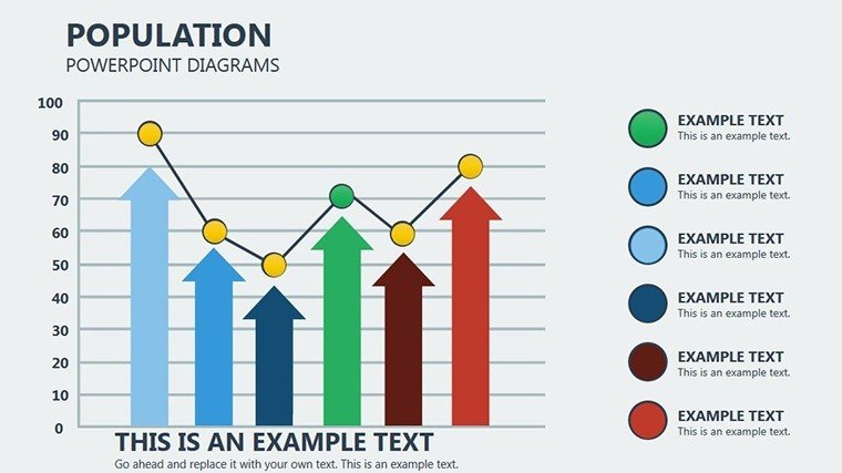
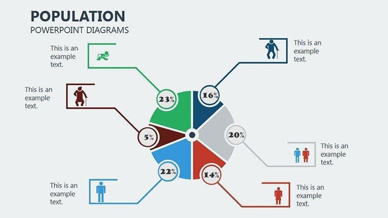
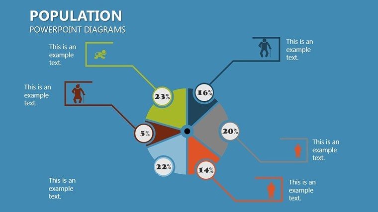
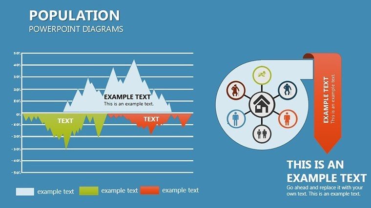
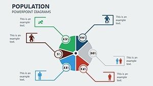
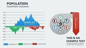
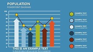
Geographers charting biodiversity hotspots leverage Slide #9's radial sectors to delineate human encroachment, informing conservation strategies. Policy wonks dissect uneven growth via Slide #15's line series, plotting GDP-per-capita divergences to argue for equitable aid.
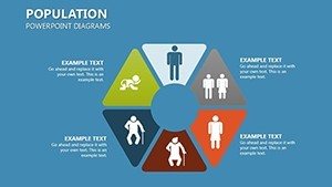
In education, professors animate Slide #5's cycle for evolutionary traits, engaging students with clickable expansions on migration's role. For architectural applications, landscape architects overlay Slide #11's heatmaps on site plans, visualizing flood risks intertwined with population shifts - vital for resilient designs per FEMA guidelines.
Mass migration modules in Slide #18's Sankey flows prove transformative for humanitarian briefs, tracing routes with capacity metrics.
Insider Strategies for Compelling Delivery
Tip: Use monochromatic schemes for somber topics like displacement, reserving pops of color for hope points. Compared to GIS software dumps, our template's simplicity democratizes advanced viz, empowering non-experts to rival specialist outputs. Always validate with peer reviews to sidestep biases in representation.
Don't let data divide - Secure your Population PowerPoint Diagrams today and weave humanity's threads into actionable insights. The map to tomorrow starts here.
Frequently Asked Questions
How do these diagrams handle environmental data?
With layered overlays for climate and geochemical factors, fully editable to incorporate latest studies like IPCC reports.
Are they suitable for urban planning presentations?
Yes, perfect for mapping densities and flows, aiding AIA-compliant designs for sustainable communities.
Can I animate the migration visuals?
Absolutely - built-in paths support sequential reveals, ideal for temporal storytelling in lectures.
What sources work best for populating the slides?
Census data, UN migrations stats, or Excel imports integrate smoothly for accurate, updatable visuals.
Is Google Slides compatibility included?
Fully supported, enabling collaborative edits for team-based demographic analyses.