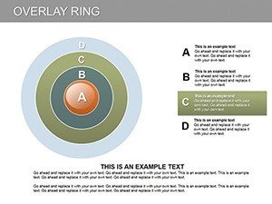
Overlay Ring PowerPoint Diagram


When dissecting markets or business sectors, a powerful visual aid can illuminate insights like nothing else. This Overlay Ring PowerPoint diagram template, with its 10 editable slides, is tailored for analysts, consultants, and leaders seeking to break down complex structures into digestible sectors. Each ring overlays to reveal interconnections, making it ideal for pie-chart evolutions or arrow-guided flows that highlight relationships in data. Move beyond static charts; this tool fosters deeper understanding, enabling you to present analyses that not only inform but also influence key decisions in boardrooms or client meetings.
Revolutionize Sector Analysis with Overlaid Precision
This template reimagines traditional diagrams by incorporating overlays, a technique praised in data visualization texts like those by Edward Tufte for minimizing ink while maximizing information. Use it to segment markets, showing how overlapping sectors - like tech and finance in fintech - interact, with references to PwC reports on industry convergences for credibility.
Core Features Driving Analytical Excellence
Designed for PowerPoint prowess, the slides offer:
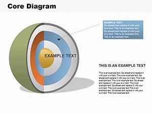
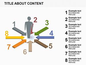
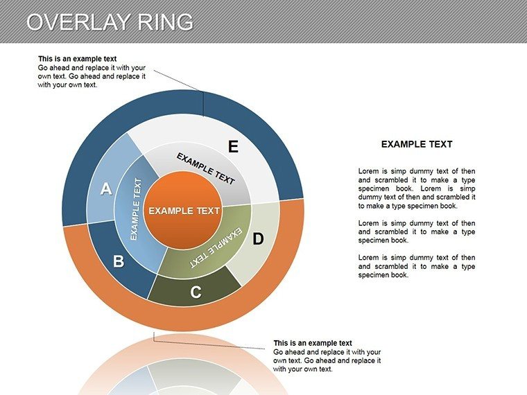
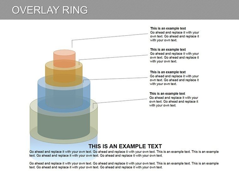
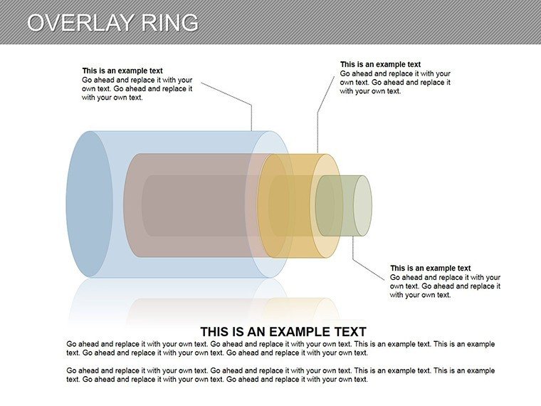
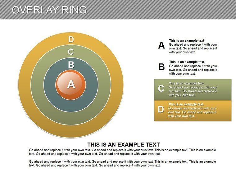
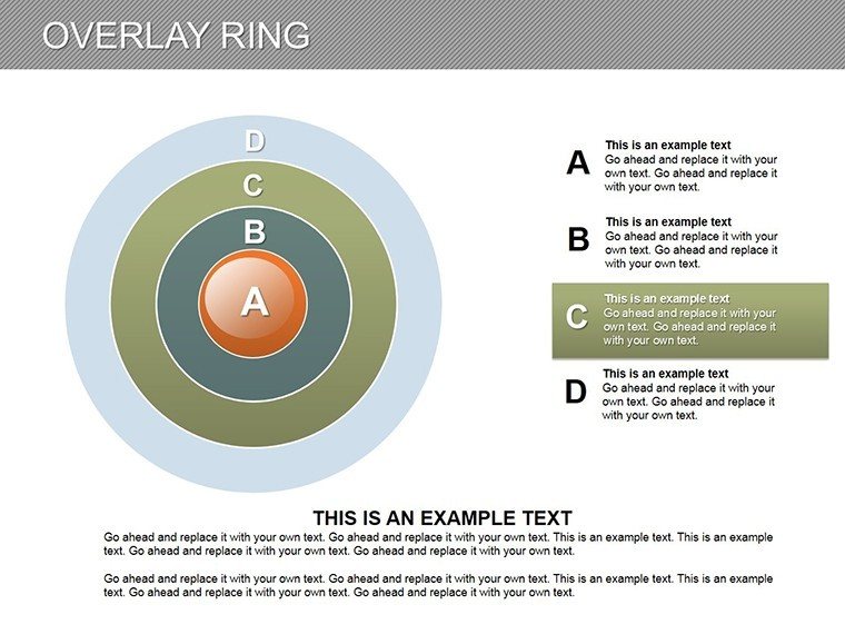
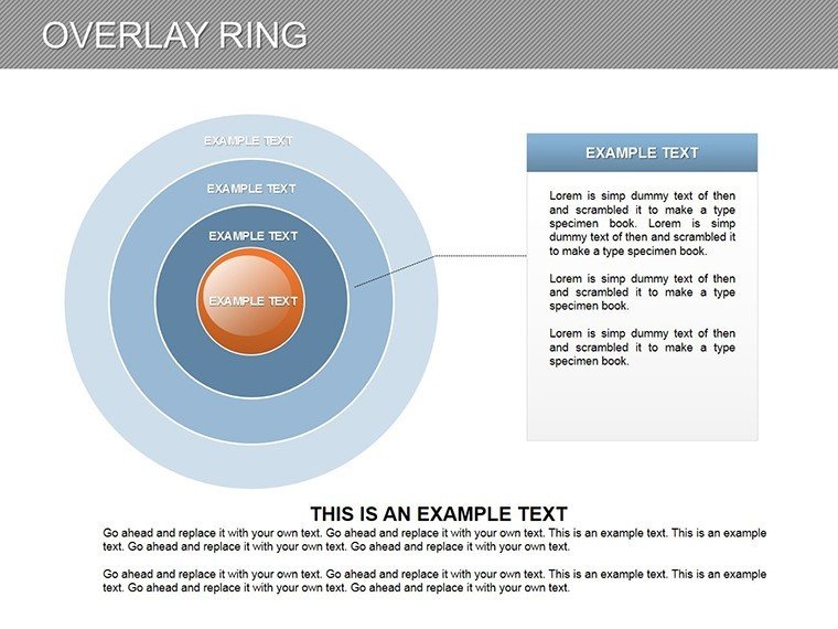
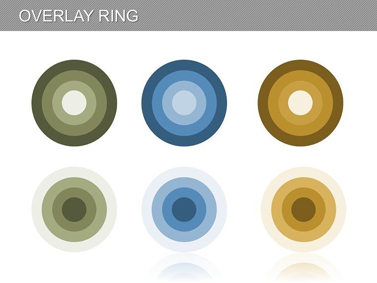
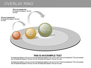
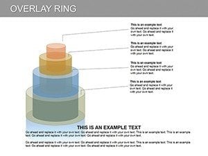
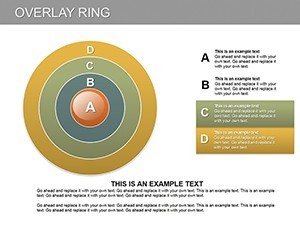
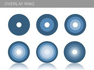
- Sector-Divided Rings: Multiple layers for detailed breakdowns, editable for custom segments.
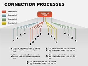
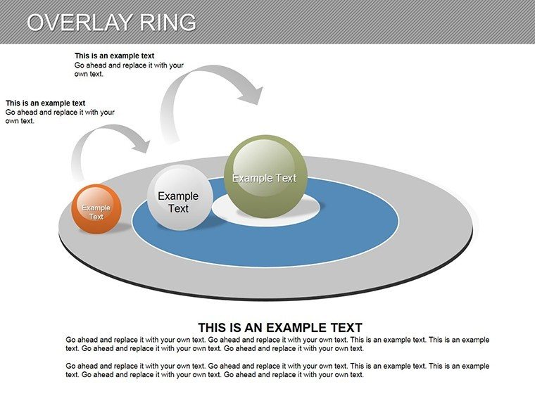
- Arrow Integrations: Guide flows between overlays, illustrating cause-effect or progressions.
- High-Fidelity Edits: Resize, recolor, or rearrange without quality loss.
- Compact Yet Comprehensive: 10 slides cover essentials without overwhelming.
Surpassing basic pie charts, these overlays allow for dynamic intersections, revealing hidden patterns in data.
Targeted Use Cases for Business Insights
Deploy in market research to overlay consumer segments, or in business planning to analyze operational rings, akin to how Deloitte uses similar visuals in client advisories. For startups, map competitive landscapes, layering internal strengths over external threats with SWOT-inspired structures.
Navigating Customization: A Practical Roadmap
- Assess Your Data: Identify sectors, such as product lines or geographic markets.
- Pick an Overlay Style: From simple rings to arrow-enhanced for directional analysis.
- Layer Information: Build overlays progressively, adding data points per ring.
- Visual Tweaks: Use transparency for overlaps, per UX principles from Nielsen Norman Group.
- Validate Output: Ensure clarity through peer reviews or test runs.
This workflow tackles ambiguities in sector data, mirroring successes in analytical firms like Bain & Company.
Insider Tips for Overlay Mastery
Amplify effects by narrating overlays: Reveal layers one by one in presentations for dramatic builds. Dodge density issues by capping sectors at 6-8. For broader applications, sync with Excel for live data pulls or convert to images for reports. Rooted in reliable visualization standards from the International Institute for Analytics, this template assures professional integrity.
Your Gateway to Advanced Analytical Visuals
Compact, customizable, and compelling - this Overlay Ring template is your ally in demystifying complexities. Embrace it to deliver analyses that resonate and results that endure. Step up your game; acquire this diagram set and overlay your path to analytical acclaim.
Frequently Asked Questions
How do overlays enhance standard ring diagrams?
They reveal intersections between sectors, providing deeper insights into relationships.
Can I add more than the default sectors?
Yes, edit freely to expand or contract rings as your analysis requires.
Is Google Slides support available?
Import .pptx for use, though overlays may need fine-tuning.
What data types suit this template best?
Proportional data, like market shares or budget allocations, shine in sectoral overlays.
Any tips for color selection?
Choose contrasting hues for clarity, following accessibility guidelines from WebAIM.