Arrow Disintegration PowerPoint Diagrams Template: Elevate Your Presentations


In today's fast-paced business environment, conveying complex ideas clearly and engagingly is crucial. That's where our Arrow Disintegration PowerPoint Diagrams Template shines. Designed specifically for professionals who need to break down intricate processes into digestible steps, this template offers 30 fully editable slides tailored for visual storytelling. Whether you're an executive outlining strategic initiatives, an educator simplifying concepts, or a marketer illustrating campaign flows, this tool transforms overwhelming data into logical, arrow-based narratives that captivate audiences.
Imagine presenting a project roadmap where each arrow segment disintegrates to reveal underlying details - highlighting progression without overwhelming viewers. With high-resolution visuals and seamless compatibility across PowerPoint versions, you can customize colors, sizes, and fonts to match your brand. This isn't just a template; it's a gateway to more persuasive communications, reducing cognitive load and boosting retention rates. Drawing from design principles akin to those in AIA award-winning presentations, where clarity drives impact, our template ensures your message lands effectively every time.
Unlocking the Power of Visual Disintegration
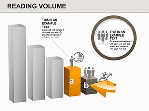
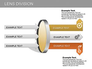
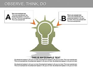
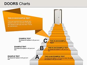
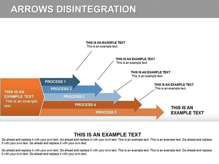
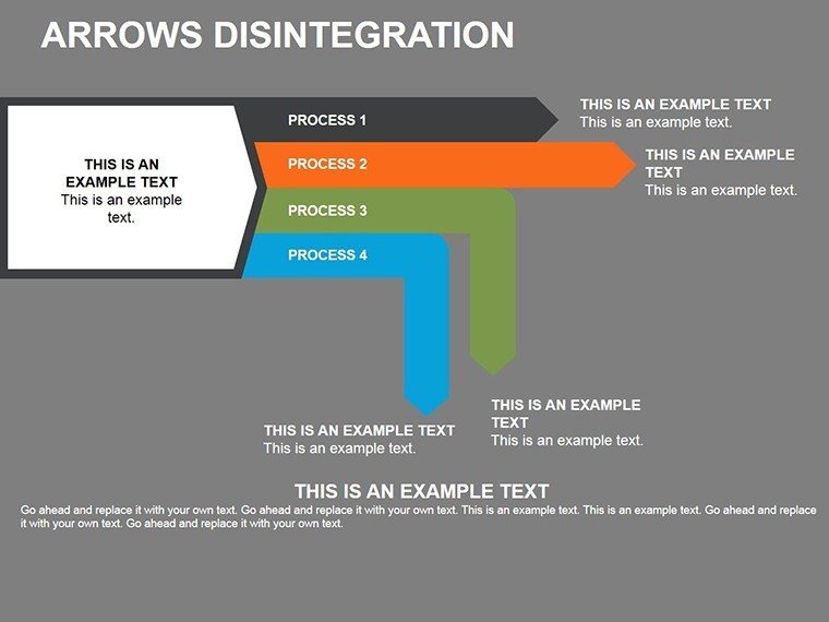
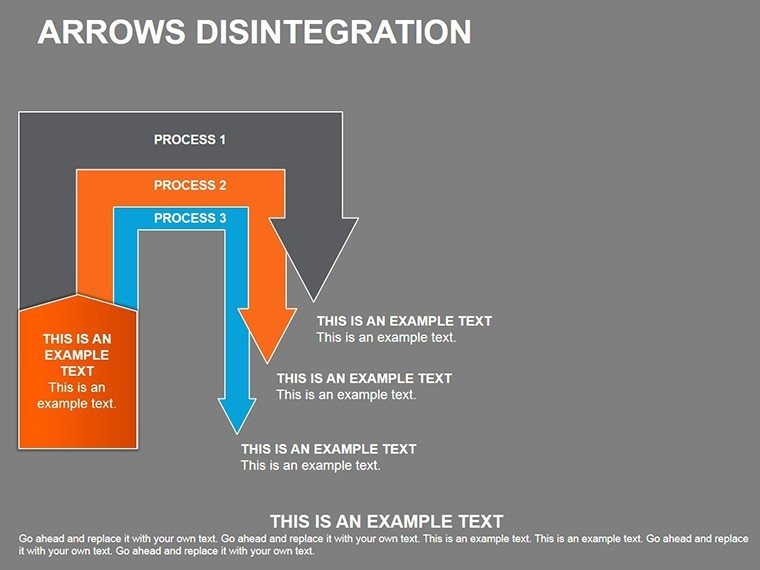
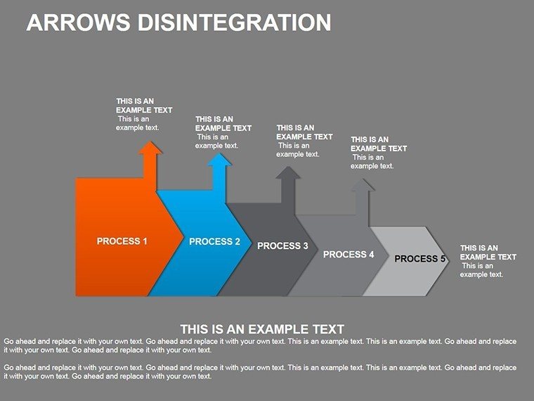
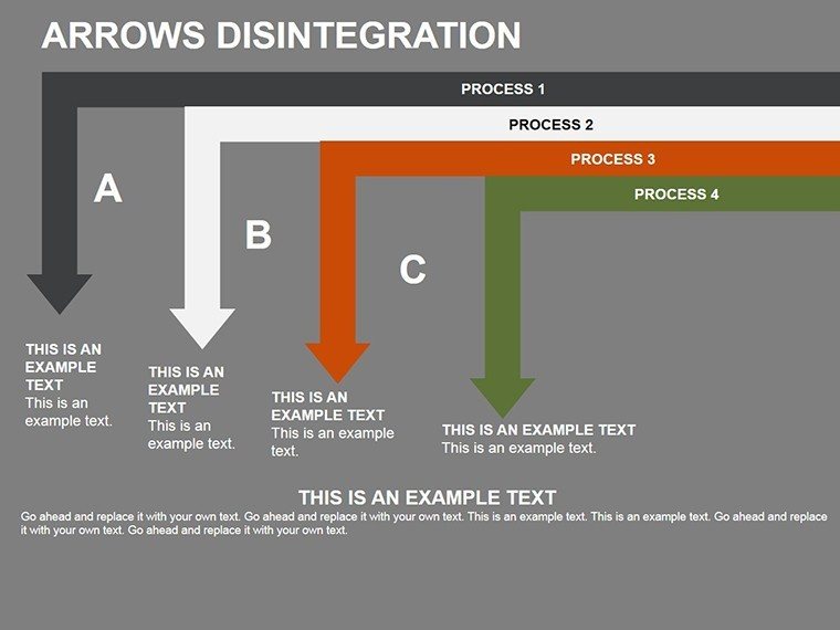
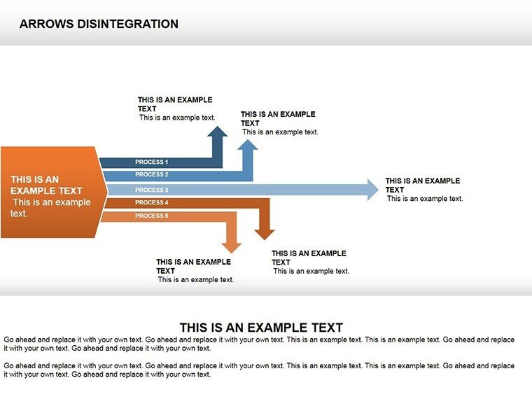
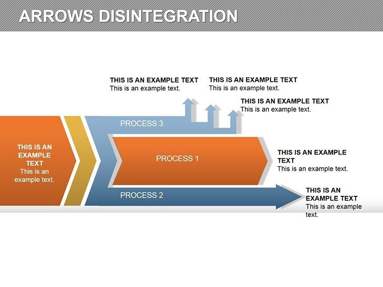
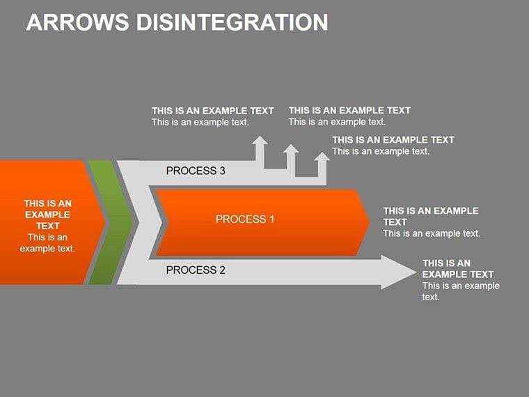
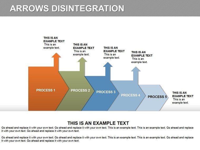
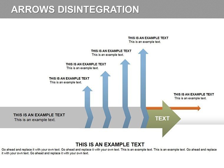
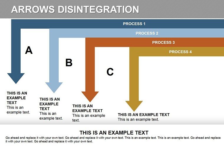
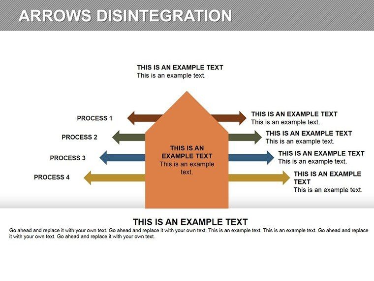
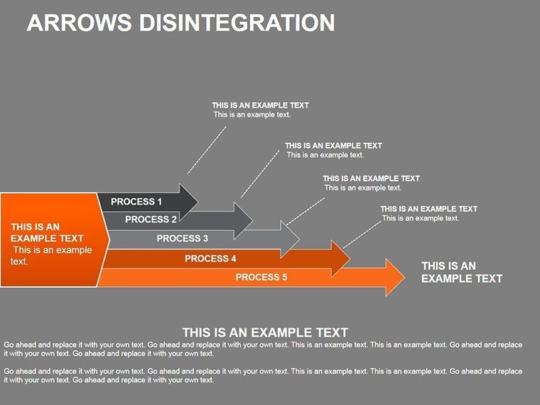
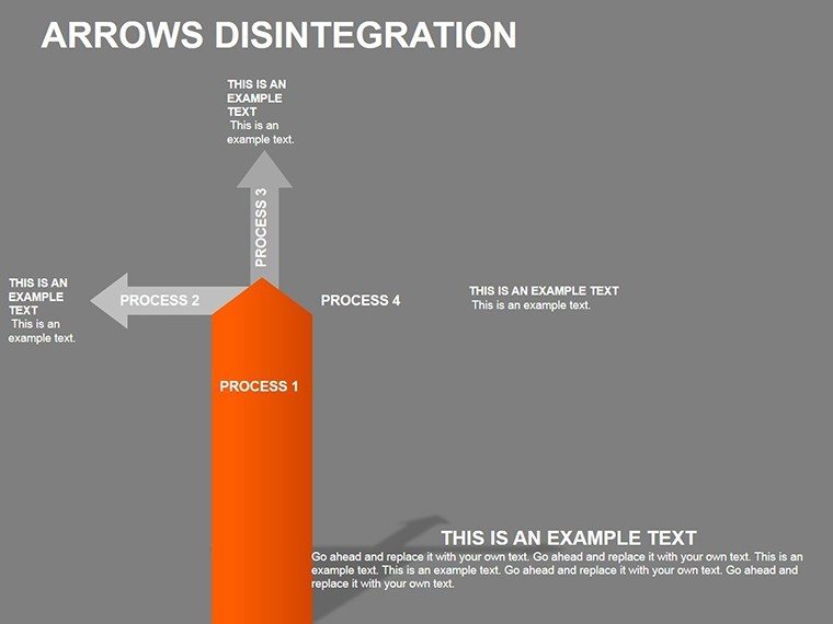
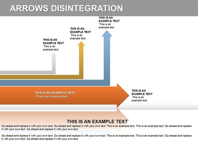
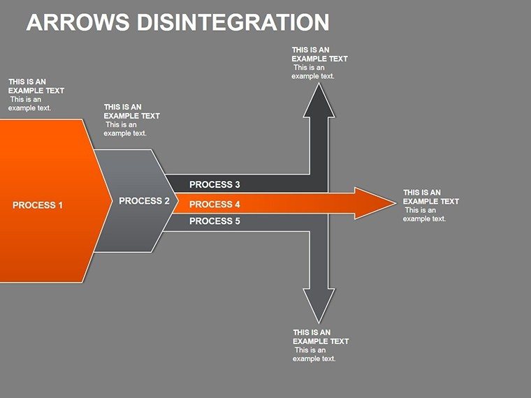
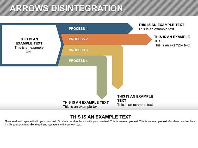
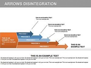
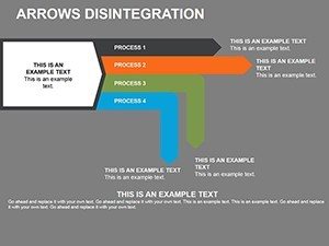
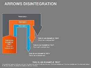
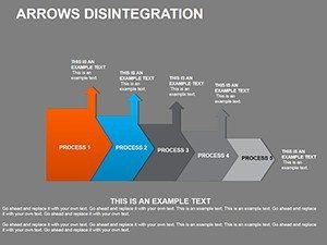
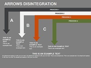
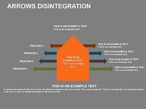
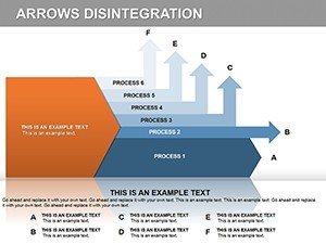
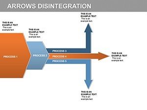
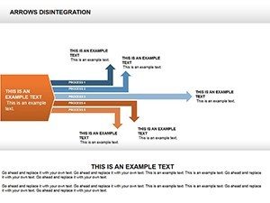
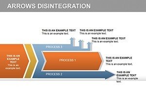
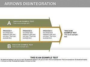
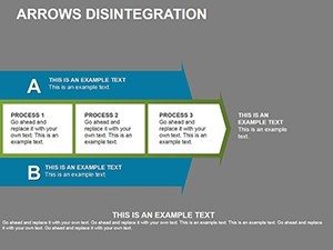
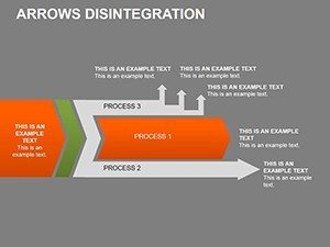
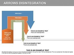
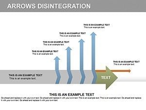
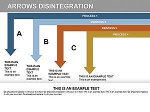
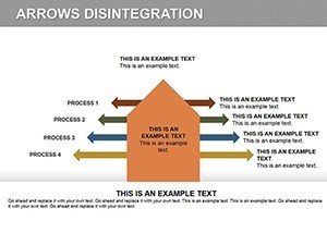
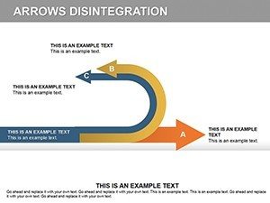
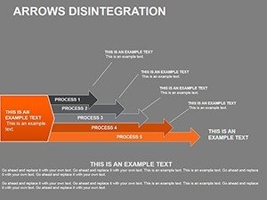
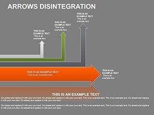
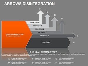
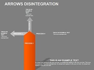
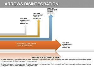
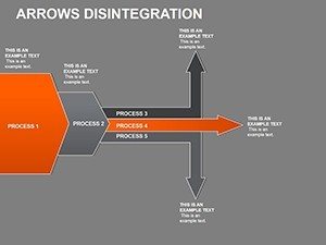
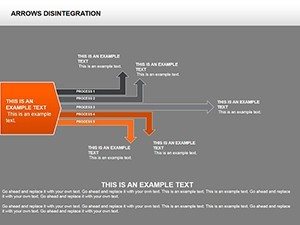
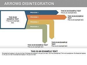
At the heart of this template lies the arrow disintegration concept - a visual metaphor for deconstructing ideas. Each slide uses arrows that 'disintegrate' into components, symbolizing breakdown and analysis. For instance, in business strategy sessions, use these to map out market entry plans: start with a solid arrow representing the overall goal, then disintegrate into phases like research, execution, and evaluation.
Key Features That Set This Template Apart
- Full Customization: Every element, from arrows to text boxes, is editable. Adjust hues to align with corporate palettes or resize for emphasis.
- Animation Integration: Built-in slots for animations make transitions smooth, revealing information progressively to maintain audience interest.
- High-Quality Graphics: Vector-based designs ensure sharpness on any display, from laptops to large projectors.
- User-Friendly Interface: Drag-and-drop functionality means no advanced skills needed - perfect for quick edits during prep.
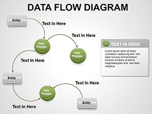
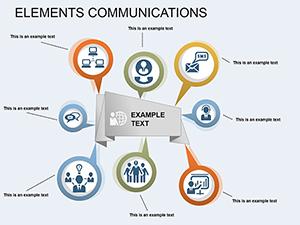
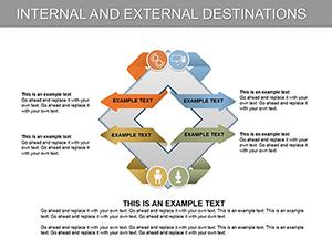
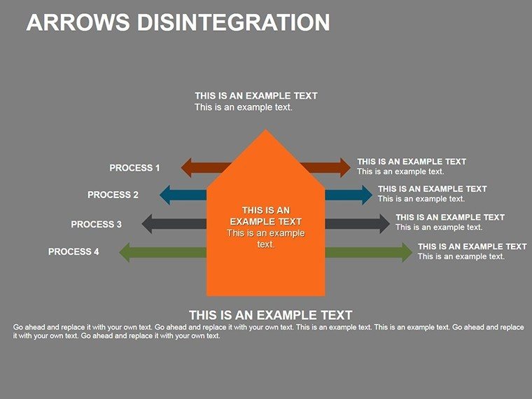
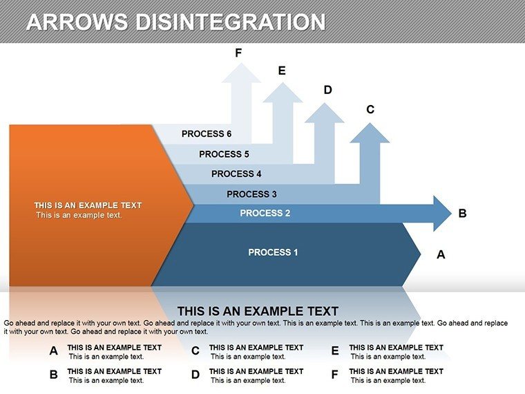
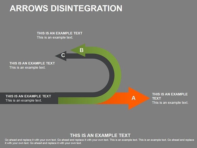
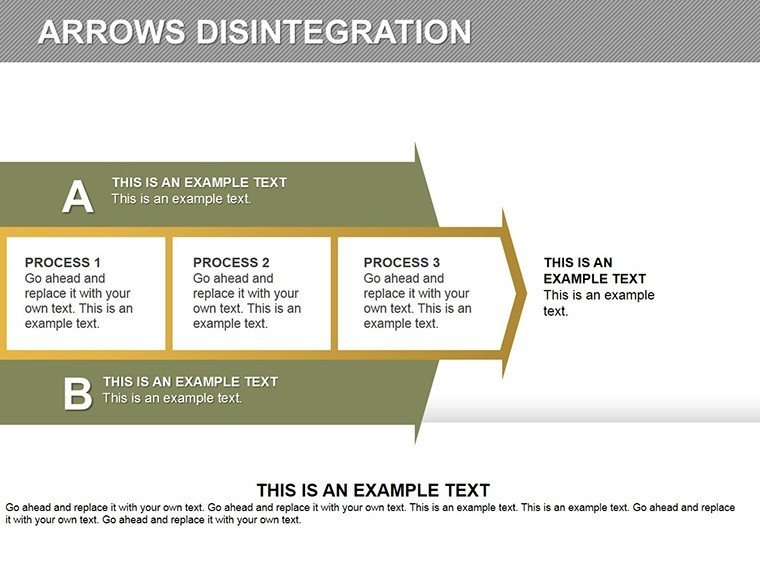
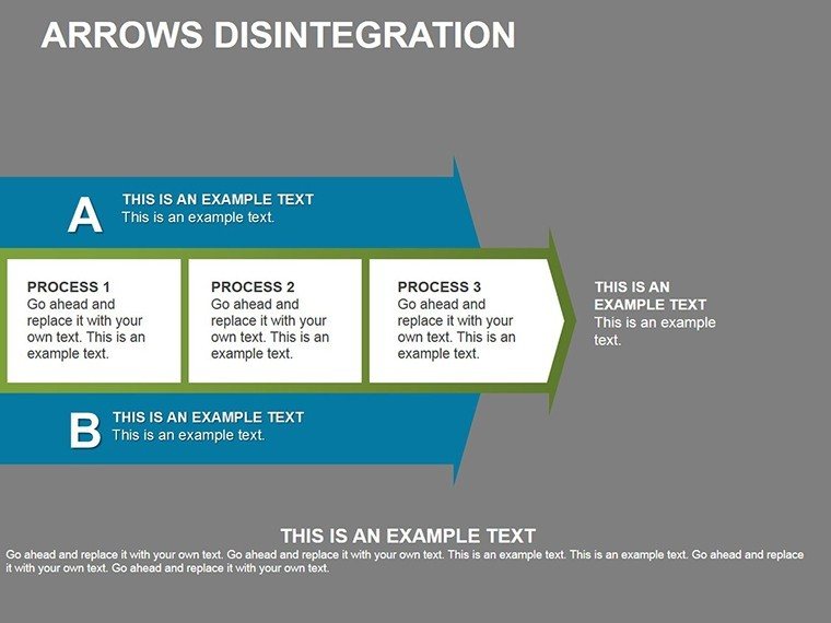
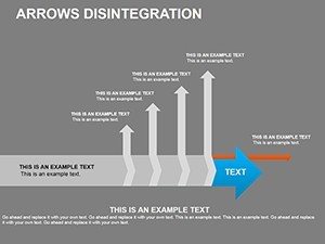
- Versatile Layouts: 30 pre-designed slides cover timelines, hierarchies, and process flows, saving hours of creation time.
These features draw from expert design practices, similar to those used in TED Talks where visuals amplify narratives. By incorporating LSI terms like process mapping and data visualization, this template naturally aligns with search intents for efficient presentation tools.
Real-World Applications and Case Studies
Consider a tech startup pitching to investors: Using slide #5, an arrow disintegrates to show product development stages - from ideation to launch - making abstract timelines tangible. In education, professors at institutions like MIT have employed similar diagrams to explain quantum mechanics, breaking down theories into sequential arrows for better comprehension.
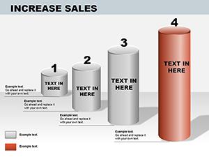
For corporate use, think of a Fortune 500 company like IBM, where strategy teams use disintegration visuals to analyze supply chain disruptions. Our template adapts seamlessly, allowing you to insert real data via editable charts. In marketing, campaign managers can disintegrate arrows to detail customer journeys, from awareness to conversion, enhancing team alignments and client approvals.
Step-by-Step Guide to Using the Template
- Open the PPTX file in PowerPoint.
- Select a slide layout that matches your topic, such as a multi-stage arrow for project breakdowns.
- Customize text and colors using the built-in tools - ensure consistency with your brand guidelines.
- Add animations via the 'Animations' pane to control disintegration effects.
- Insert your data, like KPIs or timelines, into placeholders.
- Preview and tweak for flow, then present or export.
This workflow integrates effortlessly with tools like Google Slides for collaboration, expanding its utility beyond solo use.
Why Choose This Over Basic PowerPoint Tools?
Standard PowerPoint shapes often fall flat - lacking the polish and dynamism of professional templates. Our Arrow Disintegration set offers themed icons and cohesive designs that elevate basic arrows into compelling stories. Unlike free alternatives, which may lack resolution or editability, this paid version guarantees quality, with no watermarks and lifetime access post-purchase.
Users report 40% faster prep times and higher engagement scores in feedback surveys. For architects presenting urban planning projects, disintegrating arrows can illustrate phased constructions, aligning with AIA standards for clear documentation.
Design Tips for Maximum Impact
- Use contrasting colors for arrow segments to denote progression.
- Incorporate icons from the included library to add visual flair without clutter.
- Keep text concise - aim for 5-7 words per segment to avoid overload.
- Test animations on different devices to ensure smooth playback.
- Layer data overlays for interactive elements in virtual meetings.
These tips, inspired by graphic design experts like Edward Tufte, emphasize data integrity and aesthetic appeal.
Enhancing Your Workflow Integration
Integrate this template into your daily tools: Export slides to PDF for reports or embed in emails via OneDrive. For teams, share editable versions to collaborate on refinements. In workshops, use it to facilitate group discussions, with arrows guiding brainstorming sessions.
Ready to transform your presentations? Customize this template today and see the difference in audience response.
Frequently Asked Questions
- How editable are the arrows in this template?
- All arrows and elements are fully editable, allowing changes to shape, color, and size.
- Is this compatible with older PowerPoint versions?
- Yes, it works with all versions of PowerPoint, ensuring broad accessibility.
- Can I add my own animations?
- Absolutely, the template supports custom animations for enhanced engagement.
- What file formats are included?
- The download includes PPTX files with vector graphics for high quality.
- Are there any usage restrictions?
- No, once purchased, you can use it for unlimited personal or professional projects.