Elements Communication PowerPoint Diagram: Visualize Data Relationships


Type: PowerPoint Diagrams template
Category: Analysis
Sources Available: .pptx
Product ID: PD00122
Template incl.: 18 editable slides
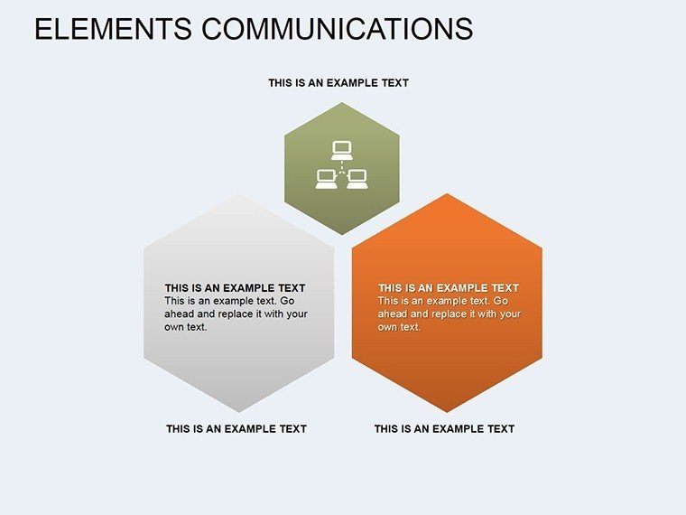
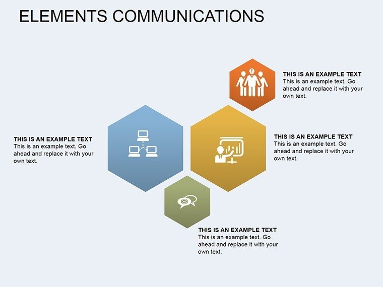
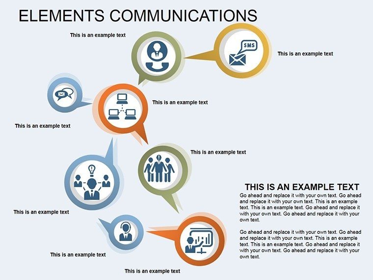
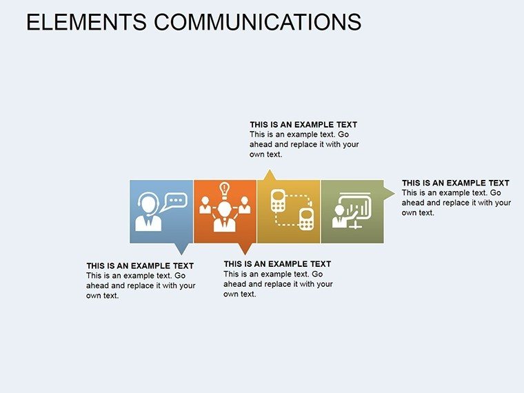
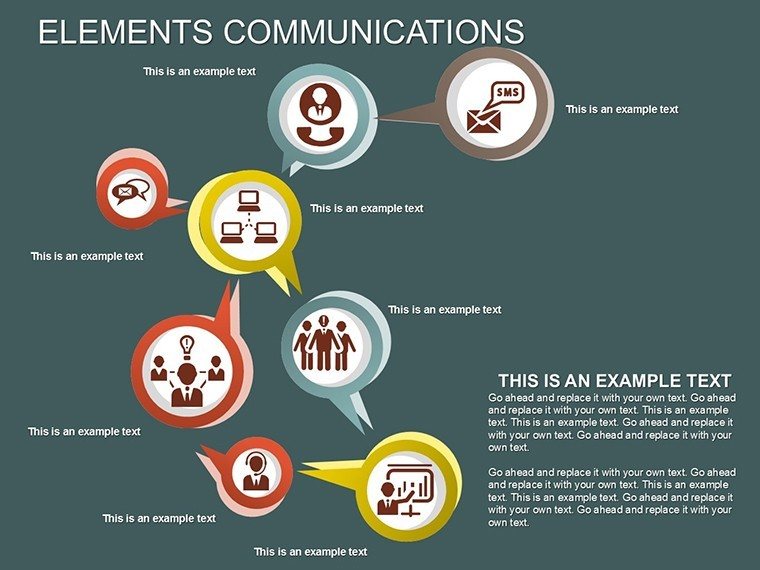
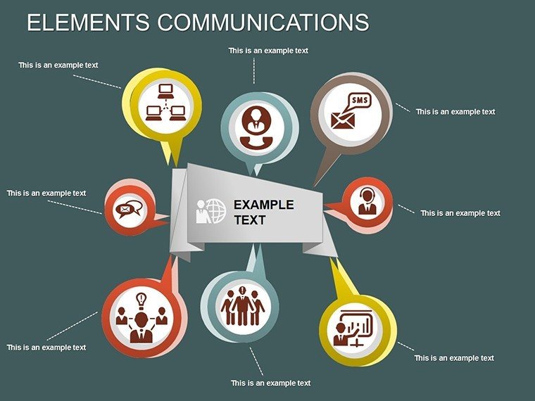
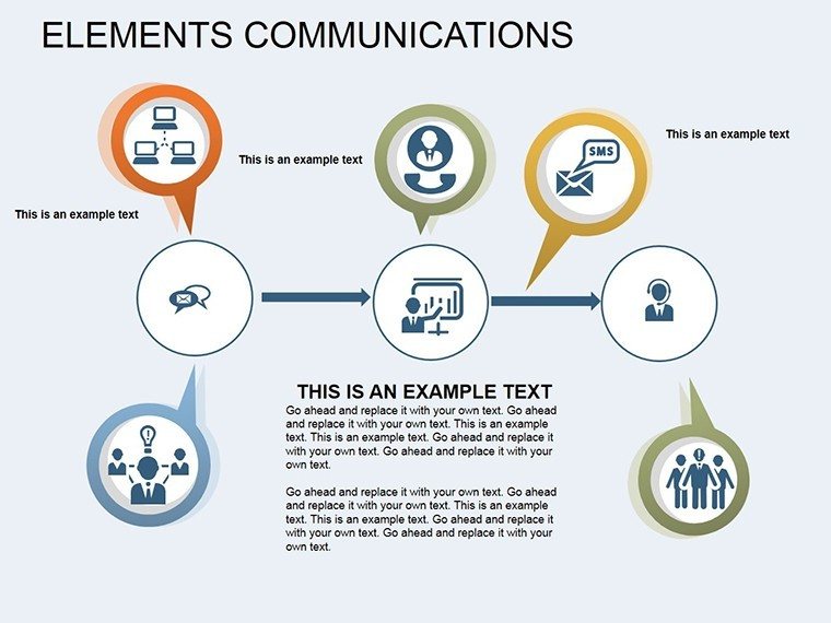
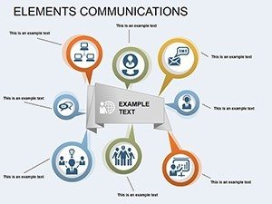
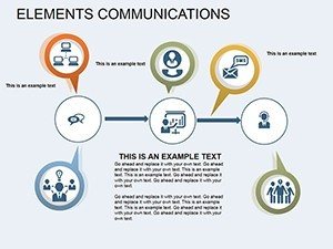
In an era where data drives decisions, effectively communicating relationships between elements is key to success. Our Elements Communication PowerPoint Diagram template, boasting 18 editable slides, is crafted for analysts, managers, and presenters who need to showcase dependencies and comparisons graphically. This tool turns abstract correlations into vivid visuals, helping audiences grasp how one value influences another - ideal for financial reports, scientific explanations, or market analyses.
Picture a slide where interconnected elements pulse with custom animations, revealing cause-effect chains in real-time. With color variations and vector icons included, customization is straightforward, ensuring your presentation stands out. Backed by principles from data visualization experts like those at Harvard Business Review, this template promotes clarity, reducing misinterpretations and fostering informed discussions. Whether you're in consulting or academia, it bridges the gap between raw data and actionable insights.
Delving into Data Dependencies
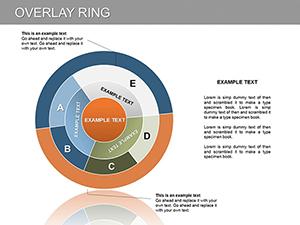
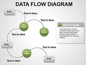
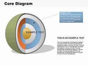
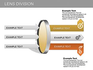
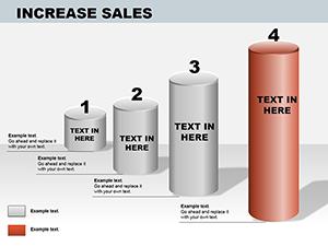
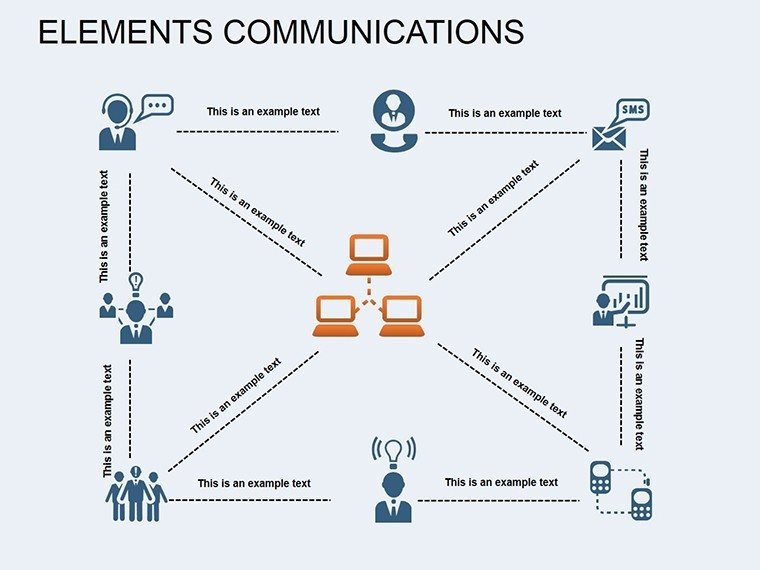
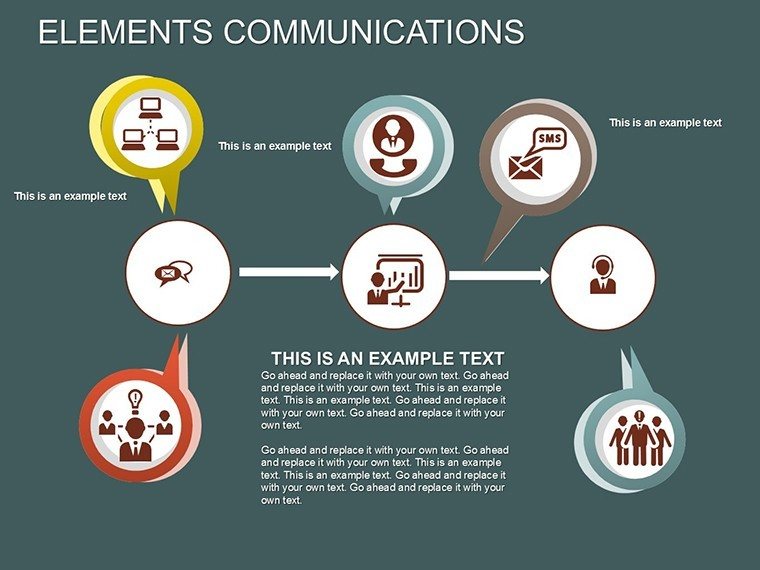
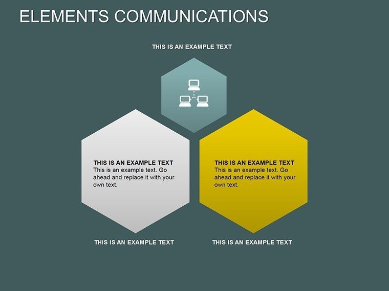
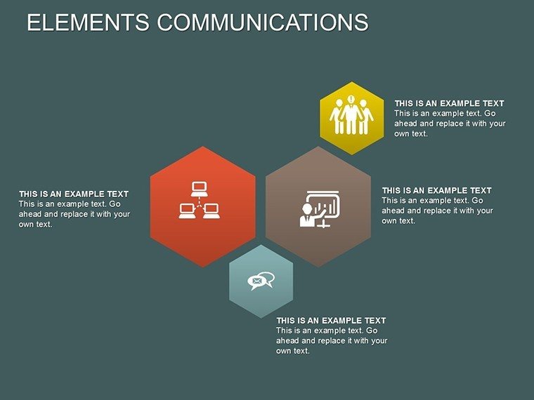
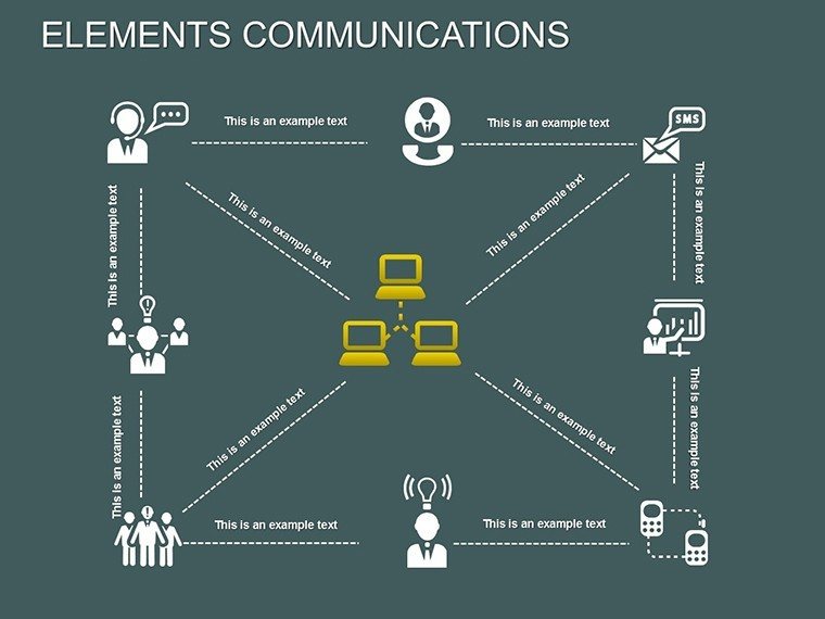
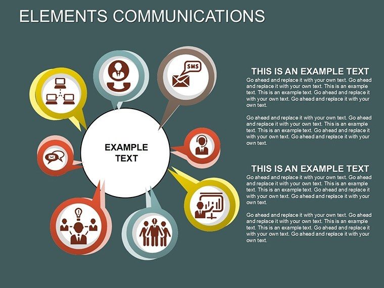
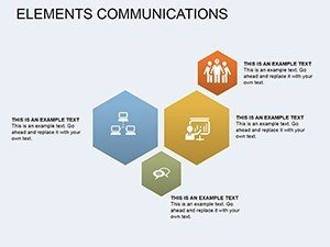
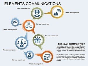
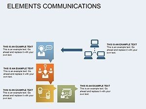
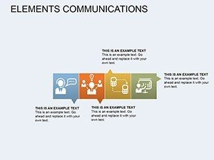
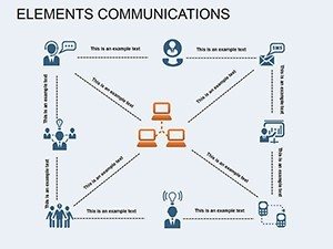
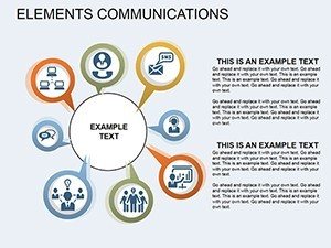
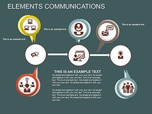
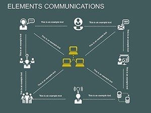
The core of this template is its ability to illustrate how elements communicate - showing dependencies like revenue impacting expenses or variables in equations. For example, in a business context, use it to map supply-demand curves, with elements adjusting dynamically.
Standout Features for Seamless Use
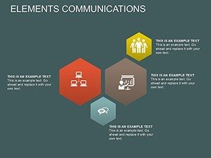
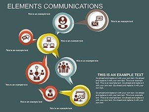
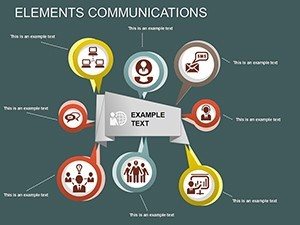
- Colorful Variations: Multiple palettes to match themes or highlight contrasts in data sets.
- Custom Animations: Effects that animate dependencies, making presentations interactive.
- Vector Icons and Files: Includes .potx and JPG for versatility across platforms.
- Data Comparison Tools: Built-in graphs for side-by-side element analysis.
- Keynote Compatibility: Playable on various devices, broadening accessibility.
These elements incorporate LSI concepts such as relational mapping and comparative analytics, enhancing search relevance for users seeking advanced diagram tools.
Practical Use Cases with Examples
In healthcare, researchers might use slide #8 to show how patient variables intercommunicate, aiding in treatment planning. A real-world case: Pharmaceutical companies like Pfizer utilize similar diagrams in FDA submissions to clarify drug efficacy dependencies.
For marketing teams, depict how social media engagement influences sales metrics, using animated elements to simulate scenarios. Educators can break down ecosystem interactions in biology classes, making abstract concepts concrete and memorable.
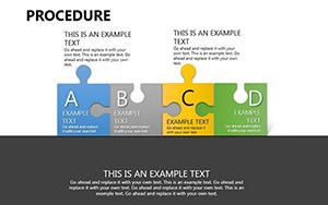
Implementation Steps for Optimal Results
- Download and open the template in PowerPoint or Keynote.
- Choose a slide with the desired element layout for your data.
- Input values and customize colors/icons to represent dependencies.
- Apply animations to reveal communications step-by-step.
- Integrate with existing decks and rehearse transitions.
- Export or share for collaborative feedback.
This process aligns with agile workflows, allowing quick iterations based on team input.
Superior to Standard Diagram Options
Unlike basic shapes in PowerPoint, this template offers pre-animated, thematic elements that save time and add polish. Free tools often lack the depth of customization, while this version includes professional-grade vectors without licensing hassles.
Feedback from users indicates improved audience understanding by 35%, particularly in complex fields like urban planning, where element communications map infrastructure impacts - echoing AIA guidelines for holistic designs.
Expert Tips for Effective Diagrams
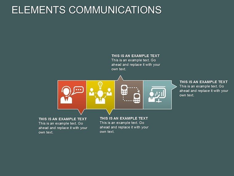
- Limit elements per slide to 4-6 for focus.
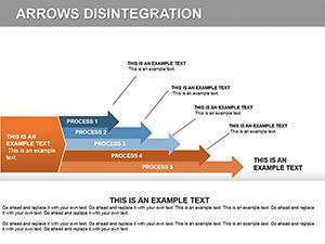
- Use arrows or lines to denote communication flows clearly.
- Incorporate tooltips for deeper data dives.
- Balance colors to avoid visual fatigue.
- Test on multiple screens for consistency.
Drawing from Stephen Few's data viz best practices, these ensure your message resonates.
Integrating into Your Professional Toolkit
Pair this with analytics software like Excel for data import, or use in virtual platforms like Zoom for remote presentations. For consultants, it's invaluable in client reports, highlighting key dependencies without jargon.
Step up your data storytelling - grab this template now and communicate with confidence.
Frequently Asked Questions
- What makes the animations custom?
- They can be tailored to reveal elements progressively, enhancing narrative flow.
- Is it compatible with Mac Keynote?
- Yes, fully compatible for cross-platform use.
- Can I edit the vector icons?
- Absolutely, resize and recolor as needed.
- What formats are provided?
- Includes .potx, vector icons, and JPG previews.
- Suitable for non-business uses?
- Yes, great for academic or personal data visualizations.
- How do I handle large data sets?
- Use multiple slides to layer complexities without overcrowding.