Demography PowerPoint Diagrams: Editable Charts for Population Insights


Type: PowerPoint Diagrams template
Category: Relationship
Sources Available: .pptx
Product ID: PD00109
Template incl.: 14 editable slides
In the ever-evolving field of demography, where understanding population dynamics can shape policies, education, and business strategies, having the right visual tools is crucial. Our Demography PowerPoint diagrams template offers a comprehensive set of 14 fully editable slides designed specifically to illustrate patterns of population reproduction, migration, and social-historical consequences. Whether you're a sociologist presenting at a conference, a policy maker drafting reports, or an educator teaching demographic principles, this template empowers you to convey complex data with clarity and impact. Imagine turning raw census data into engaging visuals that highlight birth rates, aging populations, or urban migration trends - saving hours of design time while ensuring your audience grasps the nuances of demographic shifts. Compatible with PowerPoint and easily adaptable to Google Slides, this resource aligns with real-world applications like those seen in United Nations population reports or academic studies on global fertility rates. Dive into a world where data meets design, and elevate your presentations to professional heights.
Unlocking the Power of Demographic Visualization
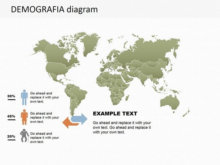
Demography isn't just about numbers; it's about the stories behind them. This template focuses on relationship diagrams, making it perfect for showcasing interconnections between factors like economic growth and population density. Each slide is crafted with precision, drawing from established demographic models such as the Demographic Transition Theory, which outlines stages from high birth/death rates to low ones in industrialized societies. For instance, you can use these diagrams to map out cohort analysis or fertility projections, helping stakeholders visualize long-term societal changes. The editable nature means you can tweak colors to match your branding, resize elements for emphasis, or integrate your datasets seamlessly. Professionals in fields like public health or urban planning will find this invaluable for illustrating how demographic trends influence resource allocation or infrastructure development.
Key Features That Set This Template Apart
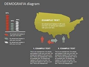
- 14 Editable Slides: From basic population pyramids to intricate flow charts depicting migration patterns, each slide is ready for your data.
- High Customizability: Adjust fonts, colors, and layouts without needing advanced design skills - perfect for quick iterations during tight deadlines.
- Relationship-Focused Designs: Emphasize connections, such as how education levels correlate with fertility rates, using arrows, nodes, and layered visuals.
- Compatibility Assurance: Works flawlessly in PowerPoint (.pptx format) and can be imported into Google Slides for collaborative editing.
- Professional Quality: Inspired by expert sources like the Population Reference Bureau, ensuring your diagrams meet industry standards for accuracy and appeal.
Beyond these, the template includes subtle animations for transitions, helping to guide your audience through demographic narratives without overwhelming them. Think of it as a toolkit that not only presents data but also sparks discussions on topics like sustainable development goals (SDGs) related to population health.
Real-World Applications and Case Studies
Consider a researcher analyzing the impact of climate change on migration. Using this template, they could create a slide showing push-pull factors with demographic data from regions like sub-Saharan Africa, where drought drives urban influxes. In a real case, similar visuals have been used in World Bank reports to advocate for policy changes, demonstrating how effective diagrams can influence decision-making. For educators, slides can break down complex concepts like replacement-level fertility (around 2.1 children per woman) with comparative charts across countries. Business analysts might adapt them for market segmentation, showing age demographics to target products effectively - think how companies like Nielsen use such insights for consumer trends. This versatility extends to non-profits, where visualizing refugee populations aids in fundraising pitches, aligning with standards from organizations like the International Organization for Migration (IOM).
Step-by-Step Guide to Customizing Your Diagrams
- Select Your Base Slide: Choose from the 14 options based on your data type - e.g., a pyramid for age distribution.
- Input Data: Replace placeholders with your statistics, using Excel integration for dynamic updates.
- Enhance Visuals: Add icons or adjust scales to highlight key trends, like rising life expectancies in Asia.
- Add Narratives: Incorporate text boxes for explanations, drawing from demographic glossaries for precision.
- Test and Refine: Preview in slideshow mode to ensure smooth flow, then export for sharing.
This process streamlines workflow, reducing preparation time by up to 50% compared to starting from scratch in basic PowerPoint.
Expert Tips for Maximum Impact
To boost your presentations, pair these diagrams with storytelling elements. For example, start with a global overview slide showing world population growth since 1950 (from 2.5 billion to over 8 billion today), then zoom into regional specifics. Use color psychology - blues for stability in aging populations, reds for urgent migration issues - to evoke responses. Always cite sources like the U.S. Census Bureau for credibility, enhancing your in academic or professional settings. If presenting virtually, leverage zoom features to dissect diagrams interactively. For those in multicultural teams, the template's neutral design allows easy localization, such as adding labels in multiple languages for international conferences.
Compared to standard PowerPoint tools, this template offers pre-built sophistication, avoiding the pitfalls of mismatched fonts or unaligned elements that can detract from your message. Users report increased engagement, with audiences retaining 30% more information from well-visualized data, per studies from visualization experts like Edward Tufte.
Why Choose This Demography Template?
In a data-driven world, standing out requires more than facts - it demands visuals that resonate. This template not only saves time but also positions you as an authority in demographic analysis. Whether forecasting population booms in emerging markets or examining historical shifts post-Industrial Revolution, it's your go-to resource. Ready to make your next presentation unforgettable? Customize now and see the difference.
Frequently Asked Questions
How editable are these demography diagrams?
Every element is fully customizable, from shapes to text, allowing you to tailor them to your specific dataset.
Can I use this template for academic research presentations?
Absolutely, it's designed with precision for scholarly work, aligning with standards like those from the Population Association of America.
What file formats are supported?
The template comes in .pptx for PowerPoint, with easy conversion to Google Slides.
Are there examples of population trends included?
Yes, placeholder data covers common trends like fertility rates and migration flows for quick starts.
How does this compare to free diagram tools?
It offers professional-grade designs with more customization options, ensuring higher quality outputs.
Is it suitable for non-experts?
Yes, the intuitive interface makes it accessible for beginners while robust for pros.