Fully Editable Cycle, Pyramid, Arrow, Pie & Puzzle PowerPoint Diagram Templates - 11 Slides | Instant Download


Get our fully editable PowerPoint diagram templates with 11 slides including cycle, pyramid, arrow, pie chart and puzzle diagrams. Ideal for business process mapping, data visualization, hierarchies and team collaboration. Instant download, professional and easy to customize for any presentation.
Transform Complex Ideas into Clear Visuals with Professional Diagram Templates
Presenting complex business concepts can be challenging without the right visuals. These versatile PowerPoint diagram templates provide ready-made, professional graphics that make your presentations more engaging and easier to understand. The pack includes 11 editable slides featuring a variety of diagram types that professionals rely on daily to communicate processes, data, and structures effectively.
Whether you are in corporate strategy, consulting, education, or operations, these diagrams help you convey your message with clarity and authority. The designs are modern, clean, and fully vector based so they look sharp in any presentation size or when printed.
When and Why to Use These Diagram Templates
Use these diagrams when you need to explain ongoing processes, show hierarchical relationships, map sequential steps, display data proportions, or highlight interconnected elements. They solve the common problem of spending too much time creating custom graphics from scratch. Instead, you can focus on your content while delivering visually compelling slides that keep your audience engaged.
Business users often use them in quarterly reviews, sales strategy sessions, and client proposals. Educators use them to explain concepts in lectures. Consultants rely on them for process improvement recommendations and change management presentations.
Key Diagram Types and Real-World Scenarios
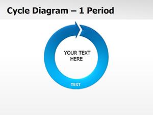
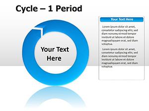
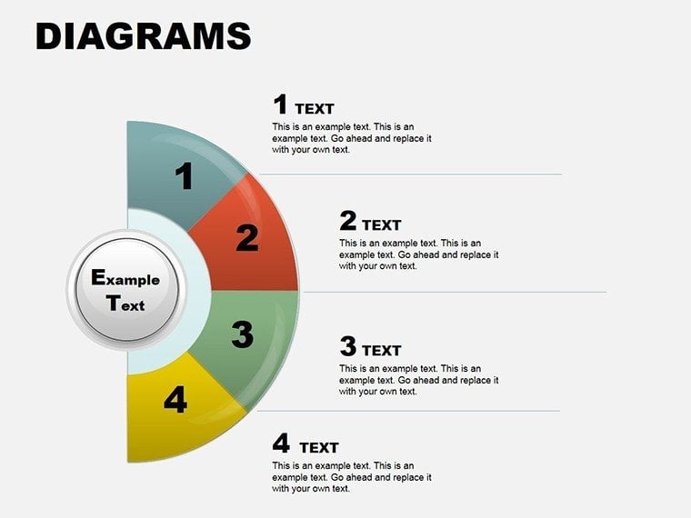
Cycle Diagrams for Continuous Processes
Cycle diagrams are perfect for marketing campaigns, quality control loops, or seasonal business planning. The circular format emphasizes repetition and flow, making it clear how different stages connect in a continuous loop. In a consulting presentation, you can use them to show the customer acquisition cycle or employee development program.
Pyramid Diagrams for Hierarchies and Priorities
Pyramids work great for showing organizational structures, Maslow's hierarchy in HR training, or priority setting in project management. The base-to-top structure visually represents how foundational elements support higher-level goals. Management teams use them to discuss company priorities or resource allocation.
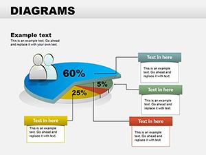
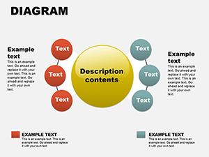
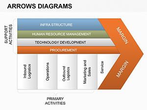
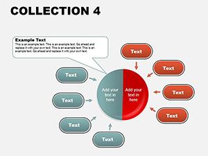
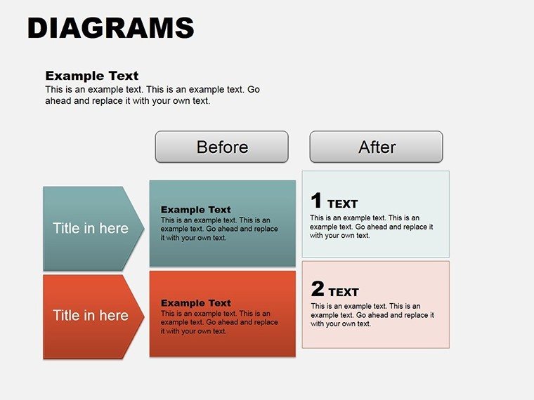
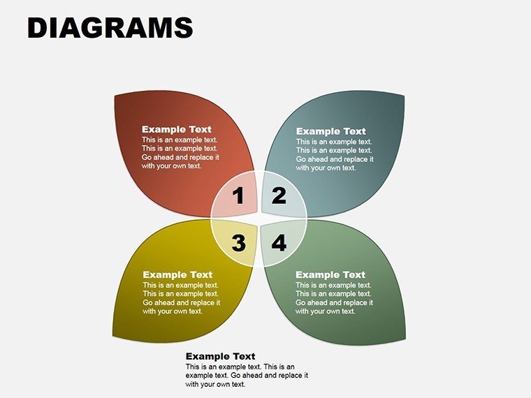
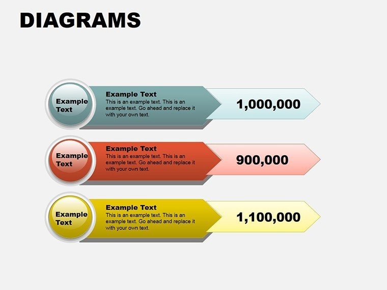
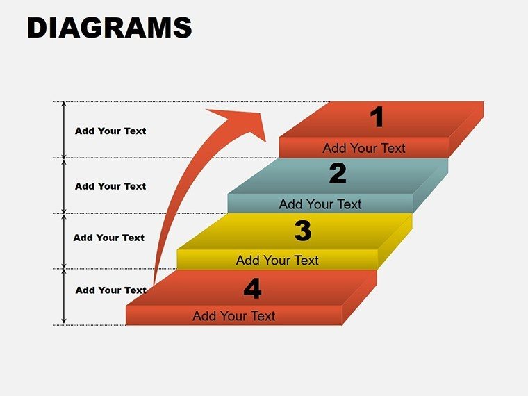
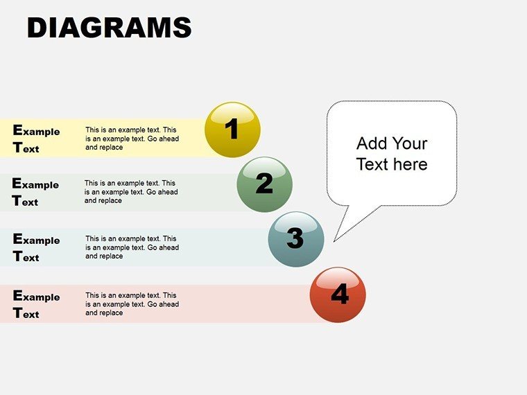
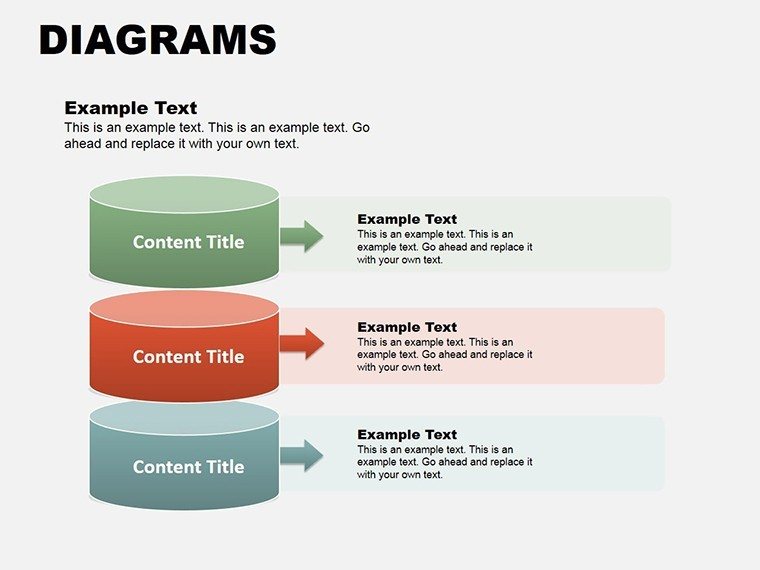
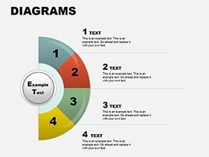
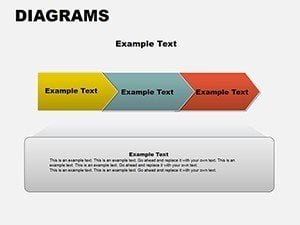
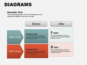
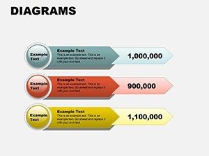
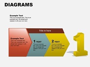
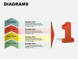
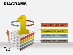
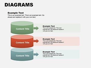
Arrow Diagrams, Pie Charts and Puzzle Elements
Arrow diagrams help outline step-by-step workflows in project implementation or sales funnels. Pie charts allow clear data segmentation for budget breakdowns or market share analysis in executive meetings. Puzzle diagrams symbolize team collaboration, problem solving, or system integration in IT and operations presentations.
How to Customize and Integrate These Templates
Editing is straightforward: open the template, select a slide, update the text placeholders with your own content, and change colors to match your brand guidelines using standard PowerPoint tools. Elements are grouped for easy selection but can be ungrouped for advanced changes. You can copy individual diagrams into your existing presentation decks seamlessly.
This approach ensures consistency across your company's presentations while saving significant design time for busy professionals.
Take your presentations to the next level - download now and start creating standout slides today.
Frequently Asked Questions
Are these PowerPoint diagram templates fully editable?
Yes, every element is created using native PowerPoint shapes, allowing you to change colors, text, sizes, and layouts freely without losing quality.
What is included in the 11 slides?
The template includes multiple variations of cycle, pie, arrow, pyramid, and puzzle diagrams, giving you plenty of options to choose the best fit for your content.
Is the template compatible with different PowerPoint versions?
It works with PowerPoint 2016 and all newer desktop versions. The provided .pot and .potx formats ensure maximum compatibility.
Can I use these diagrams for client projects?
Yes, the templates are licensed for both personal and commercial use, making them perfect for client deliverables and internal company use.