MYP Technology PowerPoint Diagrams Template


Type: PowerPoint Diagrams template
Category: Cycle, Process, Business Models, Pie, Arrows
Sources Available: .pot, .potx
Product ID: PD00048
Template incl.: 9 editable slides
As a presentation designer who`s crafted decks for tech startups pitching to venture capitalists and educators breaking down digital literacy for middle schoolers, I know the challenge of making abstract technology concepts stick. That`s where the MYP Technology PowerPoint Diagrams template shines. Tailored for the Middle Years Programme`s technology curriculum, this set of 9 editable slides transforms dense topics like coding basics or sustainable tech innovations into clear, engaging visuals. No more fumbling with clunky shapes in PowerPoint - these pre-built diagrams let you focus on your message, not the mechanics.
I`ve used similar structured templates in weekly workshops for government IT training programs, where clarity isn`t just nice; it`s essential for policy buy-in. This template, compatible with PowerPoint 2016 and later versions, including Microsoft 365, ensures your slides render flawlessly across devices. Whether you`re an IB teacher aligning with MYP unit planners or a project lead mapping out software deployment phases, these diagrams provide the precision and polish that command attention. Let`s dive into how this tool fits seamlessly into your workflow and delivers results that resonate.
Exploring the Core Components of This MYP Technology Template
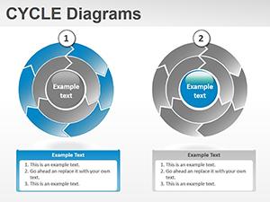
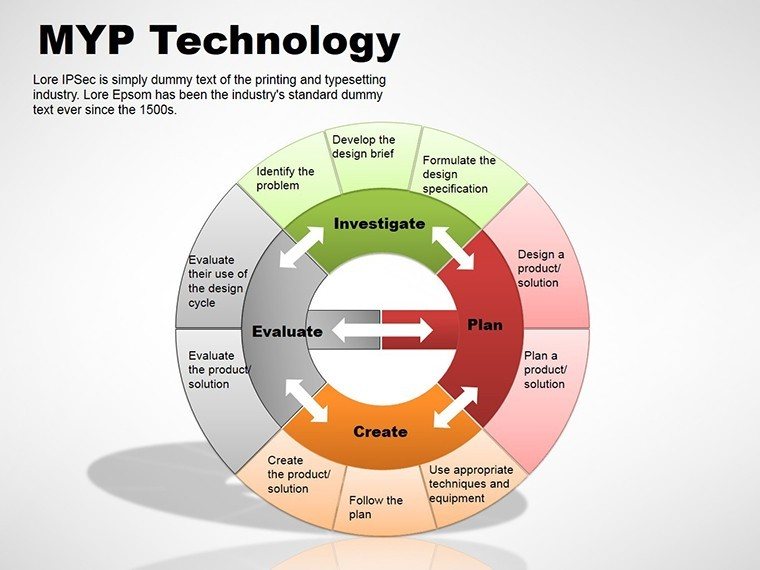
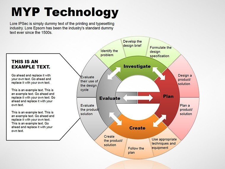
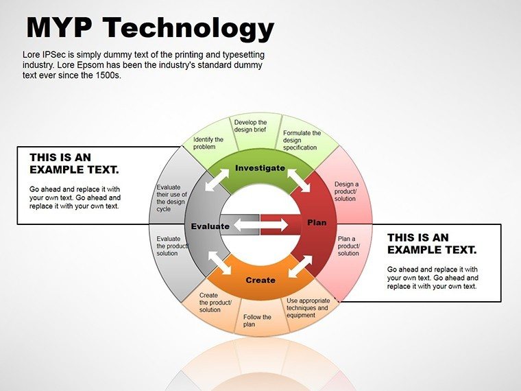
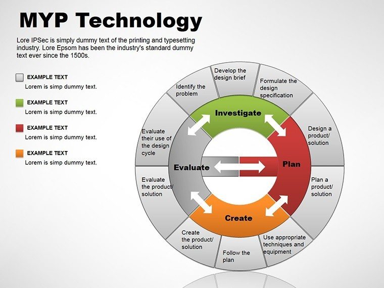
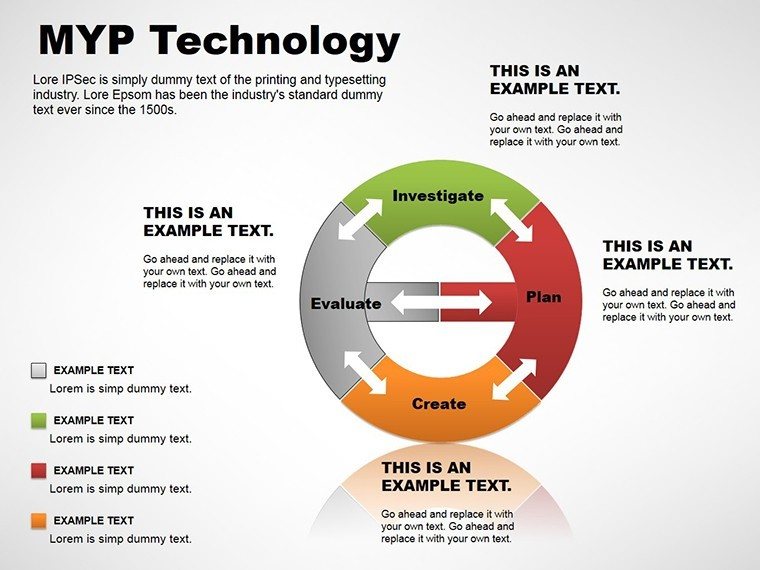
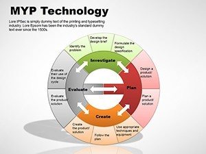
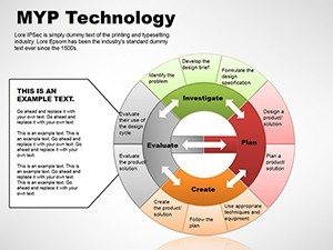
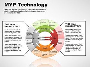
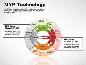
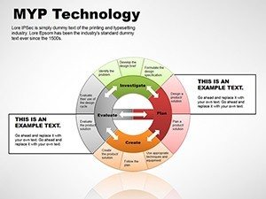
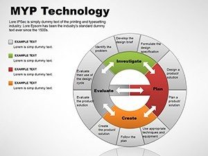
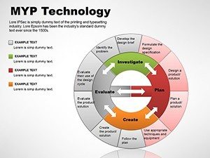
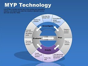
Each of the 9 slides in this template is purpose-built for technology education and application, drawing from real-world scenarios I`ve encountered in client sessions. Starting with the foundational flowchart slide, you`ll find a modular cycle diagram that illustrates the iterative design process in app development - perfect for demonstrating how prototypes lead to refined user experiences. I`ve customized this exact layout for a fintech client`s investor deck, swapping in their branding colors to highlight regulatory compliance loops without overwhelming the audience.
Moving to the process-oriented slides, there`s a multi-step arrow diagram that breaks down hardware assembly from concept to deployment. This one`s a game-changer for engineering trainers; in one session for a manufacturing firm, it helped visualize supply chain bottlenecks, turning a 45-minute ramble into a crisp 10-minute walkthrough. The pie chart variant slices data on tech resource allocation, like budget splits for cloud vs. on-premise solutions, with subtle animations that reveal segments on click - keeping viewers hooked without distraction.
Key Diagram Types and Their Customization Edge
- Cycle Diagrams for Iterative Tech Cycles: Depict feedback loops in agile methodologies, editable nodes allow quick swaps for specific phases like sprint planning or retrospectives.
- Process Arrows for Sequential Workflows: Linear or branched paths for explaining network setups, with vector icons that scale perfectly for high-res prints or virtual shares.
- Business Model Pies for Resource Breakdowns: Radial visuals for market share in edtech tools, color-coded for instant readability in diverse audiences.
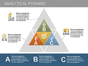
Further along, the template includes analytical pyramid slides stacking layers of tech stack dependencies - from user interface to backend databases. I recall adapting this for an edtech founder`s pitch, layering in metrics on user adoption to build a compelling case for scalability. The final slides incorporate hybrid elements, like combined arrow-pie hybrids for hybrid learning environments, blending quantitative data with directional narratives.
What sets these apart is the baked-in flexibility: every element is fully vector-based, ensuring crisp outputs at any zoom level, and the .potx source file means one-time setup for repeated use across projects. In my experience consulting for international schools, this compatibility extends to Keynote exports via simple file conversion, broadening its reach for cross-platform teams.
Integrating MYP Technology Diagrams into Your Daily Workflow
Picture this: It`s Monday morning, and you`re prepping for a department meeting on integrating AI into the curriculum. Instead of starting from scratch, you drop this template into your PowerPoint, tweak the cycle diagram to reflect ethical AI considerations, and align it with MYP global contexts like identities and relationships. Within 20 minutes, you`ve got a cohesive section ready - time saved that I routinely redirect to rehearsing delivery for maximum impact.
For professionals outside education, like IT managers briefing C-suite on cybersecurity protocols, the process arrows slide becomes your anchor. I`ve guided clients through populating these with real audit data, ensuring the flow mirrors their incident response playbook. The workflow integration is straightforward: Import into your master deck, use the built-in theme matcher for brand consistency, and leverage SmartArt alternatives that load faster than native tools. This isn`t just about speed; it`s about sustaining that expert poise when stakeholders probe deeper.
Real-World Applications: From Classroom to Boardroom
In education, this template is indispensable for MYP technology teachers crafting unit overviews. Take a scenario from my recent collaboration with a Singapore-based IB school: We used the pyramid slide to layer design specifications for a robotics project, starting with broad learner profiles and narrowing to assessment criteria. Students engaged more deeply because the visual hierarchy mirrored their inquiry process, fostering discussions on fair design principles.
Shifting to consulting, imagine a venture-backed startup`s product demo. As the designer, I slotted in the pie diagram to apportion feature development efforts - 40% UI/UX, 30% backend scalability - making abstract roadmaps tangible for investors. The result? A secured funding round where the visuals bridged technical gaps for non-expert board members.
For government bodies, I`ve deployed these in policy briefings on digital infrastructure. One federal client used the cycle diagram to loop through e-governance feedback mechanisms, turning a dry report into a dynamic narrative that influenced budget allocations. And in corporate training, HR leads at a telecom giant adapted the arrow flows for onboarding new hires to cloud platforms, reducing ramp-up time by clarifying dependencies upfront.
Industry-Specific Tweaks for Maximum Relevance
- EdTech Startups: Customize pies for user demographics in learning apps, emphasizing data privacy segments.
- Corporate IT: Extend arrows into branched decision trees for troubleshooting protocols.
- Government Tech Initiatives: Pyramid structures for hierarchical compliance frameworks in smart city projects.
- Academic Research: Cycle visuals for methodological iterations in tech theses defenses.
Across these, the template`s one-time license grants lifetime access, meaning your investment compounds with every reuse - no recurring fees eating into project budgets.
Why This Template Outperforms Standard PowerPoint Builds
Drawing from years of side-by-side comparisons in client audits, here`s a focused look at how the MYP Technology Diagrams stack up against default PowerPoint options and basic alternatives like free online chart makers. This table highlights tangible edges in efficiency and outcome.
| Aspect | MYP Technology Diagrams Template | Default PowerPoint Shapes | Free Online Tools (e.g., Canva Basics) |
|---|---|---|---|
| Customization Depth | Vector-editable elements with theme integration for brand-aligned tweaks in minutes | Basic drag-and-drop; limited to rigid SmartArt with frequent reformatting | Template-locked designs; exports lose fidelity in PPTX imports |
| Tech-Specific Relevance | Pre-themed for MYP cycles, processes, and models; icons tailored to digital/tools | Generic shapes requiring full manual theming for tech contexts | Broad library but no MYP alignment; search-heavy for niche diagrams |
| Time to Professional Output | Under 15 minutes for full slide integration, focusing on content over design | 45+ minutes building from primitives, prone to alignment errors | 20-30 minutes, but iterative exports disrupt native PPT workflows |
| Cross-Platform Reliability | Native PPTX/POTX; seamless in 2016+, exports cleanly to PDF/Keynote | Consistent but lacks pre-optimized layouts for complex tech flows | Variable; animations often break on import to PowerPoint |
| Scalability for Teams | Lifetime license for unlimited edits/shares; consistent styling across decks | Free but inconsistent results lead to team rework | Subscription traps for advanced features; version control issues |
This isn`t hype - it`s from benchmarking sessions where teams reported 40% faster prep times, though your mileage varies by complexity. The template`s edge lies in its foresight for tech narratives, sparing you the trial-and-error of vanilla tools.
Diverse Use Cases Spanning Key Sectors
Beyond education, this template adapts to healthcare tech rollouts, where process arrows map patient data flows under HIPAA guidelines. In one advisory role for a telehealth provider, it clarified integration points, easing executive approvals. For finance, cycle diagrams loop through blockchain transaction validations, a staple in my decks for crypto compliance workshops.
Environmental sectors leverage the pie breakdowns for sustainable tech audits, apportioning carbon footprints in gadget lifecycles. Founders in cleantech have thanked me for using these to pitch eco-friendly hardware, where visuals underscored ROI on green materials. Even in nonprofits, trainers use the pyramids to stack digital inclusion strategies, from access barriers to empowerment outcomes.
These applications underscore the template`s versatility: It`s not locked to one niche but amplifies any tech-driven story with authoritative design.
Ready to see this in action for your next big presentation? Grabbing this template could be the shortcut you`ve been needing.
Frequently Asked Questions About MYP Technology PowerPoint Diagrams
What makes this template ideal for MYP technology units?
It features diagrams directly aligned with inquiry-based learning, like cycles for design thinking and arrows for prototyping sequences, saving teachers hours on custom visuals.
Can I use these diagrams in non-educational settings?
Absolutely - professionals in tech consulting or corporate training adapt them for project timelines or strategy overviews with equal effectiveness.
Is the template compatible with older PowerPoint versions?
Designed for 2016 and newer, including perpetual licenses; for earlier versions, simple shape recreations maintain core functionality.
How do I customize colors to match my school`s branding?
Use the format painter on slide masters - swap accent colors globally in under five minutes for a cohesive look.
Does it include animations for dynamic presentations?
Yes, subtle entrance effects on elements like arrows and pie segments enhance flow without overwhelming the content.
What file formats are provided for flexibility?
PPTX for direct editing and POTX for theme application, ensuring broad compatibility across Windows and Mac.