Honeycomb PowerPoint Diagrams - Editable PPTX | ImagineLayout


Type: PowerPoint Diagrams template
Category: Illustrations, Puzzles
Sources Available: .pptx
Product ID: PD00038
Template incl.: 25 editable slides
Package Contents
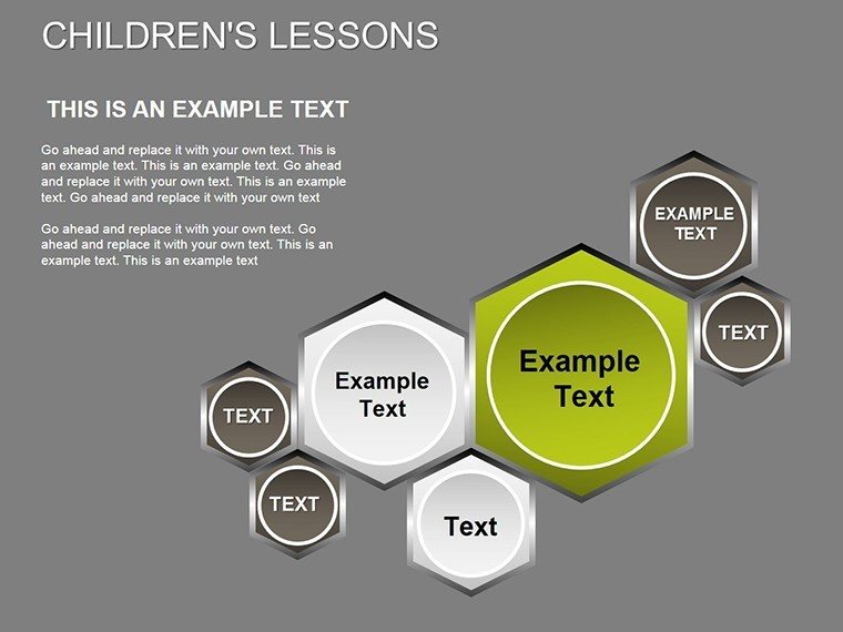
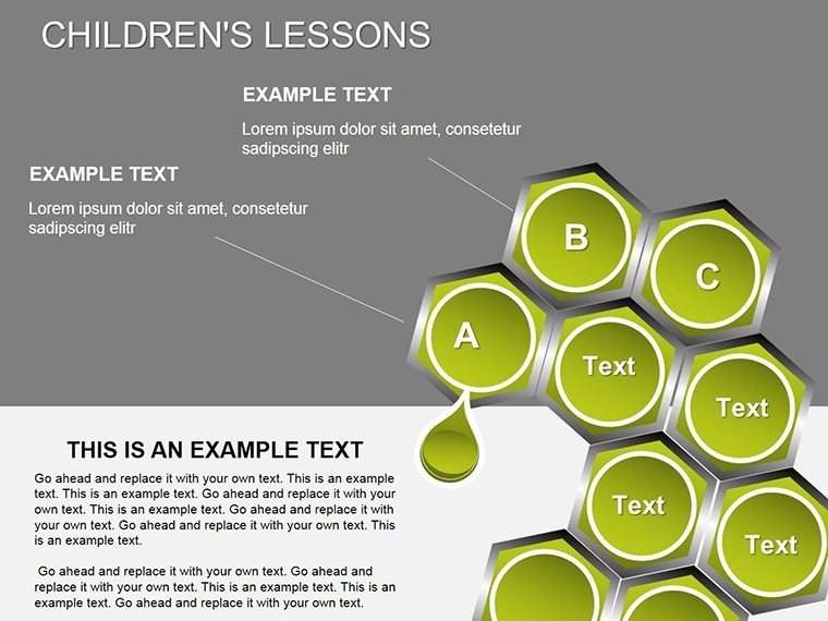
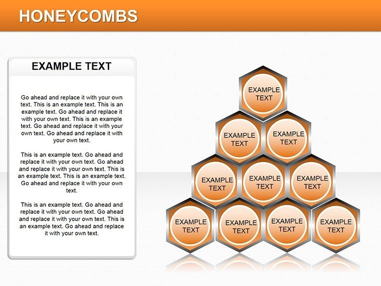
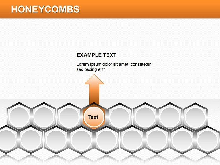
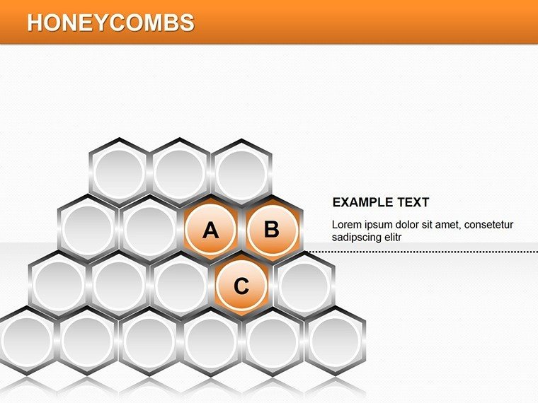
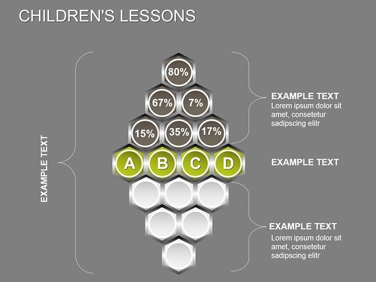
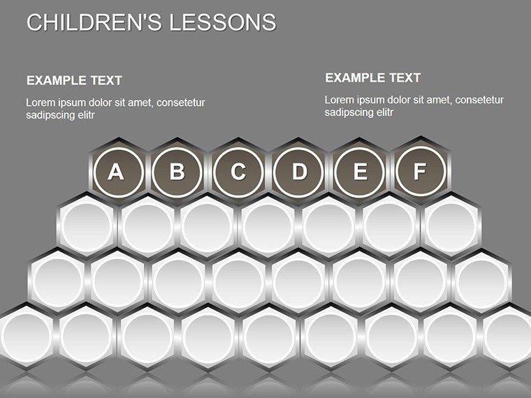
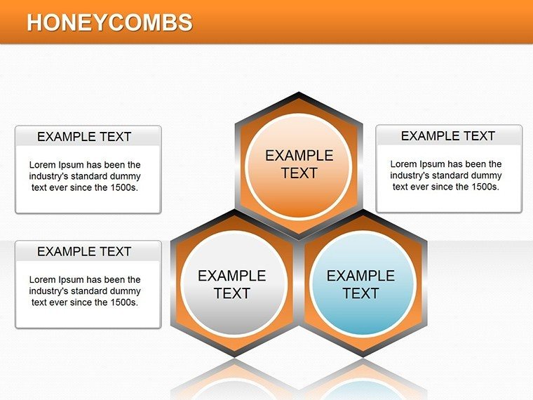
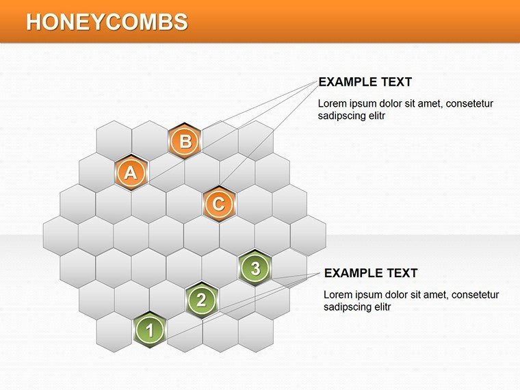
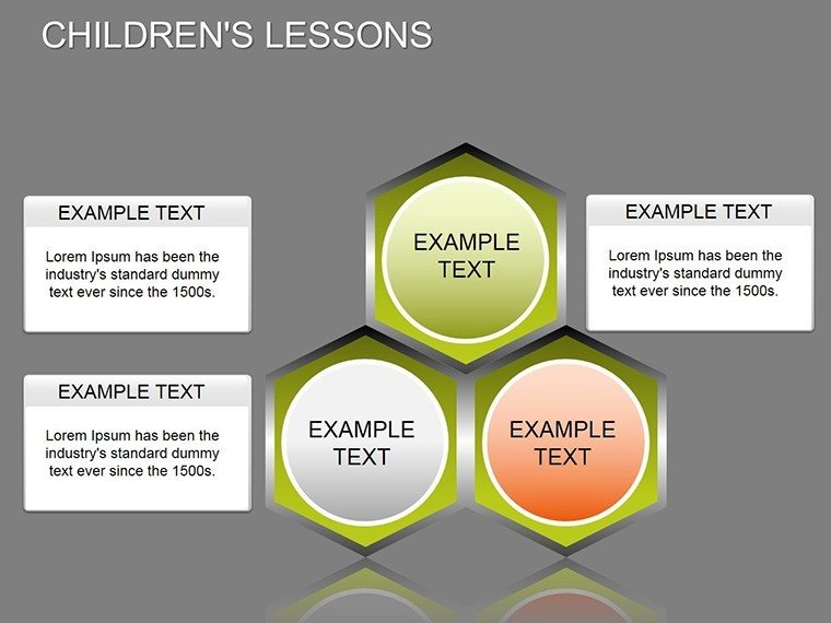
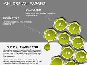
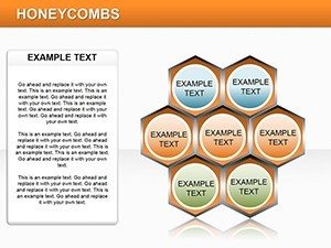
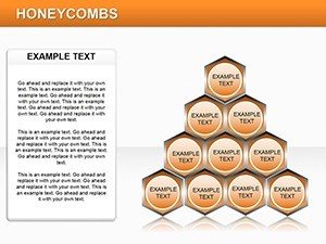
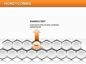
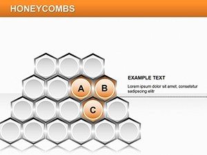
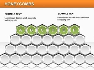
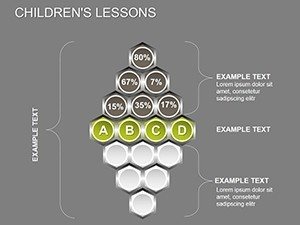
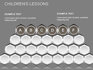
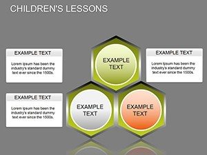
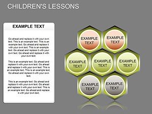
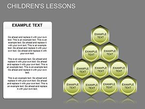
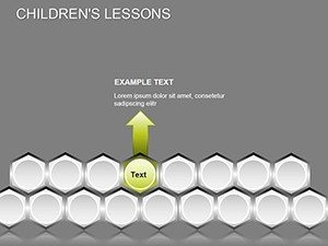
25 diagrams fill the download package. Interlocking hexagonal cells form the main structure for ranges and distributions. Each slide keeps editable shapes separate so zones resize without breaking the grid.
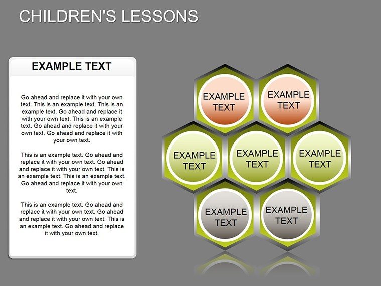
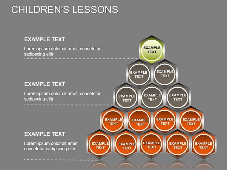
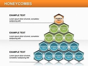
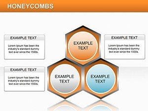
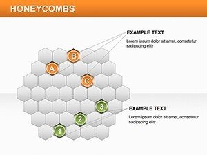
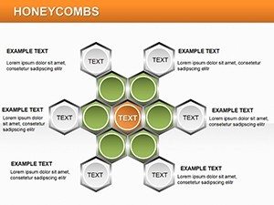
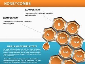
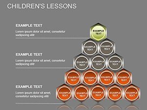
The package supports distribution visuals in business presentation settings through combined hex zones. Diagram structure combines multiple hex cells into zones that show overlaps and phases together for strategy meetings.
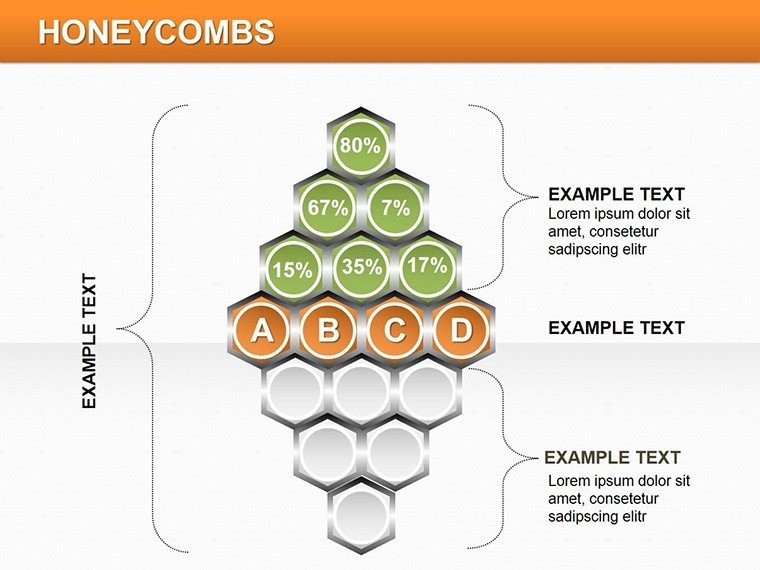
The interlocking hexagonal cells enable zone segmentation for ranges unlike workflow-focused sets. One specific visual characteristic is the flat hexagons joined edge-to-edge. For presenting distribution data in strategy meetings this works best since the structure clarifies overlaps better than single-chart layouts. The paid version delivers all 25 slides with independent shape editing.
Editing Capabilities at a Glance
| Feature | Details |
|---|---|
| Slides included | 25 diagrams focused on honeycomb grids |
| Editable elements | Individual hex cells resize and recolor independently |
| Color theme adjustments | Slide master palette supports full recoloring |
| Diagram connectors | Lines between zones adjustable in weight |
| Aspect ratio | Standard 16:9 for modern screens |
| PowerPoint compatibility | Versions 2016, 2019 and Microsoft 365 |
Who Reaches for This Template
Financial analysts in the banking sector reach for this template during quarterly reviews. They input distribution data into the hex zones and complete the deck in 45 minutes instead of three hours from scratch.
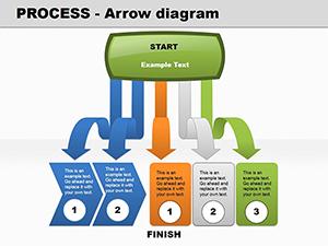
Project managers in tech firms use the diagrams for internal reporting. They pair the set with process flow diagrams for comprehensive reporting and reuse the same file across three client reports by swapping color schemes.
Download the honeycomb diagrams now to start editing immediately.
Customization in 5 Steps
1. Open the .pptx file in PowerPoint 2016 or later (1 minute).
2. Replace placeholder text with your content (3 minutes).
3. Adjust brand colors via the slide master (2 minutes).
4. Edit diagram labels and connectors (4 minutes).
5. Export as PPTX or PDF (1 minute).
Editing difficulty remains moderate.
Compared to Starting From Zero
Professionals spend over four hours building hex grids manually. This package reduces that to under 15 minutes. Advanced vector alignment skills are required when starting from blank slides. Alignment issues and inconsistent spacing often appear on projection screens.
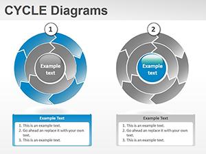
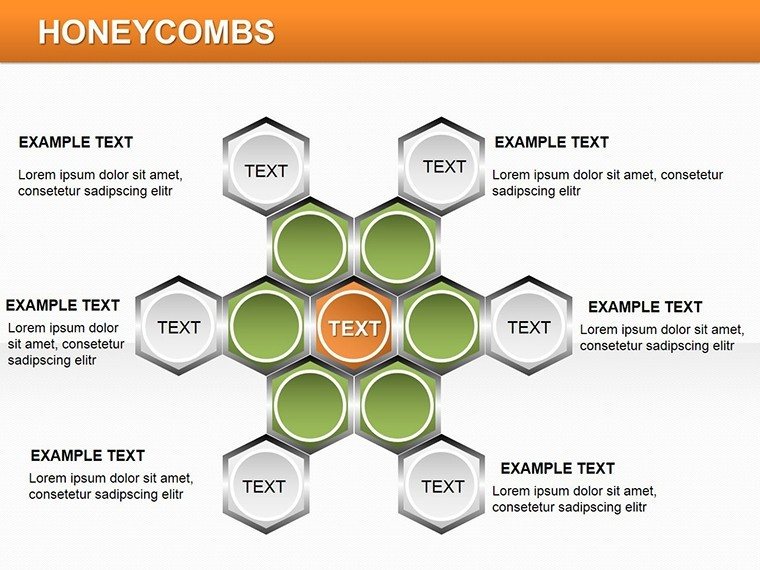
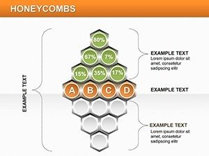
Hexagonal layouts place labels outside the cells connected by thin lines. That approach maintains readability during live meetings without adding editing complexity compared to inside labels that shrink on zoom. Project managers often pair these diagrams with cycle visualization sets when structuring multi-phase strategy decks.
Get the full set and present with confidence today.
What PowerPoint versions support these honeycomb diagrams?
The PPTX format works with PowerPoint 2016, 2019, and Microsoft 365 on Windows systems. Mac users can open it in PowerPoint for Mac 2016 or later with full editing support. Test the file in your installed version before large projects to ensure compatibility. The page does not specify exact requirements beyond PPTX so verify your software.
How do I change the color scheme in the file?
Open the slide master view in PowerPoint. Select the color palette and update the theme colors. All hex zones update automatically across the 25 diagrams. Save the file and return to normal view to check the result in under two minutes.
What does the license permit for client work?
You can use the diagrams in paid client work and internal presentations. Resale of the template file or sublicensing remains prohibited. The download includes a license file with full terms. Contact support for any specific usage questions.
Are there free and paid versions available?
The page does not list a free version. The paid purchase covers the full set of 25 editable slides. No partial diagrams appear in any tier. Check the download page for current pricing details.
What file formats are included and which software opens them?
The download contains only PPTX files. PowerPoint 2016 and newer opens them directly on Windows or Mac. Export options include PDF for distribution. No KEY or other formats appear.