Curved Arrows PowerPoint Template: Bend Data to Your Will


Type: PowerPoint Diagrams template
Category: Process, Relationship, Arrows, Illustrations
Sources Available: .pptx
Product ID: PD00032
Template incl.: 14 editable slides
When straight lines bore and data demands nuance, curved arrows swoop in to save the day. Our Curved Arrows PowerPoint Template delivers 14 slides of elegant, flowing diagrams that gracefully compare ranges, spotlight extremes, and distribute insights with style. Aimed at data wranglers in finance or strategists in consulting, this PPTX file in PowerPoint's realm makes complexity curve toward comprehension.
These aren't stiff pointers - they're sinuous guides that arc through your points, emphasizing distributions with organic bends that mimic real-world flows. Editable from tip to tail, with PowerPoint 2016+ support, you resize curves, recolor paths, and layer text without breaking a sweat. It's the subtle flex that turns rote reports into rhythmic revelations, helping you highlight what sways decisions.
Essential Curves That Contour Your Content
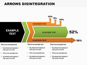
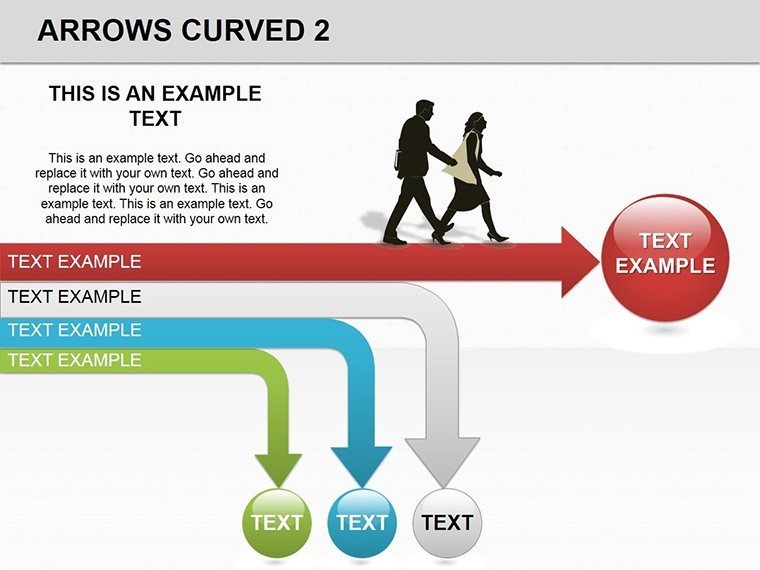
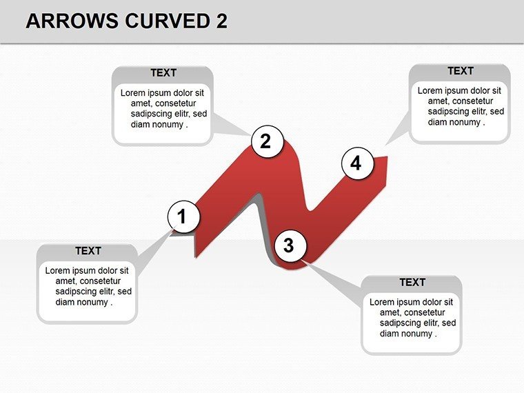
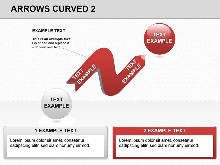
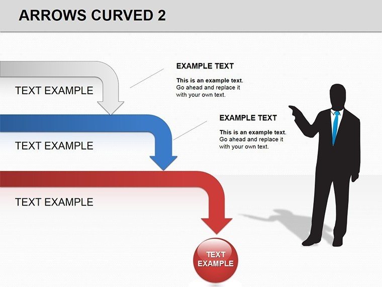
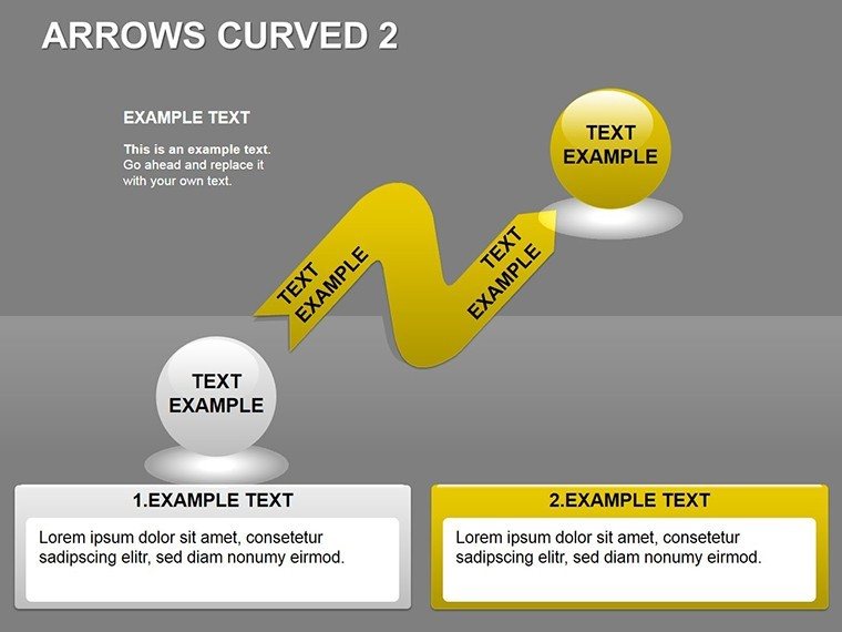
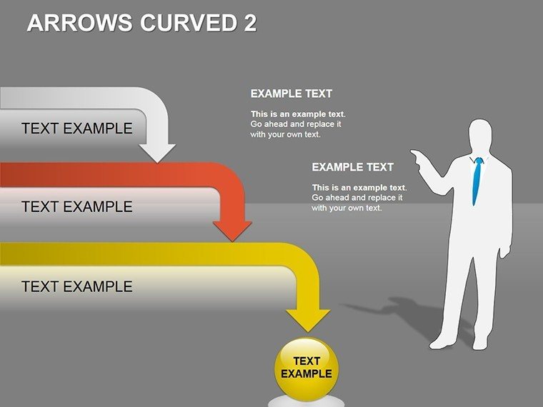
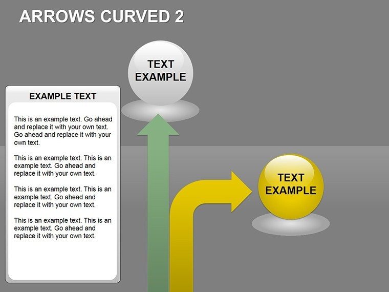
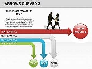
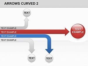
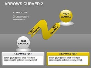
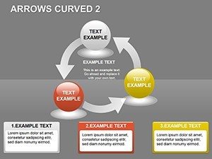
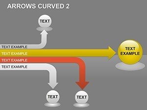
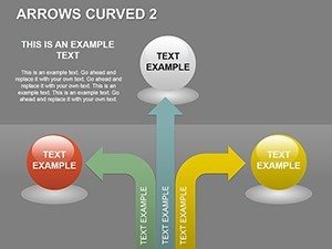
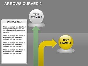
Lead with a sweeping single-arrow slide, its gentle S-curve traversing from start state to end, ideal for evolution overviews like market shifts. Annotate bends with callouts for inflection points, where trends pivot. Multi-arrow variants fan out in parallels, comparing datasets - like quarterly revenues - curves thickening at peaks for visual weight.
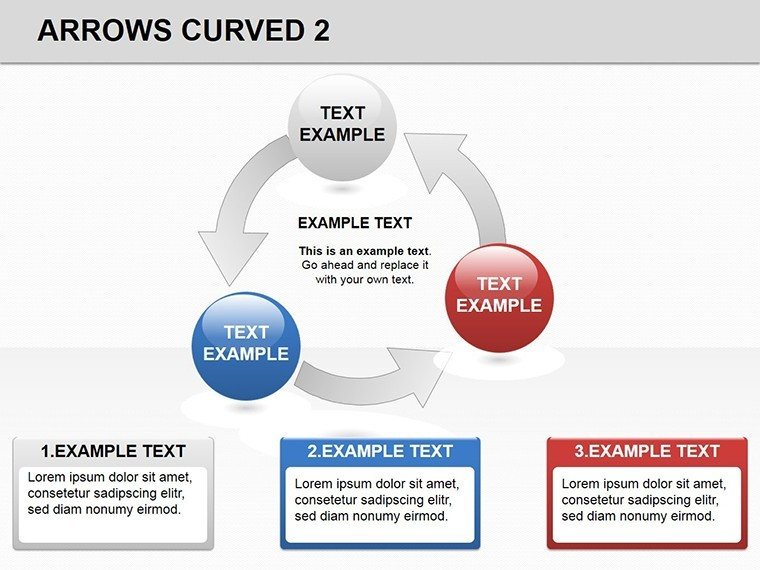
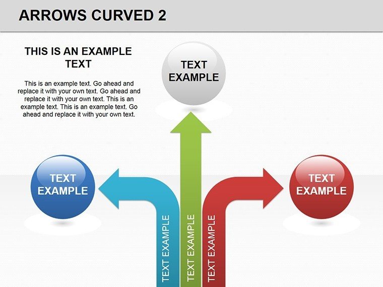
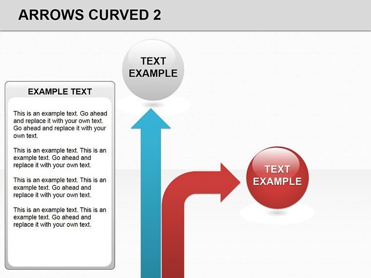
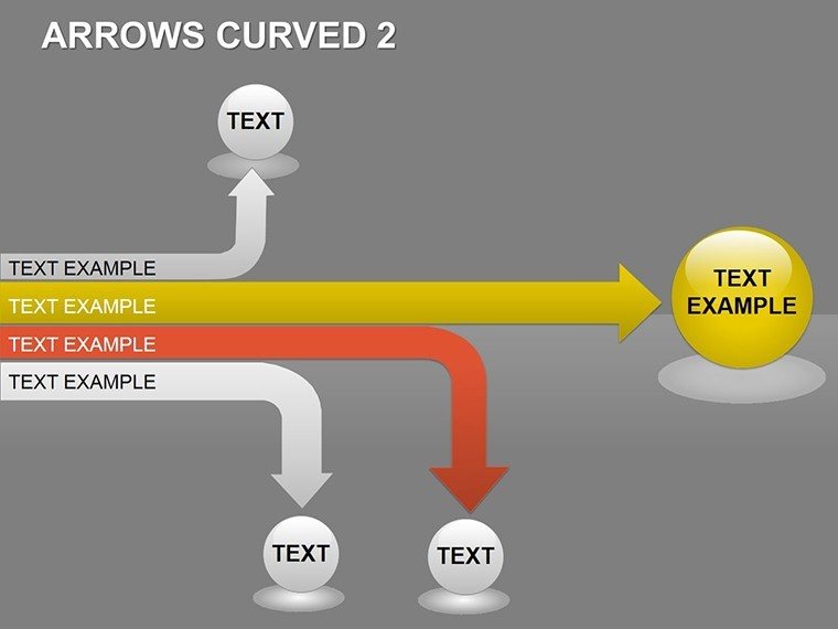
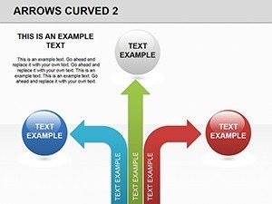
For distributions, a clustered curve set radiates from a core, each arc weighted by volume, perfect for bell-curve approximations without the math hassle. Animations trace paths sequentially, drawing eyes along the journey as you narrate. An extreme-focus slide loops arrows back on themselves, magnifying highs and lows in looped emphasis.
- Fluid Path Tools: Bezier curves that smooth edits, maintaining elegance post-tweak.
- Range Markers: Dotted extensions along arrows for scale references.
- Distribution Shades: Gradient fills that intensify at concentrations.
- Motion Paths: Pre-mapped animations for arrow travel across slides.
A logistics manager curved these arrows for route optimizations, bends illustrating detours that shaved delivery times, impressing ops leads with tangible routes to efficiency.
Curving Your Customization Curve
Fire up PowerPoint, insert the template, and curve away - select a path, curve tool in hand, drag nodes to reshape; updates cascade to connected elements. Workflow wise: Sketch your arc with placeholders, feed in values to modulate bend radii, then polish with shadows for depth. This echoes curve-fitting in analytics software but stays visual, no code required.
Insight: Anchor endpoints with guides for alignment, ensuring curves don't wander off-grid. It's quicker than freehand drawing in native tools, where curves often kink unnaturally.
Curved Applications: Twists on Tradition
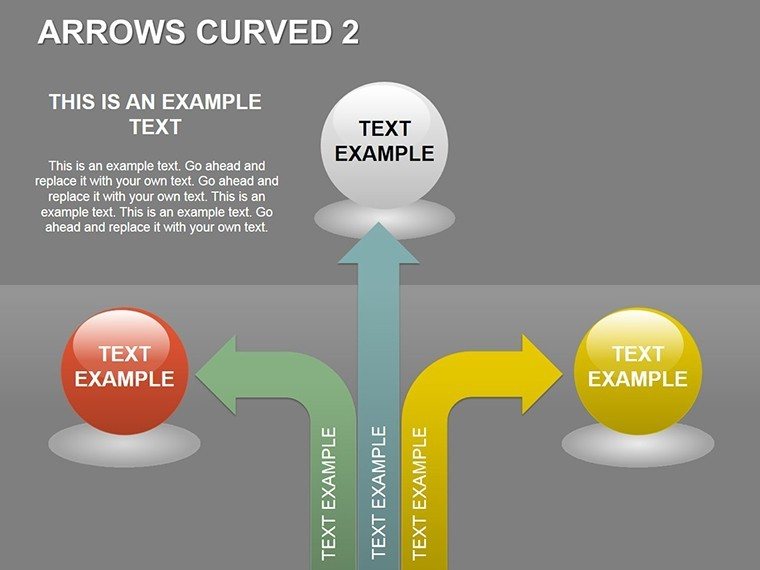
Flex it wide. In finance, parallel curves chart portfolio volatilities, extremes bowed out for risk flares. Consultants curve process maps, arcs linking phases with decision loops for agile flows. Educators arc historical timelines, distributions showing event densities over eras.
Product teams use radial clusters for user journey maps, curves diverging at choice points to explore paths not taken. In R&D, they distribute innovation funnels, bends highlighting bottleneck clusters. Everywhere, the curve conveys continuity - smoother than angles, more dynamic than lines - guiding views through variances with finesse.
Refining Curves for Peak Persuasion
Blend with scatter plots at curve intersections for hybrid views, or link arcs to timelines for chrono-distributions. Cap curves at three per slide for focus, drawing from design tenets like those in "The Visual Display of Quantitative Information" - curves clarify when they caress data, not coerce. Outshining basic arrows, this template's organic forms reduce visual noise, amplifying your analytical edge.
The Graceful Glide of Superior Design
Underpinning it all: Parametric equations baked in for perfect bends, plus a 2.5MB footprint for swift loads. It empowers fluid storytelling, where data dances rather than drags, earning nods from peers for its poise.
Bend toward brilliance - claim the Curved Arrows PowerPoint Template today and let your data flow free.
Frequently Asked Questions
Are the curves vector-based for scaling?
Yes, all paths are vectors, scaling crisply without pixelation.
Can I straighten a curved arrow if needed?
Easily - use the edit points tool to align into straights.
Does it support color gradients along arrows?
Built-in, apply via fill options for seamless transitions.
How many arrows per slide maximum?
Up to 10 comfortably, with grouping for management.
Is it compatible with PowerPoint Online?
Fully, though advanced edits shine in desktop.
Can I add text along the curve path?
Yes, text follows contours via attach-to-path feature.