Economic Fluctuations PowerPoint Diagrams: Visualize Volatility


Type: PowerPoint Diagrams template
Category: 3D, Silhouettes & People
Sources Available: .pptx
Product ID: PD00020
Template incl.: 12 editable slides
In the ever-shifting world of economics, clarity is your competitive edge. These Economic Fluctuations PowerPoint Diagrams offer 12 editable slides that capture the pulse of markets, from booms to busts. Crafted for analysts, economists, and strategists who need to convey volatility without jargon, this template uses fluid curves and interconnected spheres to map financial ecosystems. It's not just about showing data - it's about revealing patterns that inform bold moves, whether in board discussions or client advisories.
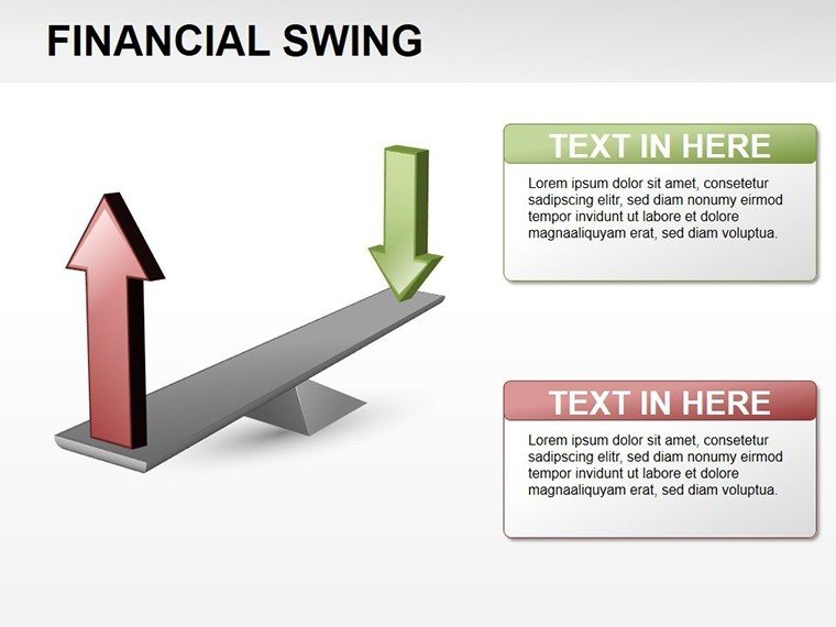
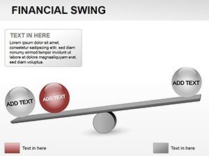
The template's genius lies in its hybrid approach: combining range charts for extremes with link-based models for systemic flows. Picture spheres representing institutions, linked by proceeds arrows - editable to reflect your scenario. Fully PowerPoint-native, it supports dynamic updates, turning static reports into living analyses.
Key Components That Drive Economic Narratives
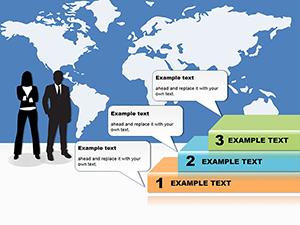
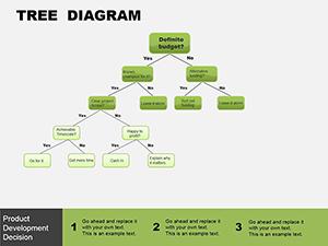
Explore the slides that matter. The fluctuation wave diagram undulates like market lines, with peaks for highs and troughs for lows, customizable wavelengths for different cycles. Add data points via simple drags, and it auto-scales for precision.
- Data Distribution Funnel: Widens to show spreads, narrowing on outliers for focused insights.
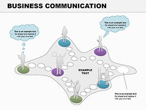
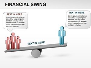
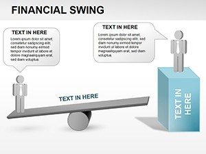
- Financial Link Chain: Sequential spheres tracing capital movement, with break points for disruptions.
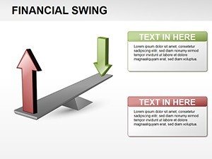
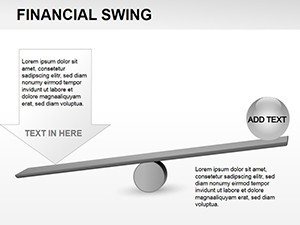
- Range Comparison Bars: Side-by-side extremes, color-shifted for quick variance spots.
Drawing from economic modeling basics, the visuals prioritize readability - clean fonts, balanced whitespace, and a professional navy-gold scheme. A market researcher once used the sphere set to illustrate recession ripples, making abstract linkages pop for non-experts.
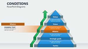
Tailored Tweaks for Economic Depth
Adaptation is key: Resize links to denote strength, or recolor spheres for sectors like banking versus manufacturing. The master layout ensures consistency, while grouped objects ungroup easily for granular edits. For time-series, embed Excel links that refresh on open, keeping your deck current.
In global contexts, the scalable design handles multi-variable inputs, like GDP versus inflation, without clutter.
Use Cases Tailored to Economic Realities
Apply it where fluctuations hit hardest. For forecasting sessions, the predictive curve slide extrapolates trends with dashed futures, sparking scenario planning. In regulatory reviews, the institution web visualizes compliance flows, highlighting weak links.
- Market Volatility Reports: Wave forms to chart stock swings over periods.
- Policy Impact Assessments: Linked models showing ripple effects from rate changes.
- Portfolio Reviews: Distribution visuals for risk profiling assets.
An investment firm adapted the range slide for currency exposures, turning dense tables into a compelling diversification pitch.
Outshining Generic Economic Tools
Versus plain line graphs, this template's 3D depth adds relational context, and pre-built interactions - like hover reveals - boost interactivity. It's faster than from-scratch builds, with themes that align to financial standards for instant polish.
Insight: Use the emphasis animations to pulse on key fluctuations, guiding audience focus dynamically.
Fitting Into Your Analytical Routine
Workflow integration is seamless - import datasets, align to templates, and export PDFs for distribution. Collaborative features allow annotations on spheres, fostering team input. For long-form reports, hyperlink sections to dive deeper.
The result? Decks that not only inform but anticipate, positioning you as the go-to for economic foresight.
Essential Tips for Fluctuation Mastery
Anchor visuals with baselines for context, vary line weights for emphasis, and rehearse with real data to catch scaling quirks. Keep narratives tied to human impacts - numbers gain meaning through stories.
Position your analyses for impact - get this template and navigate economic waves with confidence.
Frequently Asked Questions
Does it support real-time data links?
Yes, compatible with Excel embeds for automatic updates.
Are the spheres fully 3D?
They render with depth effects, editable in 2D for lighter files.
Best for which economic models?
Ideal for cyclical analyses, like business cycles or supply chains.
Customization time estimate?
Under 30 minutes for basic data swaps.
File compatibility?
.pptx for PowerPoint 2016+; export options include PDF.
Any animation limits?
No - fully customizable paths and timings.