Butterfly PowerPoint Diagrams Template


Type: PowerPoint Diagrams template
Category: Relationship, Timelines, Tables, Arrows
Sources Available: .pptx
Product ID: PD00016
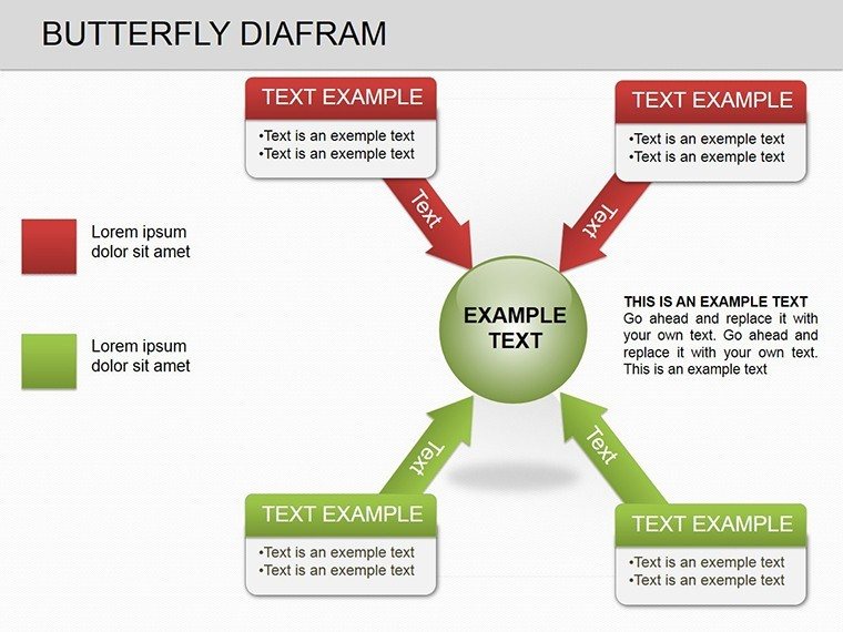
Template incl.: 10 editable slides
Dive into the elegance of data comparison with our Butterfly PowerPoint diagrams template, where symmetry meets insight in 10 meticulously crafted editable slides. This isn't just about charts; it's about unveiling patterns in your data that flat spreadsheets can't capture - like the subtle wings of a butterfly spreading to reveal extremes and distributions. Tailored for analysts, marketers, and decision-makers who crave visuals that cut through noise, this template turns raw numbers into narratives that stick, whether you're benchmarking sales regions or evaluating performance metrics.
Think of those moments in strategy sessions when you need to spotlight variances without burying your audience in details. Our butterfly diagrams excel here, using mirrored bars to juxtapose datasets side-by-side, making outliers pop and trends whisper their stories. Drawing from proven visualization principles, much like those in Edward Tufte's data design ethos, each slide invites focus on what matters most, fostering discussions that lead to sharper strategies and confident calls.
Discovering the Wings of Data Visualization
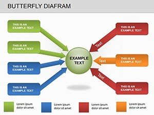
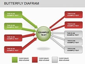
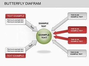
The template unfolds with Slide 1's basic butterfly layout: two horizontal bars extending like wings from a central axis, ideal for plotting quarterly revenues against targets. Customize the scales to fit your data range, and watch as positive deviations soar on one side while shortfalls mirror on the other. Slide 4 introduces variance indicators with shaded zones, perfect for risk assessments in project portfolios.
- Mirrored Comparisons: Symmetrical designs for before-and-after views, such as pre- and post-campaign metrics.
- Distribution Highlights: Layered bars to show spread, from bell curves to skewed patterns in customer feedback scores.
- Scalable Axes: Auto-adjusting labels ensure clarity, even with disparate units like percentages versus absolutes.
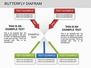
These elements combine to create diagrams that are as intuitive as they are informative. A marketing lead might employ Slide 6's multi-wing variant to compare ad channel ROIs - left wing for costs, right for returns - revealing at a glance which platforms deserve more budget. The editable gridlines let you fine-tune for precision, ensuring your visuals align perfectly with the slide's composition.
Applying Butterfly Diagrams in Business Analytics
In analytics, butterfly diagrams shine for competitive analysis. Start with Slide 2: Input your competitor pricing on one wing and yours on the other, with the central spine marking market average. Adjust bar widths to reflect volume, and suddenly, pricing gaps become a visual story of opportunity. Follow these steps to integrate it seamlessly:
- Gather datasets: Compile comparable metrics in a linked Excel sheet for real-time pulls.
- Populate the wings: Drag data into placeholders, letting PowerPoint's smart alignment handle the rest.
- Add context: Overlay trend lines or icons for qualitative notes, like market shifts.
- Animate for emphasis: Sequence bar growth to build suspense in your reveal.
This workflow not only simplifies prep but elevates delivery, turning data dumps into dialogue starters.
Enhancing Presentations with Focused Comparisons
Embed these diagrams into storytelling arcs for maximum effect. In a sales forecast deck, Slide 8's extended butterfly contrasts regional performances, with color gradients signaling growth potential. Unlike standard bar graphs that stack endlessly, the butterfly's balance keeps eyes centered, reducing cognitive load and boosting retention.
Customization flows naturally: Swap bar orientations for vertical needs, or infuse brand colors via the theme editor. Supporting PowerPoint 2013 onward, it embraces transitions like wipe effects to mimic wing flaps, adding whimsy to serious topics. An analyst shared how this template clarified budget variances in a finance review, mirroring actuals against forecasts to pinpoint savings - the mirrored clarity sparked immediate action items.
Targeting Extremes in Performance Reviews
For performance evaluations, Slide 7's distribution-focused butterfly maps employee metrics - skills on one wing, outcomes on the other - highlighting top performers and development areas. In education, adapt it for grade comparisons across classes, with wings denoting averages and extremes. These uses underscore the template's flexibility, bridging corporate and academic realms with equal finesse.
Prioritize inclusivity by choosing accessible palettes and providing data tables beneath visuals, ensuring all viewers can engage fully.
Expert Tips for Butterfly Diagram Mastery
Pair your diagrams with concise legends to guide interpretations, avoiding overload. For dynamic sessions, hyperlink wings to detail slides, inviting deeper dives on demand. As you refine, test with peers - does the symmetry aid quick scans? This iterative touch polishes your craft, making every presentation a masterclass in clarity.
Elevate your data storytelling - secure the Butterfly PowerPoint diagrams template for $18 and let your comparisons take flight.
Frequently Asked Questions
- What makes butterfly diagrams unique for data comparison?
- Their symmetrical, mirrored bars provide balanced views of ranges and distributions, emphasizing extremes without clutter.
- Are the slides fully customizable?
- Yes, edit bars, colors, labels, and axes directly in PowerPoint for tailored fits.
- Which PowerPoint versions work with this template?
- It's optimized for PowerPoint 2013 and later, including online versions.
- Can I use it for non-numerical data?
- Certainly - adapt for categorical comparisons, like feature sets across products.
- Does it support animations?
- Built-in options allow sequential bar animations to enhance flow in presentations.
- How do I link external data?
- Use PowerPoint's data import from Excel for live updates in your diagrams.