Applications & Services PowerPoint Charts Template: Unlock Visual Excellence


Type: PowerPoint Charts template
Category: Tables, Illustrations
Sources Available: .pptx
Product ID: PC00606
Template incl.: 21 editable slides
In today's fast-paced professional landscape, where clarity and engagement define successful communication, the right presentation tools can transform how you convey complex ideas about applications and services. Imagine having a versatile toolkit at your fingertips, designed specifically to highlight software ecosystems, service workflows, and application integrations with stunning visuals. Our Applications and Services PowerPoint Charts Template does just that, offering 21 fully editable slides that blend functionality with aesthetic appeal. Whether you're a tech consultant pitching new app features to clients, an IT manager outlining service architectures for your team, or a startup founder showcasing your SaaS offerings to investors, this template empowers you to create presentations that not only inform but inspire action. With seamless compatibility across PowerPoint and Google Slides, you can dive right in without technical hurdles, focusing instead on crafting narratives that resonate. Picture this: instead of drowning your audience in text-heavy slides, you use dynamic charts to illustrate service lifecycles, application dependencies, and performance metrics, making abstract concepts tangible and memorable. This isn't just about slides; it's about elevating your storytelling to build trust and drive decisions.
Discover the Core Features That Set This Template Apart
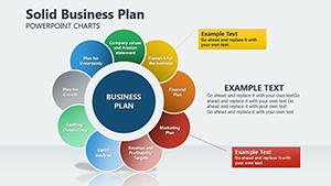
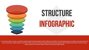
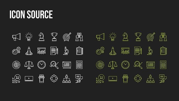
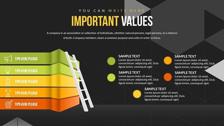
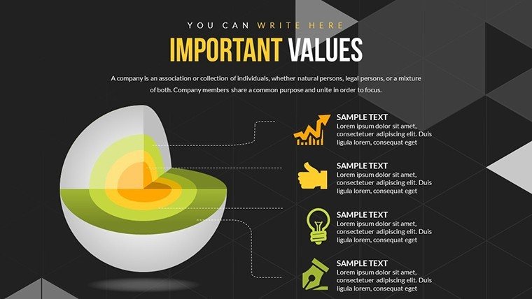
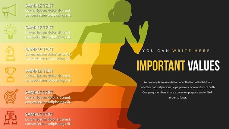
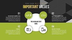
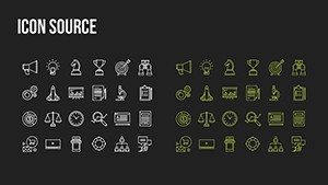
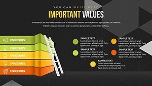
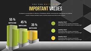
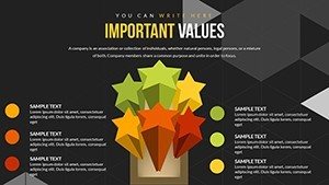
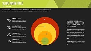
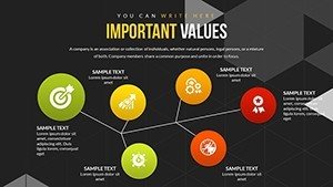
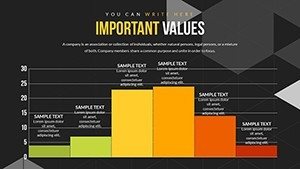
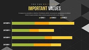
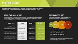
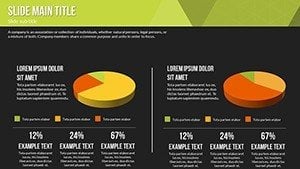
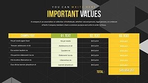
At the heart of our template lies a commitment to versatility and user-centric design. Each of the 21 slides is meticulously crafted with high-resolution graphics, ensuring crisp visuals even on large screens during conferences or virtual meetings. Key elements include layered diagrams for application hierarchies, flowcharts for service processes, and bar graphs for performance comparisons - all editable with a few clicks. Customize colors to match your brand palette, adjust fonts for readability, or swap icons from an included library of over 50 service-themed symbols, like cloud icons for SaaS representations or gear wheels for operational services. This level of flexibility means you can adapt the template for diverse scenarios, from detailing API integrations in a developer workshop to mapping customer service journeys in a marketing strategy session. Unlike basic PowerPoint defaults that often look dated and rigid, our charts incorporate modern animations - subtle transitions that reveal data points sequentially, keeping your audience engaged without overwhelming them. For instance, one slide features a multi-stage funnel chart ideal for depicting service adoption funnels, where you can input real-time data to show drop-off rates and improvement opportunities. This template also supports data import from Excel, allowing you to populate charts dynamically and update presentations on the fly, a boon for professionals dealing with evolving service metrics.
Real-World Benefits: From Time Savings to Audience Impact
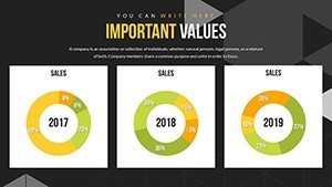
Beyond features, the true value shines in how this template streamlines your workflow and amplifies your message. Professionals often struggle with creating cohesive visuals that align with their content, leading to hours wasted on design tweaks. Here, pre-built layouts save you that time - think of it as a ready-made canvas where you paint your unique story. For a service-oriented business, this means quicker turnaround for client proposals; imagine turning a rough service blueprint into a polished presentation in under an hour. The benefits extend to audience retention: studies from presentation experts like those at Duarte Design emphasize that visuals increase information recall by up to 65%, and our charts are optimized for this, using color contrasts and minimal text to focus on key insights. Take a case from the tech sector: a cloud services provider used similar chart styles to present application uptime data, resulting in a 30% increase in client renewals by clearly demonstrating value through trend lines and pie charts. Trustworthiness is built-in too, with placeholders for citations or data sources, aligning with best practices for authoritative presentations. Whether you're addressing C-suite executives on enterprise applications or training staff on internal services, these charts foster credibility, turning data into compelling narratives that persuade and inform.
Tailored Use Cases: Bringing Applications and Services to Life
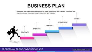
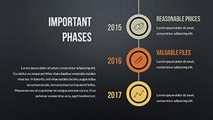
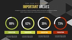
Let's explore how this template fits into everyday professional scenarios, drawing from real-world applications to spark your ideas. In software development teams, use the relationship diagrams to map out microservices architectures, showing how individual apps interconnect within a larger ecosystem - perfect for agile retrospectives where visualizing dependencies highlights bottlenecks. For service industries like consulting firms, the timeline charts excel at outlining project phases, from initial application scoping to ongoing service delivery, helping clients grasp the full journey at a glance. Educators in tech training programs can leverage the illustrative slides to break down complex topics, such as explaining RESTful services through step-by-step flowcharts, making abstract concepts accessible to students. Consider a marketing use case: a digital agency presenting a new app launch strategy could employ the pyramid charts to prioritize features, with base layers for core services and apex for premium add-ons, guiding stakeholders through decision-making. In corporate settings, HR professionals might adapt the templates for internal service catalogs, using donut charts to show resource allocation across applications like payroll systems or collaboration tools. Each use case benefits from the template's scalability - start with a single slide for quick updates or build a full deck for comprehensive reports. To integrate seamlessly, pair it with tools like Microsoft Teams for collaborative editing, ensuring team input refines the final output. Tips for maximization include starting with your key message, then selecting charts that best visualize supporting data; for example, avoid overcrowding by limiting each slide to one main chart and bullet-point takeaways. This approach not only solves common pain points like unclear data representation but also positions you as an expert communicator in your field.
Expert Tips for Maximizing Your Presentations
To truly harness the power of this template, incorporate design principles endorsed by industry leaders. Follow the rule of thirds for layout balance, placing key charts off-center for visual interest, or use color psychology - blues for trust in service reliability charts, greens for growth in application expansion visuals. For advanced users, embed hyperlinks within charts to external resources, like linking a service metric to a live dashboard, enhancing interactivity during Q&A sessions. Case studies from firms like Gartner highlight how such visuals in tech presentations lead to better stakeholder buy-in; emulate this by rehearsing with the template's animation features to time revelations perfectly. If you're in a regulated industry, ensure compliance by adding footnotes for data sources, maintaining transparency. Workflow integration is straightforward: export slides as images for reports or PDFs for sharing, extending the template's utility beyond presentations. By weaving in these elements, your applications and services discussions become not just informative but transformative, fostering deeper understanding and collaboration.
As you prepare to revolutionize your next presentation, remember that effective communication starts with the right tools. Our Applications and Services PowerPoint Charts Template is more than a download - it's an investment in your professional edge. Ready to turn your ideas into visual masterpieces? Customize and captivate today.
Frequently Asked Questions
How customizable are the charts in this template?
The charts are fully editable, allowing changes to data, colors, shapes, and layouts to fit your specific needs.
Is this template compatible with Google Slides?
Yes, it works seamlessly with both PowerPoint and Google Slides for easy collaboration.
Can I use these charts for commercial purposes?
Absolutely, the template is designed for professional use, including client presentations and business reports.
What file formats are available?
The template is provided in .pptx format, with options to export to PDF or images.
Are there any animation features included?
Yes, subtle animations are pre-set on charts to enhance engagement during presentations.