Technical Condition Assessment PowerPoint Charts: Precision in Every Slide


Type: PowerPoint Charts template
Category: Process
Sources Available: .pptx
Product ID: PC00605
Template incl.: 21 editable slides
When managing assets in industries like manufacturing or infrastructure, understanding their technical condition isn't just routine - it's critical for longevity and performance. Our Technical Condition Assessment PowerPoint Charts Template steps in as your reliable ally, providing 21 editable slides tailored to dissect and display asset health data with clarity and depth. Engineers grappling with machinery diagnostics, project managers overseeing infrastructure audits, or business leaders reviewing operational integrity will find this template indispensable. It bridges the gap between raw data and actionable insights, using intuitive charts to reveal wear patterns, failure risks, and maintenance needs. Compatible with PowerPoint and Google Slides, it integrates effortlessly into your toolkit, allowing you to focus on analysis rather than design. Envision transforming a complex equipment audit into a compelling narrative: line graphs tracking degradation over time, pie charts apportioning condition categories, and matrices highlighting intervention priorities. This template doesn't merely present data; it equips you to make proactive decisions that minimize downtime and maximize ROI, drawing from proven methodologies in asset management.
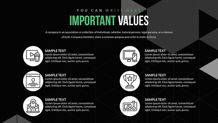
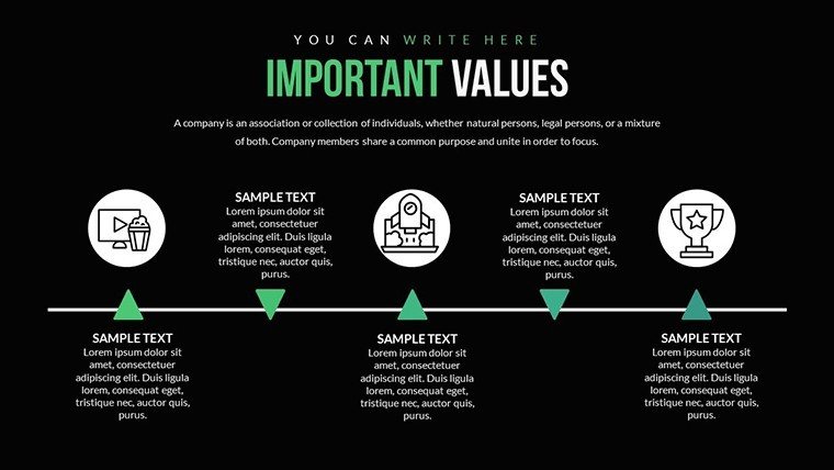
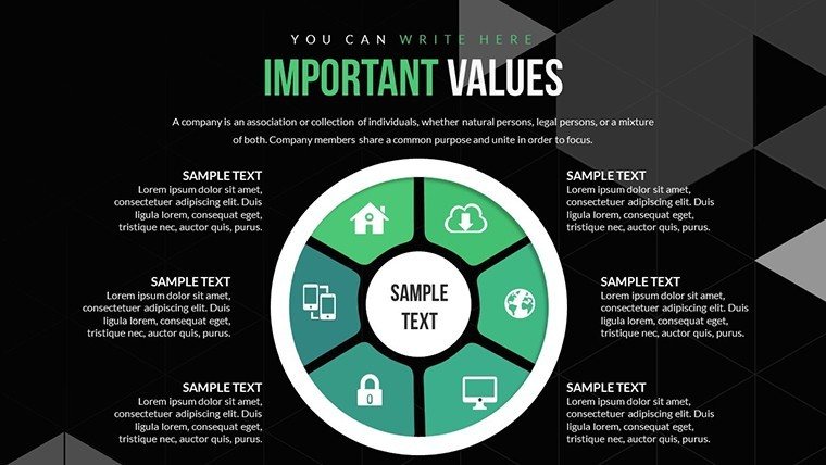
Essential Features for Thorough Assessments
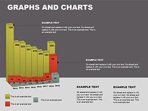
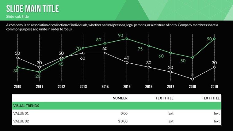
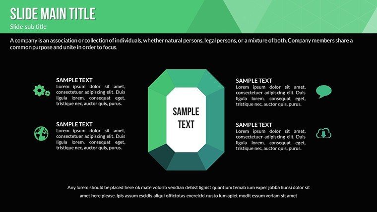
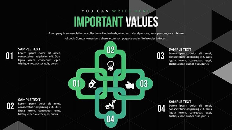
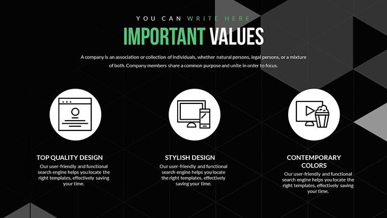
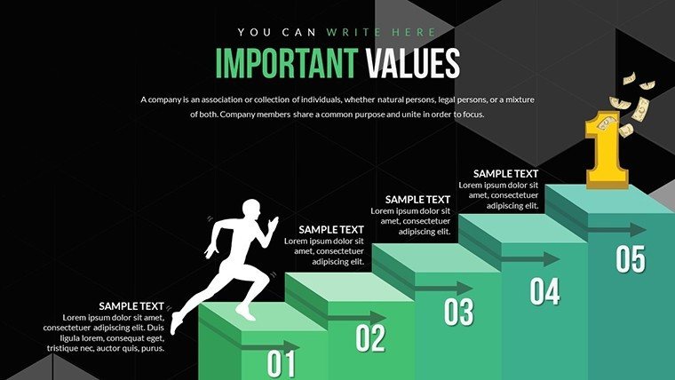
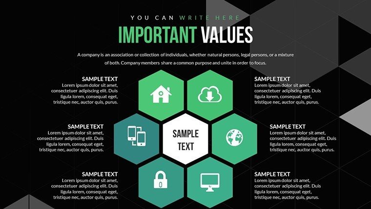
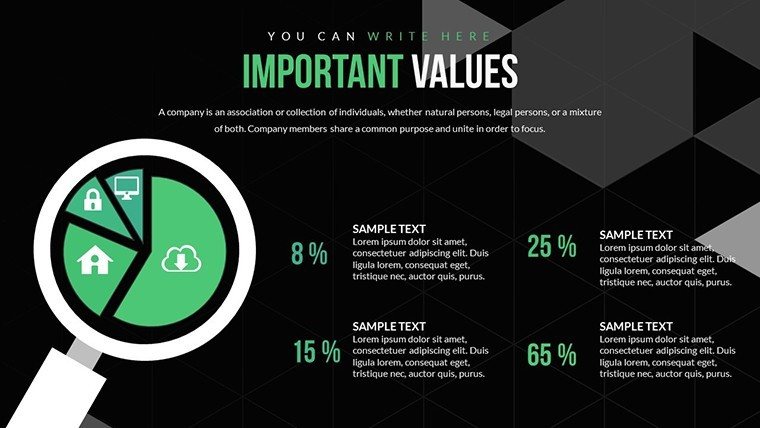
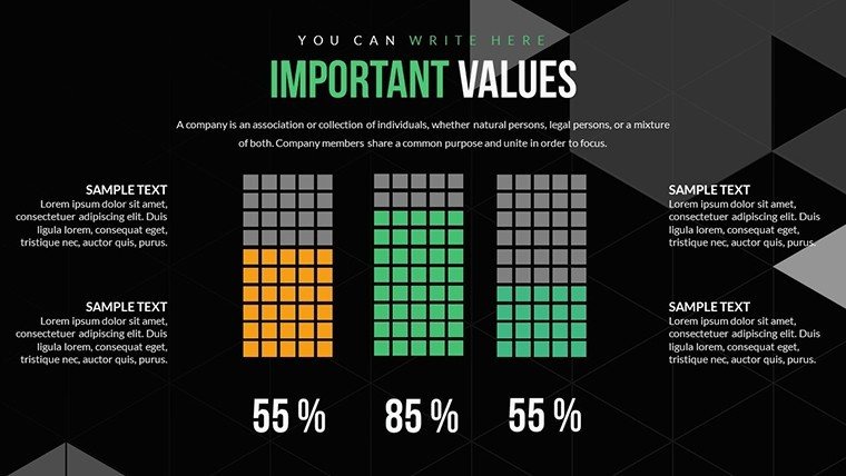
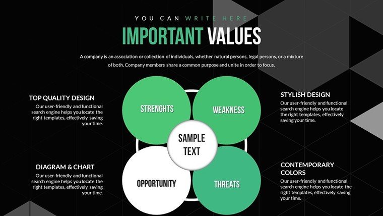
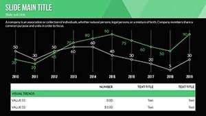
Diving deeper, the template's features are engineered for precision and ease. With 21 slides, you'll access a suite of tools including condition rating scales, trend analysis graphs, and comparative bar charts - all fully customizable. Adjust data points via Excel integration, modify axes for specific metrics like vibration levels or corrosion rates, and incorporate icons from a built-in library representing assets like turbines or bridges. This customization extends to themes: opt for industrial grays and reds for urgency in high-risk assessments or blues for calm, data-driven reviews. Unlike generic slides that force-fit data, these are optimized for technical contexts, supporting formulas for automated calculations, such as remaining useful life estimates. For example, a dedicated slide for root cause analysis uses fishbone diagrams to map out failure modes, helping teams pinpoint issues like material fatigue in real-time during meetings. The user-friendly interface means even non-designers can produce professional outputs, with drag-and-drop elements and pre-set alignments ensuring consistency across your deck.
Unlocking Benefits for Asset Management Excellence
The benefits ripple through your operations, starting with efficiency gains. Traditional assessments often involve cumbersome spreadsheets and disjointed visuals, but this template consolidates everything, slashing preparation time by up to 50% based on user feedback from similar tools. Enhanced visibility is another win: by visualizing condition data, you spot trends that spreadsheets obscure, like seasonal wear in outdoor assets, enabling predictive maintenance strategies endorsed by bodies like the Institute of Asset Management. In a real-world scenario, a facilities manager at a manufacturing plant used analogous charts to present equipment health to executives, securing budget for upgrades that reduced breakdowns by 25%. Trust is fostered through transparent data handling - include audit trails or source notes in footers, aligning with ISO 55000 standards for asset management. This not only bolsters your presentations' authoritativeness but also positions you as a forward-thinking professional, ready to tackle challenges in volatile environments.
Practical Use Cases: From Field to Boardroom
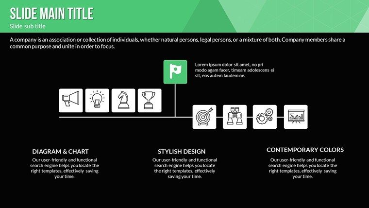
Applying this template across scenarios reveals its adaptability. In infrastructure projects, employ heatmap charts to assess bridge components, color-coding conditions from green (optimal) to red (critical), aiding prioritization for repairs in line with FHA guidelines. Manufacturing teams can utilize control charts to monitor machine performance, identifying deviations that signal impending failures, thus optimizing production lines. For energy sectors, radar charts compare asset conditions across sites, facilitating resource allocation in renewable setups like wind farms. Step-by-step: begin by importing your inspection data, select a chart type - say, a Gantt for maintenance schedules - then customize legends for clarity. In educational or training contexts, use the slides to simulate assessments, teaching best practices with interactive elements. Consultants might adapt for client reports, embedding hyperlinks to detailed logs for deeper dives. To enhance, pair with software like CMMS for live data feeds, turning static presentations into dynamic tools. Tips include using consistent scales across charts for comparability and incorporating narratives: don't just show a declining trend line; explain it with annotations like "Post-2023 overhaul impact." These applications solve pain points like miscommunication in cross-functional teams, ensuring everyone from technicians to C-level aligns on asset strategies.
Pro Tips to Elevate Your Technical Narratives
For peak performance, leverage expert insights: apply data visualization principles from Edward Tufte, minimizing chartjunk to focus on core metrics, or use storytelling arcs - introduce the asset's current state, build with analysis, and conclude with recommendations. In high-stakes reviews, rehearse with the template's animation options, revealing data layers progressively to build suspense and understanding. For compliance-heavy fields, add disclaimers or regulatory references, enhancing trustworthiness. Integrate with BI tools for automated updates, keeping your assessments current. This holistic approach not only refines your output but transforms assessments from obligatory tasks into strategic advantages, driving operational resilience.
With asset integrity on the line, don't settle for subpar tools. Our Technical Condition Assessment PowerPoint Charts Template is your gateway to insightful, impactful presentations. Assess smarter - download and deploy now.
Frequently Asked Questions
How do I import data into the charts?
Simply link to Excel sheets or input directly; the template supports dynamic updates for real-time accuracy.
Is it suitable for non-technical users?
Yes, the intuitive interface and pre-built charts make it accessible for all skill levels.
Can I add custom metrics?
Absolutely, edit axes, labels, and formulas to tailor to your specific assessment needs.
What industries does this template best serve?
Ideal for manufacturing, infrastructure, energy, and any field requiring asset condition evaluations.