Logic of Operational Analysis PowerPoint Charts: Insightful Clarity


Type: PowerPoint Charts template
Category: Relationship
Sources Available: .pptx
Product ID: PC00603
Template incl.: 21 editable slides
Operational analysis forms the backbone of efficient business operations, yet conveying its logic often falls flat in bland presentations. Enter our Logic of Operational Analysis PowerPoint Charts Template, with 21 editable slides designed to illuminate processes, bottlenecks, and optimizations vividly. Analysts dissecting workflows, managers seeking efficiency gains, or consultants advising on operations will value this tool's ability to make data speak. Seamlessly working with PowerPoint and Google Slides, it frees you from design woes, letting you delve into analysis. Visualize a relationship chart linking inputs to outputs, or a trend graph forecasting operational shifts - these elements turn complex logic into digestible insights, inspired by lean methodologies from Toyota's production system. This template isn't static; it's a dynamic aid for fostering operational excellence and strategic alignment.
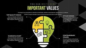
Key Features Engineered for Analytical Depth
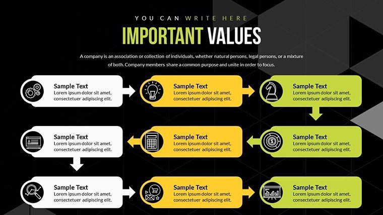
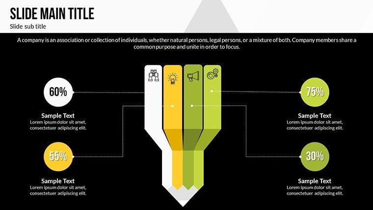
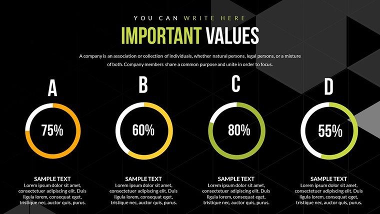
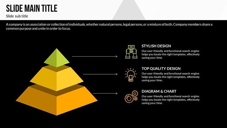
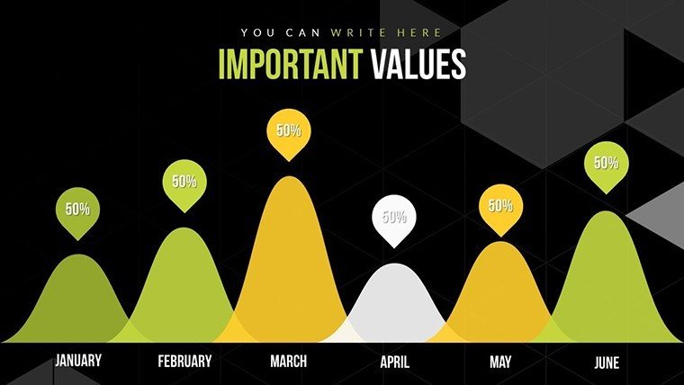
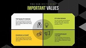
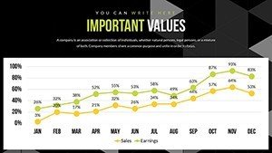
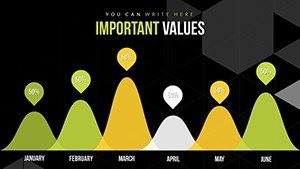
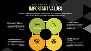
Explore features like relationship matrices for variable correlations, dynamic line charts for time-series data, and customizable dashboards - all within 21 slides. Tweak variables with formula support, alter visuals to highlight key operations, and draw from an icon set depicting flows like supply chains or process gears. This surpasses basic charts by enabling scenario modeling, such as what-if analyses in bar variants.
Benefits Driving Operational Transformations
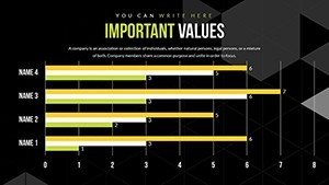
Efficiency is paramount: reduce analysis time with ready templates, per McKinsey insights on visual aids boosting decision speed. A logistics firm, for instance, used similar tools to map operations, cutting waste by 15%. Build authority with precise visuals, including error bars for reliability, ensuring trustworthy outputs.
Use Cases: Operational Logic in Action
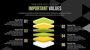
In supply chain reviews, use matrices to analyze vendor impacts; for project ops, Gantt integrations track milestones. Consultants can customize for client audits, embedding data from ERP systems. Workflow: import metrics, choose charts, annotate logic - solve silos with clear visuals. Tip: layer charts for multi-dimensional views, enhancing comprehension.
Advanced Tips for Operational Mastery
Apply Six Sigma principles: use histograms for variation analysis. Animate for step-by-step logic reveals. Integrate with Tableau exports for hybrid power. These elevate your analyses to strategic levels.
Unlock operational potential. Download this template and analyze with precision now.
Frequently Asked Questions
How to model scenarios?
Use built-in formulas for dynamic what-if adjustments.
Ideal for which sectors?
Manufacturing, logistics, consulting - any ops-focused area.
Support for large datasets?
Yes, via Excel links for scalable handling.
Animation customization?
Fully editable for tailored reveals.