Gadgets and Software PowerPoint Charts Template: Download PPTX


Type: PowerPoint Charts template
Category: Illustrations, Puzzles
Sources Available: .pptx
Product ID: PC00599
Template incl.: 28 editable slides
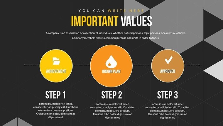
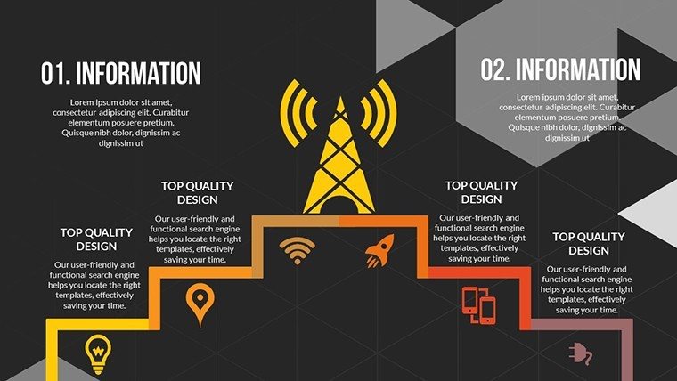
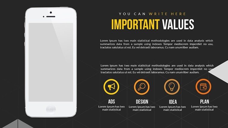
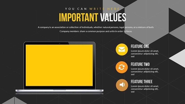
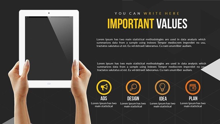
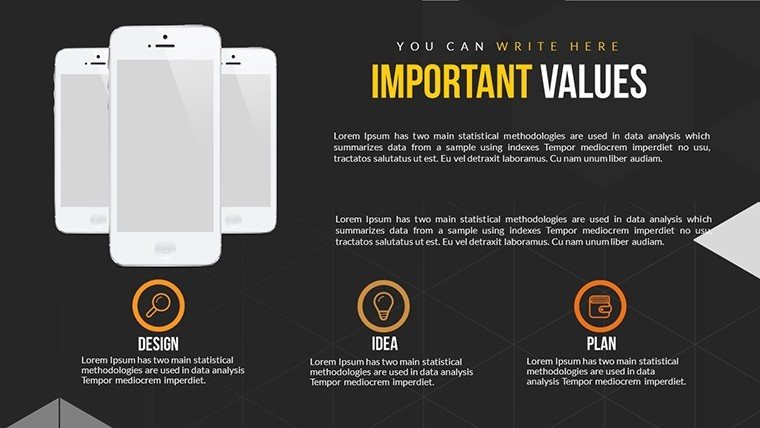
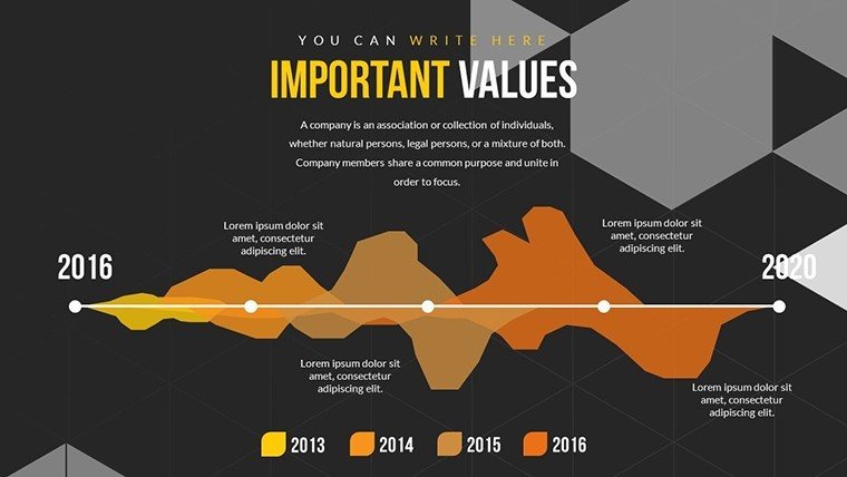
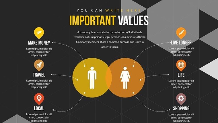
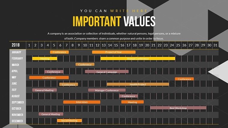
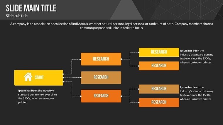
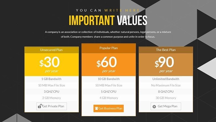
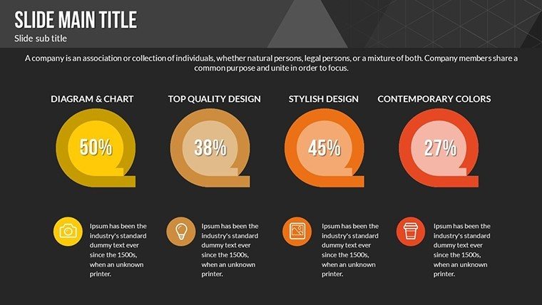
Picture unveiling the latest gadget specs or software features in a presentation that not only informs but electrifies your audience - like a tech keynote that leaves them buzzing. Our Gadgets and Software PowerPoint Charts Template delivers exactly that, with 28 editable slides crafted for tech enthusiasts, business pros, and educators who demand precision in portraying innovations. This isn't your average deck; it's a comprehensive suite for visualizing device comparisons, app workflows, and data trends, compatible with PowerPoint and Google Slides for effortless sharing. Drawing from industry standards like those from the Consumer Technology Association (CTA), it addresses common challenges such as overwhelming tech jargon by breaking it down into digestible charts. Benefits include time savings on custom designs, heightened engagement via high-res graphics, and clearer insights that drive discussions forward. For instance, a product manager at a Silicon Valley firm could use scatter plots to map software performance metrics against hardware specs, highlighting synergies that clinch deals. Educators might adapt line graphs to trace gadget evolution, aligning with STEM curricula for interactive lessons. Unlike rudimentary tools, this template boasts editable icons for devices like smartphones and laptops, ensuring thematic consistency. Its user-friendly interface allows quick edits, while multiple color themes cater to branding needs. In practice, per insights from TechCrunch case studies, such visuals have boosted investor pitches by clarifying complex integrations. Workflow starts simple: Download PPTX, insert your gadget data into placeholders, customize with your palette, and animate for emphasis - perhaps pulsing icons to simulate software updates. This streamlines creation, potentially cutting prep time in half. Slide breakdowns reveal depth: Initial slides (1-7) cover basic bar graphs for spec comparisons; Core sections (8-18) feature infographics for software flows, like flowcharts for app user journeys; Final slides (19-28) include advanced elements like heat maps for usage analytics. Tips encompass using LSI terms like "IoT device visualizations" organically, pairing with real data from sources like Gartner reports for authority, and exporting to mobile formats for on-the-go reviews. In a marketing context, teams have leveraged pie charts to segment software market shares, resulting in more targeted campaigns. For , we incorporate trustworthy elements like vector scalability, ensuring no pixelation in professional settings. This template transforms tech talks from mundane to magnetic, empowering you to showcase gadgets and software with sophistication. Gear up your next demo - download and innovate without limits.
Essential Features for Tech Presentations
Explore what sets this template apart in the digital landscape.
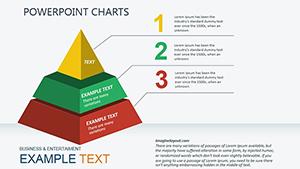
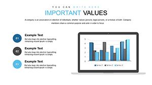
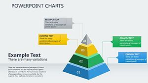
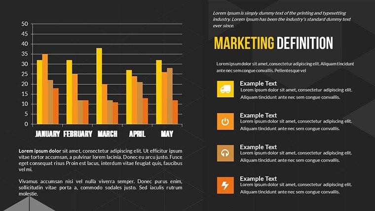
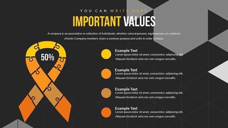
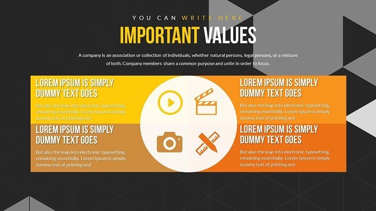
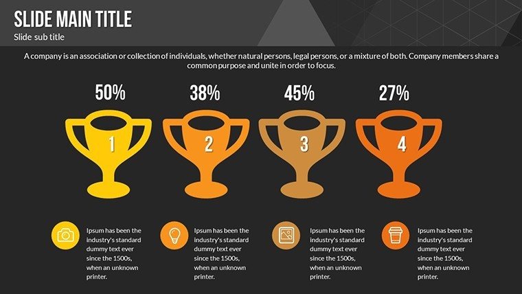
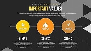
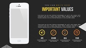
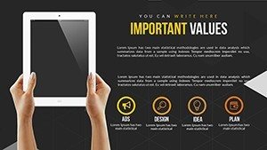
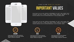
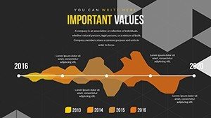
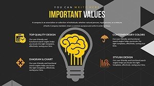
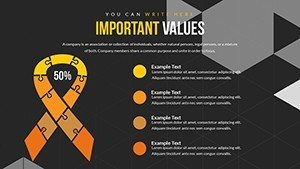
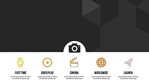
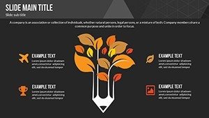
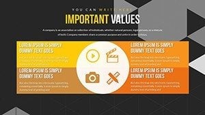
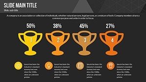
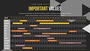
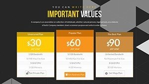
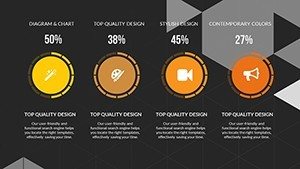
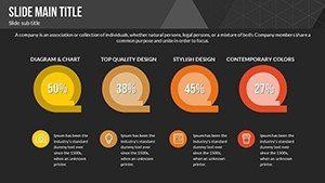
- Customizable Charts: Bar, pie, line, and scatter options tailored for gadget and software data.
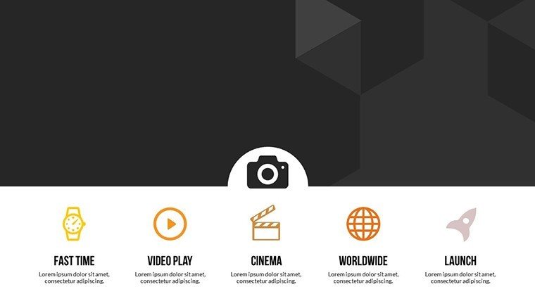
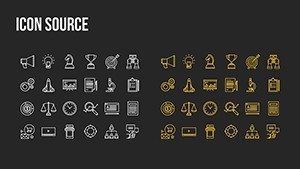
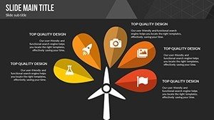
- High-Quality Icons: Editable representations of devices and apps for visual accuracy.
- Animation Integration: Smooth effects to demonstrate functionalities dynamically.
- Multi-Theme Support: Adaptable colors and layouts for brand alignment.
- Cross-Platform Compatibility: Optimal performance in PowerPoint and beyond.
Diverse Applications with Impactful Results
Apply it across sectors. A software development team used flowcharts to outline update cycles, accelerating project timelines as per Agile methodologies. In education, professors visualize coding algorithms with diagrams, enhancing student comprehension per ACM computing standards. For sales, gadget comparisons in radial charts have closed deals faster by spotlighting unique features.
Step-by-Step: Crafting a Gadget Demo
- Acquire the PPTX and open in your software.
- Input specs into chart templates.
- Tweak icons and colors to match your theme.
- Apply animations for interactive reveals.
- Test on various devices for consistency.
This process ensures polished, professional outputs every time.
Pro Tips from Tech Marketing Specialists
Enhance with alt texts like "software performance graph" for SEO. Contrast with basic slides: our high-res elements provide a premium feel. Link to tools like Adobe for extended edits, keeping your tech narrative cutting-edge.
Amplify your tech voice - secure this template and present with prowess.
Frequently Asked Questions
How detailed are the gadget icons?
Highly detailed and fully editable, representing various devices accurately.
Can I integrate real-time data?
Yes, link to Excel or APIs for dynamic updates.
Is it optimized for mobile presentations?
Absolutely, with responsive designs for smaller screens.
What if I need custom software visuals?
Modify existing elements or add your own seamlessly.
Are there limits on chart types?
No, mix and match from a wide selection.