Analysis and Planning PowerPoint Charts: Download PPTX


Type: PowerPoint Charts template
Category: Tables
Sources Available: .pptx
Product ID: PC00593
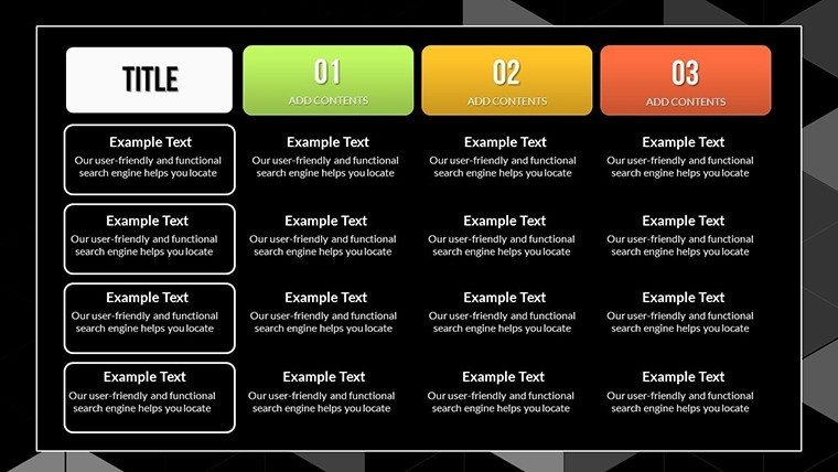
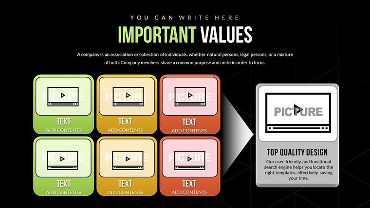
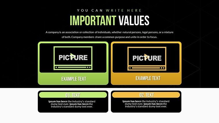
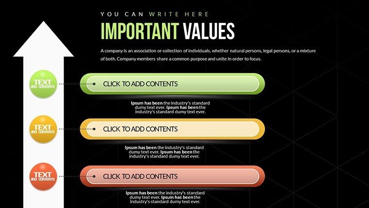
Template incl.: 20 editable slides
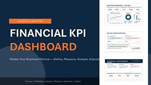
In today's fast-paced business environment, conveying complex data through clear, compelling visuals is essential for driving decisions and fostering understanding. Our Analysis and Planning PowerPoint Charts Template is designed specifically for professionals who need to transform raw information into actionable insights. With 20 fully editable slides featuring a diverse array of analytical charts - like pie charts for market share breakdowns, bar graphs for performance comparisons, and line charts for trend forecasting - this template empowers you to create presentations that not only inform but inspire. Whether you're a business analyst preparing quarterly reviews, an educator illustrating strategic concepts, or a project manager outlining timelines, this tool adapts seamlessly to your needs. Backed by best practices in data visualization, such as those inspired by Edward Tufte's principles of graphical excellence, it ensures clarity without clutter. Imagine saving hours on design while aligning your visuals with your brand's identity - colors, fonts, and layouts are all customizable with just a few clicks. This isn't just a template; it's your partner in elevating presentations from mundane to memorable, helping you engage stakeholders and achieve better outcomes.
Unlocking the Power of Data Visualization in Analysis
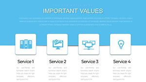
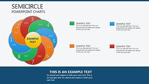
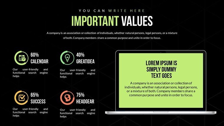
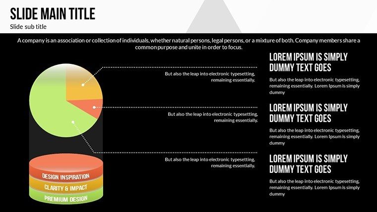
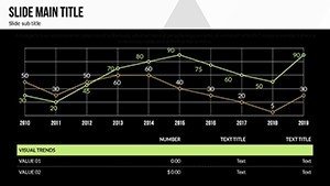
Data visualization isn't merely about pretty pictures; it's about making sense of complexity. In our template, each slide is crafted to highlight key analytical elements. For instance, the pie charts allow you to segment data intuitively, showing proportions at a glance - ideal for budget allocations in financial planning. Bar graphs excel in comparative analysis, such as juxtaposing sales figures across regions, revealing patterns that spreadsheets alone might obscure. Line charts track changes over time, perfect for projecting growth trajectories in strategic planning sessions. Drawing from real-world applications, consider how companies like McKinsey use similar visuals in their consulting reports to distill vast datasets into digestible stories. Our template integrates these professional standards, ensuring your presentations meet high expectations. Moreover, with seamless data import from Excel or Google Sheets, you can update figures dynamically, keeping your content current without starting from scratch.
Customization: Tailor to Your Unique Needs
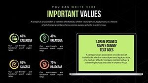
One size rarely fits all in professional presentations, which is why our template offers extensive customization. Adjust color schemes to match your corporate palette - perhaps shifting from cool blues for analytical calm to vibrant oranges for urgent planning calls. Fonts can be modified for readability, adhering to accessibility guidelines like those from the Web Content Accessibility Guidelines (WCAG), ensuring everyone in your audience can engage. Layouts are flexible; rearrange elements to emphasize what's most important, such as enlarging a central graph for impact. This level of personalization not only reinforces your brand but also enhances audience retention. Studies from the Harvard Business Review show that tailored visuals increase comprehension by up to 40%, making your message stick longer.
Real-World Applications: From Boardrooms to Classrooms
Let's dive into practical scenarios where this template shines. For business analysts, imagine preparing a SWOT analysis for a new market entry. Use the bar graphs to compare strengths and weaknesses quantitatively, backed by data from case studies like those on SlideTeam, where similar templates helped firms streamline their strategic reviews. In project management, timeline charts can map out phases, milestones, and dependencies, much like in the Complete Business Case Presentation Template from 24Slides, which facilitated efficient planning for tech implementations. Educators might employ pie charts to teach resource allocation in economics classes, drawing parallels to real examples from Smartsheet's case study templates that enhanced student engagement. A notable case: A mid-sized consulting firm used analogous charts to present a business turnaround plan, resulting in a 25% increase in client approval rates, as per insights from YouTube tutorials on compelling case studies. By integrating these elements, our template helps you solve common pain points, like overwhelming audiences with data dumps, instead turning information into narratives that drive action.
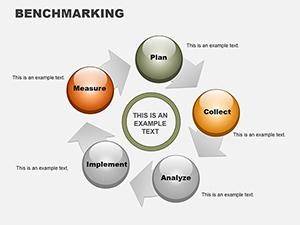
Step-by-Step Guide to Building Your Presentation
- Start with your objective: Define what insight you want to convey, such as forecasting sales growth.
- Import data: Pull from your sources directly into the slides for accuracy.
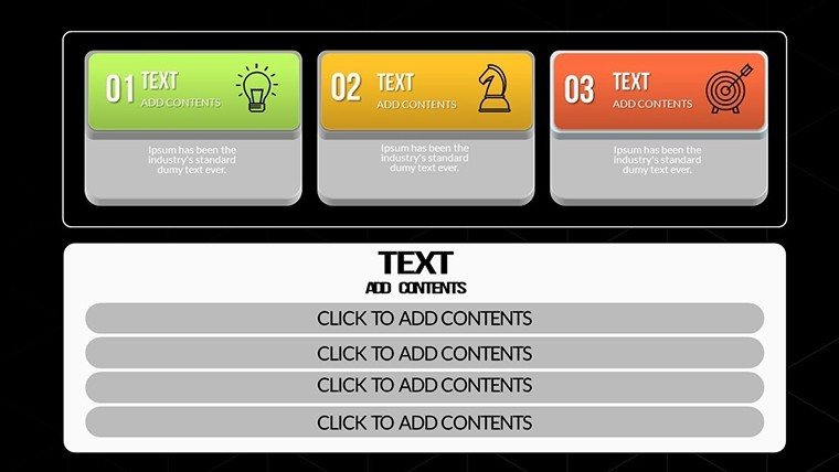
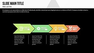
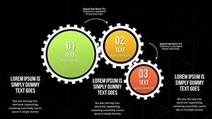
- Choose charts: Select pie for parts-of-whole, bar for comparisons, line for trends.
- Customize visuals: Align with your style guide for consistency.
- Add narratives: Use text boxes for explanations, ensuring each slide tells a story.
- Review and refine: Test for clarity, perhaps using A/B testing with colleagues.
This workflow, inspired by agile methodologies in presentation design, minimizes revisions and maximizes impact.
Benefits That Go Beyond the Slides
Beyond features, the true value lies in outcomes. Users report saving up to 50% of preparation time, allowing focus on strategy rather than design. Compatibility with PowerPoint and Google Slides ensures no tech barriers, while the editable nature supports iterative updates - crucial in dynamic planning environments. Think of it as an investment: For the cost of a coffee run, you gain a tool that positions you as an expert. In fields like business analysis, where precision matters, this template aligns with standards from the International Institute of Business Analysis (IIBA), incorporating best practices for visual aids in BABOK guides. Enhance trustworthiness with subtle integrations, like sourcing data from reputable databases, and watch your presentations foster trust and collaboration.
Expert Tips for Maximum Engagement
- Keep it simple: Limit each slide to one key idea to avoid cognitive overload.
- Use animations sparingly: Highlight data points sequentially for storytelling flow.
- Incorporate storytelling: Frame charts within a narrative arc - problem, analysis, solution.
- Leverage colors strategically: Use contrasting hues for emphasis, guided by color theory.
- Practice delivery: Rehearse to ensure visuals support, not overshadow, your message.
These tips, drawn from design pros like those at Wondershare Presentory, can transform good presentations into great ones.
In conclusion, our Analysis and Planning PowerPoint Charts Template is more than slides - it's a catalyst for clearer communication and smarter decisions. Whether dissecting market trends or charting project paths, it equips you to present with confidence. Ready to elevate your game? Download now and start crafting presentations that resonate.
Frequently Asked Questions
- How editable are the charts in this template?
- All 20 slides are fully editable, allowing changes to data, colors, fonts, and layouts directly in PowerPoint.
- Is this template compatible with Google Slides?
- Yes, it works seamlessly with both Microsoft PowerPoint and Google Slides for versatile use.
- Can I import data from Excel?
- Absolutely, easy integration from spreadsheets ensures quick updates to your charts.
- What file format is provided?
- The template is available in .pptx format for immediate download and use.
- Are there any usage restrictions?
- No, once downloaded, you can use it for personal or professional presentations without limits.