Professional Chart Templates for PowerPoint - Editable Data Visualization Slides | Instant Download


Professional presentations depend on clear data visualization. Chart templates for PowerPoint eliminate the formatting work that delays deck preparation, letting you focus on insights rather than design mechanics. These editable chart slides are built for board meetings, investor updates, quarterly reviews, and executive briefings where data clarity drives decision-making.
This template collection includes bar charts, line graphs, pie charts, and combination visualizations optimized for business audiences. Each slide maintains consistent formatting while allowing complete customization of data sources, color schemes, and labels. You control the narrative through your numbers without wrestling with PowerPoint's default chart builder.
Chart Slide Components and Data Visualization Options
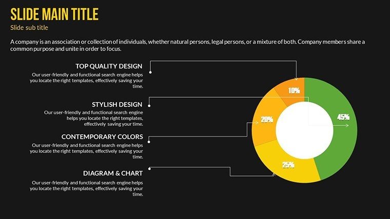
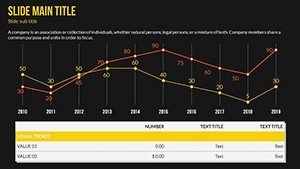
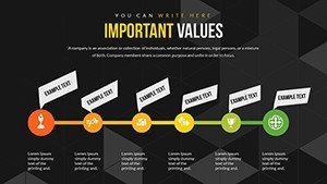
The template provides multiple chart formats to match different data stories. Bar charts compare values across categories - revenue by region, performance by product line, or budget allocation by department. Line graphs show trends over time, essential for quarterly growth patterns or year-over-year comparisons. Pie charts illustrate proportional relationships when presenting market share or resource distribution.
Combination charts layer multiple data types, such as revenue bars with profit margin lines, giving executives both volume and efficiency metrics in one view. Each chart type includes placeholder data you replace with your actual figures. Color schemes adapt to corporate branding through PowerPoint's standard formatting tools. Axis labels, legends, and data callouts are fully editable text elements.
Professional Use Cases for Chart Templates
Board meetings require concise financial summaries. Use bar charts to show quarterly revenue across business units, line graphs for customer acquisition trends, and pie charts for operating expense breakdowns. Executives scan these visuals quickly during rapid-fire agenda reviews.
Investor presentations demand growth narratives. Combination charts showing revenue growth alongside margin improvement tell compelling stories. Comparative bar charts position your performance against competitors or benchmarks. Clean data visualization builds credibility with financial stakeholders who scrutinize every claim.
Internal strategy reviews need department-level detail. Marketing teams present campaign ROI through before-after bar comparisons. Operations groups show efficiency gains via trend lines. Finance departments break down cost structures with stacked bar charts and budget variance analyses.
Editing Workflow and Template Integration
Download the PPTX file and open it in PowerPoint, Keynote, or Google Slides. Click any chart to activate PowerPoint's chart data editor - a spreadsheet window where you input your actual numbers. The visualization updates automatically as you type. This standard PowerPoint functionality means no learning curve for experienced users.
Customize colors by selecting chart elements and applying your brand palette through the format menu. Adjust font sizes for better readability in large conference rooms or virtual meetings. Duplicate slides to maintain consistent formatting across your entire deck. Copy individual charts into existing presentations to upgrade outdated visuals without rebuilding your content.
The template preserves your company's master slide formatting. If you've already established branded PowerPoint templates, these charts inherit those design elements while maintaining their optimized layout. This interoperability saves reformatting time when assembling multi-section decks from various contributors.
Real-World Presentation Scenarios
A CFO preparing for quarterly board review needs five charts: revenue by segment, gross margin trends, cash flow summary, capital expenditure breakdown, and customer retention rates. She opens this template, selects appropriate chart types for each metric, inputs financial data from her spreadsheets, applies company colors, and has presentation-ready slides in 30 minutes. The alternative - building charts from scratch - would consume two hours with inconsistent formatting.
A sales director presenting annual planning shows year-over-year pipeline growth with line charts, win rates by product category with bar charts, and deal size distribution with pie charts. His executive audience immediately understands performance patterns without narrative explanation. Clear visuals accelerate decision-making on resource allocation and territory planning.
A product manager shares feature adoption metrics with engineering leadership. Stacked bar charts show usage across customer segments. Trend lines reveal adoption velocity post-launch. The data tells the story - which features drive engagement, where users struggle, what roadmap priorities make sense. Visual clarity replaces lengthy written reports that stakeholders skim or ignore.
Chart Selection and Audience Considerations
| Chart Type | Best For | Executive Audience | Key Outcome |
|---|---|---|---|
| Bar Chart | Category comparisons, rankings | Board members, department heads | Quick performance assessment |
| Line Graph | Trends over time, growth patterns | Investors, C-suite executives | Trajectory understanding |
| Pie Chart | Proportional breakdowns, market share | Stakeholders, strategic planners | Composition clarity |
| Combination Chart | Multi-metric analysis, correlations | Finance teams, analysts | Relationship insights |
Industry Applications Across Business Functions
Financial services firms use these templates for portfolio performance reviews, risk exposure summaries, and client reporting. Bar charts compare fund returns across asset classes. Line graphs track AUM growth or market volatility. Pie charts show portfolio allocation adhering to investment mandates.
Healthcare organizations present patient outcome data, operational efficiency metrics, and budget utilization. Charts help administrators communicate complex clinical data to non-medical board members. Visual simplicity makes quality metrics and cost containment initiatives accessible to diverse stakeholders.
Technology companies demonstrate user growth, feature adoption, and development velocity. Product teams show sprint completion rates. Marketing shows conversion funnel performance. Sales presents pipeline progression. Consistent chart formatting across departments enables executive leadership to absorb information from multiple sources quickly.
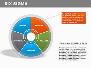
Manufacturing operations track production efficiency, defect rates, and supply chain metrics. Operations managers present downtime analysis and throughput improvements. Finance shows cost per unit trends. Quality teams display six-sigma progress through statistical control charts adapted from these templates.
Frequently Asked Questions
When should I use these chart templates instead of creating custom visualizations?
Use these templates when you need professional data visualization quickly for recurring presentation types - board meetings, investor updates, quarterly reviews, or departmental reports. They're ideal when your data story fits standard business chart formats: comparisons, trends, proportions, or correlations. Skip custom visualizations for routine presentations where speed and consistency matter more than unique design. Reserve custom work for high-stakes keynotes, major product launches, or specialized technical audiences requiring non-standard visualization approaches. These templates handle 80% of business presentation scenarios where executives expect familiar chart formats they can interpret instantly.
How do I replace the placeholder data with my actual numbers?
Click any chart in PowerPoint to select it, then right-click and choose "Edit Data" to open the embedded spreadsheet editor. Replace the sample numbers with your actual data - the chart updates automatically as you type. For large datasets, copy columns from Excel and paste directly into this editor. Adjust row and column counts by adding or deleting spreadsheet rows. The chart resizes and reformats based on your data volume. Save your PowerPoint file to preserve the edited data. This standard PowerPoint functionality works identically whether you're using Windows, Mac, PowerPoint Online, or importing into Keynote or Google Slides.
Will these charts look professional enough for board-level presentations?
Yes. The templates follow financial presentation standards used in Fortune 500 board decks: clean layouts, readable fonts at projection scale, and data-first design without decorative elements that distract executive audiences. Board members expect familiar chart formats they can interpret quickly during fast-paced reviews. These designs prioritize clarity over creativity, which aligns with boardroom expectations. Customize colors to match your corporate branding for visual consistency with other company materials. The formatting works equally well printed for in-person meetings or displayed in virtual board sessions. Professional appearance comes from clear data presentation and consistent formatting, both built into these templates.
Can I use these charts in Google Slides or Keynote?
Yes. Download the PPTX file and import it into Google Slides through File > Open or into Keynote by double-clicking the file. Most chart formatting transfers correctly, though you may need minor adjustments to fonts or colors after import. Google Slides maintains PowerPoint's chart editing functionality - click the chart and select "Open source" to edit data in Google Sheets. Keynote users click charts and choose "Edit Chart Data" for similar spreadsheet editing. Some advanced chart features might require reformatting, but standard bar, line, and pie charts transfer reliably. Test the import with your actual data before a critical presentation deadline to address any platform-specific adjustments needed.
How quickly can I customize these charts for an upcoming presentation?
Most users complete customization in 15-30 minutes depending on data complexity. Opening the file, selecting relevant chart slides, and inputting your data takes 10-15 minutes. Applying brand colors and adjusting labels adds another 5-10 minutes. Copying finished charts into an existing deck takes 2-3 minutes per slide. This timeline assumes you have data ready in spreadsheets or reports. If you're gathering numbers from multiple sources first, add that preparation time. For recurring presentations like monthly reviews, customize once and save as your own template - future updates require only data refreshes, cutting preparation time to under 10 minutes. Download now to start editing immediately.