Analysis Tricks PowerPoint Charts - Editable PPTX


Type: PowerPoint Charts template
Category: Cycle, Pie, Illustrations
Sources Available: .pptx
Product ID: PC00574
Template incl.: 28 editable slides
28 Diagrams with Cycle and Pie Charts: Files and Formats Included
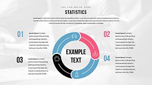
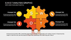
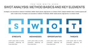
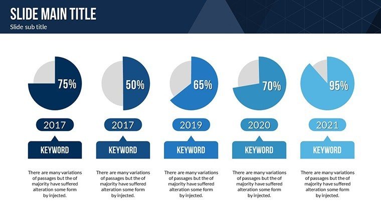
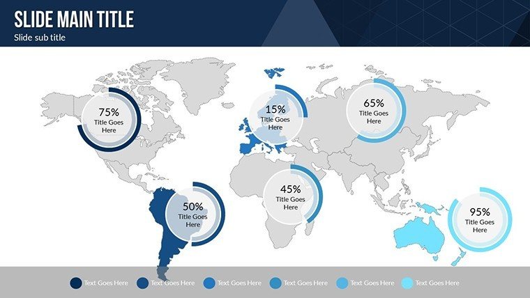
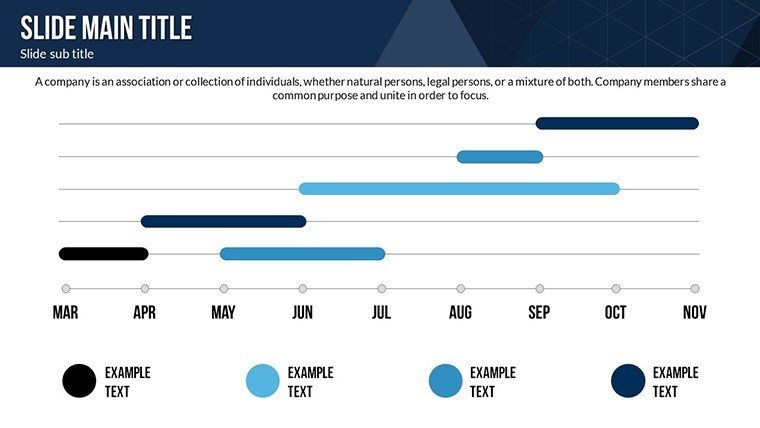
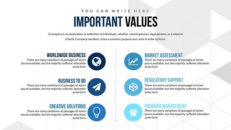
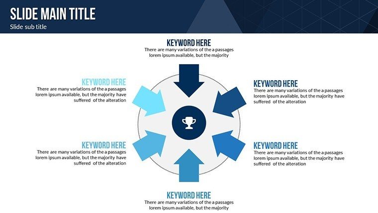
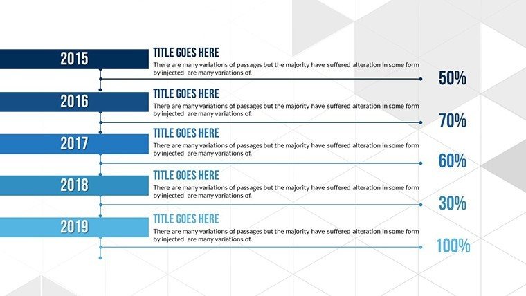
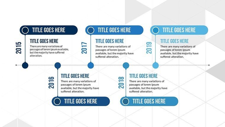
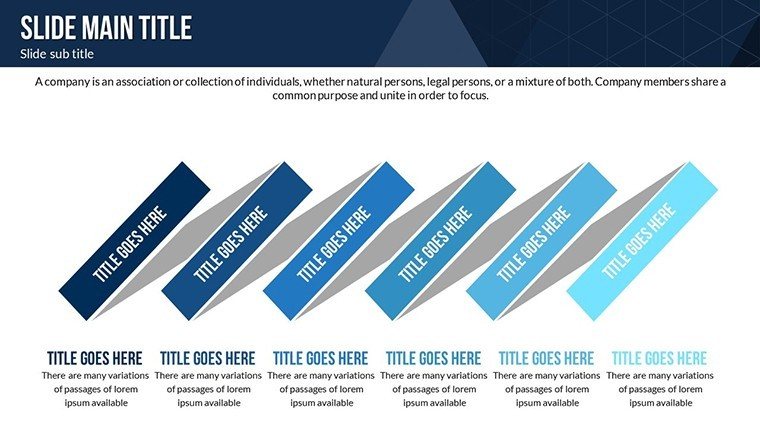
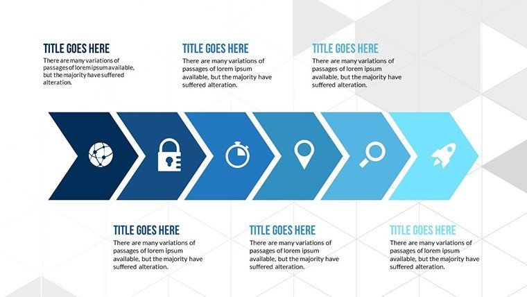
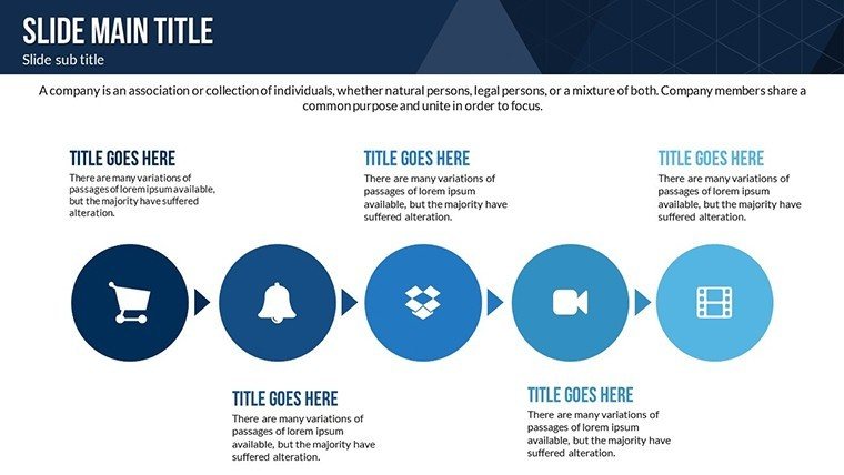
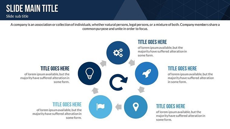
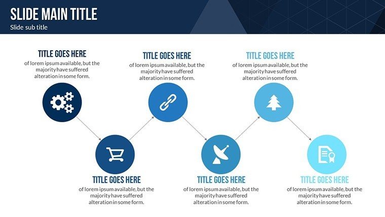
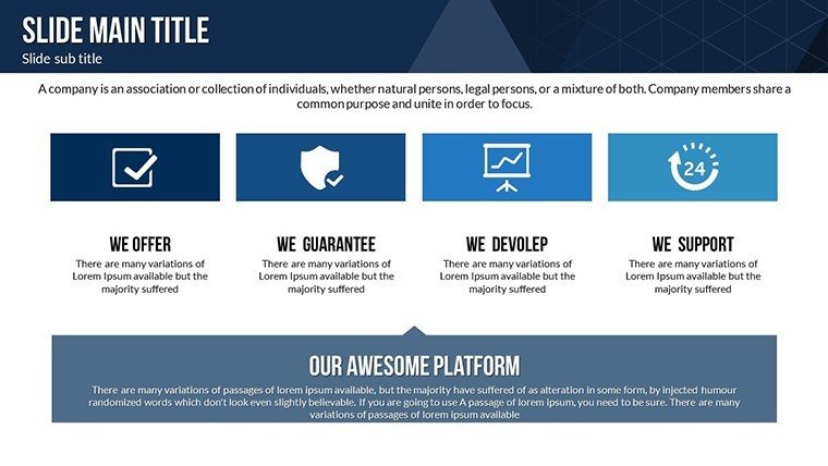
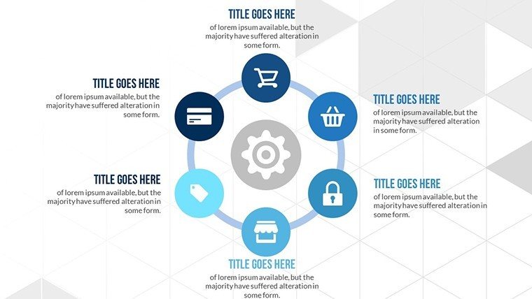
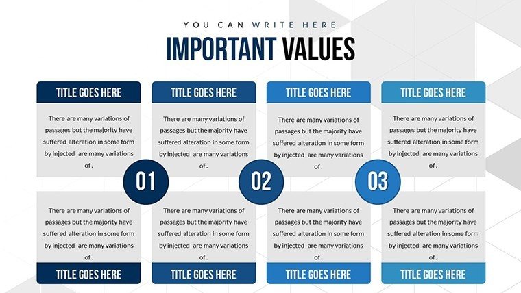
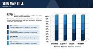
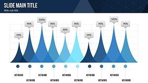
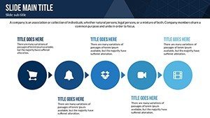
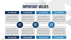
28 editable slides include cycle diagrams for process flows. Pie charts show distribution. Illustrative elements clarify steps.
These elements work together to support data demystification by allowing label swaps across cycles. The set brims with cycle diagrams unlike single-chart layouts.
This one works best for project flow analysis because the 28 slides enable quick updates of illustrative elements. The paid version includes the full 28 editable slides.
File format is PPTX. Layout composition follows zone segmentation. Flow direction moves clockwise in cycles. Color contrast segments phases.
Trainers often pair these diagrams with a cycle chart templates when mapping project flows.
Technical Specs
| Feature | Details |
|---|---|
| Slides included | 28 charts covering cycle diagrams and pie charts |
| Editable shapes | segments resize and recolor independently |
| Text placeholders | labels update without unlocking groups |
| Color theme adjustments | compatible with slide master palette |
| Diagram connectors | arrows adjustable in direction and weight |
| PowerPoint compatibility | 2016 2019 365 on Windows and Mac plus Google Slides |
Three Situations Where This Pays Off
A project manager in engineering mapping process flows cut preparation from 3 hours to 45 minutes by updating cycle diagrams.
An educator in academic lectures reused the file across five sessions by changing pie chart data.
These outcomes occur because illustrative elements keep visual hierarchy clear.
Download the analysis PowerPoint charts now
From Download to Final Deck
1. Open the .pptx file in PowerPoint (1 minute).
2. Replace placeholder text with your content (3 minutes).
3. Adjust brand colors via the slide master (2 minutes).
4. Edit diagram labels and connectors (4 minutes).
5. Export as PPTX or PDF (1 minute).
Editing difficulty is moderate. The workflow matches actual PPTX behavior.
The Cost of Not Using a Template
Building cycle diagrams manually takes four hours and advanced skill. Illustrative elements sit outside shapes. That approach works on a laptop screen but becomes harder to read on a projection screen.
Many presentations place labels directly inside shapes. This layout maintains readability during live meetings without adding editing complexity.
You save time on layout composition. The single purchase covers the complete 28 editable slides.
Get the template and start presenting
Which PowerPoint versions does this template support?
The template opens in PowerPoint 2016 2019 and 365 on both Windows and Mac. It also works with Google Slides. Open the PPTX file in your version first. Update any missing fonts through the slide master to ensure full compatibility.
How do I change the color scheme?
Open the file and navigate to the slide master view. Select the theme colors palette. Replace the existing colors with your brand palette. The changes apply automatically to all 28 charts. Save the file and exit master view.
What does the license allow for client work?
The license permits use in internal reports and paid client presentations. You may not resell the file or sublicense it. Attribution is not required. Contact support for any custom license questions.
What is the difference between free and paid versions?
The paid version includes the full 28 editable slides. Free tier details are not listed on the page. The single purchase covers all diagram types. No additional files come included.
Is animation supported?
No animations come included by default. You can add entrance or emphasis animations in PowerPoint. Remove them easily through the animation pane. The base charts remain fully editable.